Table of Contents >> Show >> Hide
- Who Is John Robshaw, and Why Are His Prints Everywhere?
- What Makes John Robshaw Prints Worth Reading (Not Just Displaying)
- The Print DNA: What “John Robshaw” Looks Like at a Glance
- A Quick, Real-World Guide to Decorating With Robshaw-Style Prints
- The Book Signing Angle: Why Seeing the Designer in Person Hits Different
- Why This Book Matters Right Now (Yes, Even If You Already Own 47 Design Books)
- Required Reading, Actually: How to Read the Book Like a Designer
- Extra : The Experience SideWhat a “John Robshaw Prints” Moment Feels Like
- Conclusion: A Pattern Education Disguised as a Gorgeous Book
Some design books are “coffee-table books” in the same way some people are “casually athletic.”
They look the part, they live in plain sight, and they might even intimidate you into better behavior.
John Robshaw Prints is that kind of bookexcept it also teaches you something real: how a modern textile line can be built on old-world craft,
obsessive travel, and the kind of pattern confidence that makes a plain white duvet feel like it’s underdressed.
And because the universe occasionally rewards good taste, John Robshaw Prints: Textiles, Block Printing, Global Inspiration, and Interiors
isn’t just a glossy parade of pretty fabric. It’s part memoir, part travelogue, part craft primerplus the sort of decorating guidance that makes you
want to go home and “just quickly” rearrange your entire bedroom at 11:47 p.m.
This article is your friendly, slightly over-caffeinated guide to why the book belongs on your nightstand, what makes Robshaw’s prints so recognizable,
and how a book signing (yes, the kind where you awkwardly hold a tote bag and try not to fangirl over throw pillows) is the perfect excuse to fall
in love with textiles all over again.
Who Is John Robshaw, and Why Are His Prints Everywhere?
John Robshaw is a New York-based textile designer with an art-school background and a long-running love affair with traditional printing techniques.
His work is often described as globally inspired, but that phrase can be a lazy shortcutlike calling a five-layer cake “a snack.”
Robshaw’s signature look comes from a specific obsession: heritage textile traditions (especially block printing) and the way color behaves on cloth.
His patterns feel collected rather than manufacturedlike you found them on a trip, learned their story, and then brought them home to live a very
chic second life on your bed, your sofa, or your dining table. Think indigo, saturated jewel tones, lively geometrics, and florals that don’t try
to be polite. They’re not whispering. They’re hosting the party.
The “Modern Bohemian” Sweet Spot
Robshaw’s aesthetic lands in that rare overlap between “world traveler” and “I also enjoy clean sheets.” It’s bohemian, but not messy; maximal, but
not chaotic. The patterns stack well together, which is exactly why they show up in homes that look layered and lived-inwithout looking like you lost
a fight with a fabric store.
What Makes John Robshaw Prints Worth Reading (Not Just Displaying)
The book’s full titleTextiles, Block Printing, Global Inspiration, and Interiorsis essentially the table of contents in one breath.
It moves between travel, process, and decorating ideas, showing how motifs evolve from place-based craft into contemporary home textiles.
That structure matters because it keeps the book from becoming a pattern catalog with delusions of grandeur.
1) It Treats Block Printing Like the Art Form It Is
Block printing is one of those crafts that people love in theoryuntil they realize it involves patience, precision, and approximately one billion
tiny decisions. The book pulls you close to the process: carved wooden blocks, layered colors, repeat patterns, and the controlled imperfection that
makes hand-printed cloth feel alive.
Here’s the key idea that turns “pretty pattern” into “design appreciation”: block printing isn’t about producing a flawless digital repeat.
It’s about a human rhythmpress, lift, align, repeatwhere slight variation becomes texture. In other words, the “little quirks” are the point.
(If your life had fewer quirks, you’d be bored. Same for your bedding.)
2) It Connects Travel to Design Without Being Pretentious
Lots of designers travel. Some come back with souvenirs. Robshaw comes back with a visual vocabularymotifs, palettes, and techniques learned from
regions with deep textile histories. The book frames that travel as creative research, not as a victory lap.
You’ll see references to traditions like indigo printing and resist techniques, plus a broader tour of textile culturesbatiks, ikats, and other
regional patterns that show up in his work as echoes, not replicas. The result is inspiration that feels respectful and specific, rather than vaguely
“exotic,” which is a word best left in the same drawer as low-rise jeans.
3) It Actually Helps You Decorate With Pattern
Many design books assume you live in a 6,000-square-foot home where you can “simply” dedicate an entire room to a single color. Meanwhile, the rest
of us are trying to make a standard bedroom feel intentional while hiding a laundry basket.
Robshaw’s approach to pattern is refreshingly practical: start with what you love, then layer thoughtfully.
The most useful takeaway is that pattern mixing is a skill, not a personality trait. You don’t have to be born fearless. You just need a plan.
The Print DNA: What “John Robshaw” Looks Like at a Glance
Even if you can’t name a specific pattern, you can often spot the “Robshaw-ness” in a room. That’s print DNA: recurring design choices that make a
style recognizable across collections.
- Color with depth: saturated hues, especially blues and indigos, balanced with crisp whites and warm neutrals.
- Motifs that feel drawn by hand: slightly irregular lines, painterly shading, and shapes that look human, not algorithmic.
- Global references, remixed: design cues that nod to craft traditions without copying them stitch-for-stitch.
- Pattern layering that stays readable: busy prints paired with calmer ones so your eyes can rest (because your brain already has
enough tabs open).
Why the Imperfection Works
Handcrafted textiles have “movement.” The repetition isn’t sterile; it breathes. That’s why block-printed bedding can make a room feel softer and
more welcoming than a perfectly uniform print. It’s also why a single patterned pillow can elevate an otherwise simple sofa: the texture does some of
the decorating work for you.
A Quick, Real-World Guide to Decorating With Robshaw-Style Prints
You don’t need to redecorate your entire home to use bold prints well. Start small, build confidence, and let the room tell you what it needs.
(Spoiler: it probably needs fewer random “almost beige” items and one truly great pattern.)
Step 1: Choose Your Anchor
Pick the piece that carries the most visual weight. In a bedroom, that’s often a duvet cover or quilt. In a living room, it might be a rug or a pair
of large pillows. Your anchor print sets the palette and the energy.
Step 2: Mix Scale, Not Chaos
The easiest pattern mistake is mixing prints that all shout at the same volume. Instead, pair a large-scale motif with a smaller, tighter pattern,
then add a near-solid (like a subtle stripe) to create breathing room.
- Large print: big florals, bold geometrics
- Medium print: repeating medallions, ikat-like shapes
- Small print: dots, tiny florals, micro-geometrics
- Rest note: a stripe, a textured weave, or a solid that matches one color from the anchor
Step 3: Repeat One Color Three Times
Want the room to look “pulled together” without looking like you tried too hard? Repeat a key color in at least three places.
Example: indigo in the bedding, a small vase on the nightstand, and a framed print across the room. Congratulationsyour room now has a storyline.
Step 4: Use Neutrals Like a Frame
Pattern pops more when it’s surrounded by calm. White sheets, natural wood, jute, linen, or warm off-whites keep bold prints from feeling like a
circus audition. (Unless you’re going for circus chic. No judgment. Slight curiosity, but no judgment.)
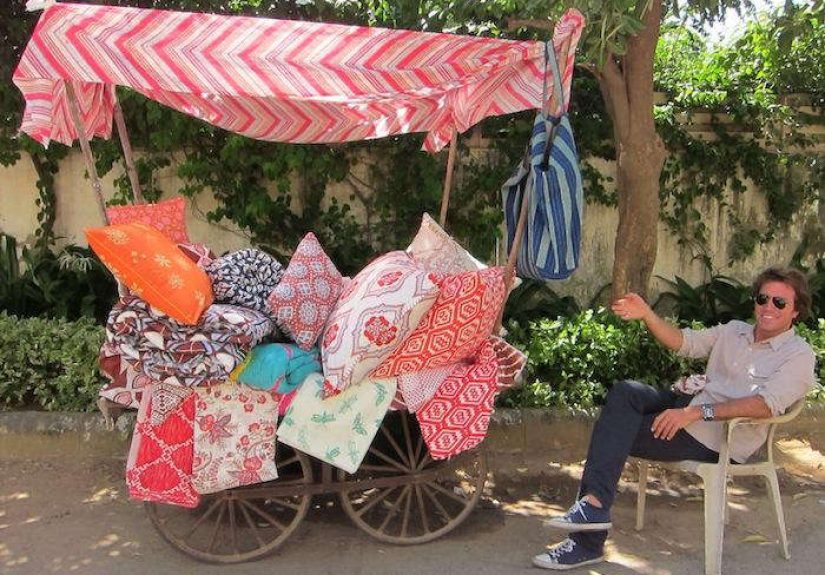
The Book Signing Angle: Why Seeing the Designer in Person Hits Different
A book signing for a design title might sound quaint, like something your aunt would do before a charity luncheon. But in the interiors world, it’s
basically a backstage pass. You get context: how a designer talks about color, what they notice in craft, why certain motifs repeat across their work.
And yes, you also get a signed copy that makes your bookshelf feel very accomplished.
Robshaw has done signings and in-store appearances tied to the bookoften hosted by design-forward shops where you can see the textiles in real life,
not just in photos. It’s a particularly good match for his work because prints are tactile. On a page, they look beautiful. In person, they look
dimensional.
What to Ask at a Book Signing (So You Don’t Panic and Say “I Like… Fabrics”)
- “How do you decide when a pattern is finished?” Designers have surprisingly specific answers.
- “What’s your go-to ‘starter’ mix for someone new to prints?” You’ll get practical guidance you can use immediately.
- “Which color is hardest to get right on cloth?” This often reveals the craft side of production.
- “What’s one ‘rule’ you love breaking in interiors?” Great for learning how pros think.
Why This Book Matters Right Now (Yes, Even If You Already Own 47 Design Books)
Interiors trends swing like a pendulumminimalism, maximalism, quiet luxury, dopamine décoruntil you’re not sure whether your living room should look
like a spa or a very fashionable fruit salad. What stays timeless is craft. The book lands in that stable territory: tradition, technique, and
storytelling through objects.
It also speaks to a growing appetite for knowing how things are made. In a world of fast everything, handwork feels grounding. Block printing
is slow, skilled, and physical. When you understand the process, you stop seeing a patterned quilt as “just bedding” and start seeing it as functional
art.
Required Reading, Actually: How to Read the Book Like a Designer
If you want more than aesthetic inspiration, read it with a notebook (or your phone’s Notes app, where good intentions go to be forgotten).
Here’s a simple way to extract real value:
- Track color combinations: pause on spreads where the palette feels “right” and write down the 3–5 colors you see.
- Notice motif families: identify recurring shapes (petals, medallions, stripes, geometrics) and how they’re reinterpreted.
- Study contrast: look for the quiet elements that keep the bold ones working (white space, solids, texture).
- Translate to your home: pick one idea per roomjust oneso you don’t end up repainting the hallway at midnight.
Extra : The Experience SideWhat a “John Robshaw Prints” Moment Feels Like
Let’s talk about the part design articles rarely capture: the sensory experience of printsespecially when a book signing turns the whole thing into a
small event. Even if you’ve never attended one, you probably know the vibe: a boutique or design shop that smells faintly like candles and ambition,
stacks of glossy books near the register, and a crowd that somehow looks relaxed while wearing shoes that definitely require personal sacrifice.
You walk in telling yourself you’re “just here for the signing,” and within two minutes you’re petting a quilt like it’s a friendly golden retriever.
That’s the first lesson of Robshaw’s world: textiles are physical. You can’t fully understand a print until you’ve seen how it sits on fabric, how the
color changes in different light, and how the repeat pattern creates rhythm instead of noise.
When you flip through John Robshaw Prints at an event, the book stops being a design object and becomes a conversation starter. Someone nearby
points to a page and says, “I tried something like that on my guest bed,” and suddenly you’re trading notes on what worked, what didn’t, and why that
one “neutral” pillow somehow turned yellow next to an indigo quilt. (Lighting: the ultimate plot twist.)
If Robshaw is there, the experience gets even more grounding. Designers talk about prints differently than the rest of us. Most people say, “I love the
blue.” A designer says, “That blue took forever.” You start to notice the hidden labor: the carving of blocks, the layering of dyes, the imperfectly
perfect alignment that makes the print feel human. Even the way a pattern is namedoften tied to place or memoryadds texture. It’s not just décor.
It’s story.
There’s also a gentle thrill in hearing a creator describe the “why” behind something you’ve only experienced as “pretty.” Maybe it’s why a certain
floral repeats across collections, or why a stripe shows up as a quiet stabilizer next to louder motifs. And if you’re lucky, you’ll pick up a
practical tip that’s worth the price of admission: how to mix patterns by scale, how to repeat a color so a room feels cohesive, or how to use white
space like a frame.
Then comes the signing itselfequal parts charming and socially awkward. You stand in line holding a book that makes you look like you have your life
together. You rehearse a sentence in your head (“Your work is so inspiring!”) and immediately forget it when it’s your turn. You end up saying
something like, “I… really enjoy prints,” which is true, but also the design equivalent of telling a chef you like food.
Still, you leave with a signed copy that feels oddly personal, like your home just gained a new tool rather than a new thing. On the way out, you
notice you’re seeing everything differently: the pattern on a lampshade, the rhythm of tiles in a backsplash, the way a rug anchors a room. That’s the
best kind of design experiencethe kind that follows you home, makes you braver, and (with any luck) prevents you from buying twelve throw pillows in a
panic because you now have an actual plan.
Conclusion: A Pattern Education Disguised as a Gorgeous Book
John Robshaw Prints is required reading if you love textiles, want to understand block printing beyond “wow, pretty,” or need a confidence
boost to mix patterns without turning your bedroom into a visual argument. It’s a tour through craft and travel, but also a practical guide to making
interiors feel layered, warm, and alive.
And if you can catch a book signing or in-store event tied to the book, do it. Seeing prints in personand hearing the story behind themturns a
design book into something more useful than inspiration: it becomes a toolkit. Plus, you’ll get a signed copy, which is basically the adult version of
a gold star that says, “Yes, I care about my home, and no, I will not apologize.”