Table of Contents >> Show >> Hide
- Why Gray Works in a Calming Neutral Living Room
- 42 Gray Living Room Ideas for a Calming Neutral Space
- 1) Start with undertones, not paint names
- 2) Sample paint in morning, afternoon, and night
- 3) Use warm greige for cozy living rooms
- 4) Use cool gray for crisp, airy spaces
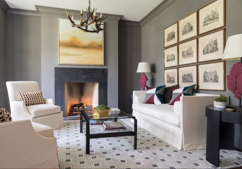
- 5) Choose one big gray anchor piece
- 6) Layer light, medium, and dark grays
- 7) Match gray to your fixed finishes
- 8) Keep trim intentional
- 9) Add a textured wool or wool-look rug
- 10) Bring in linen curtains
- 11) Mix at least two wood tones
- 12) Use velvet strategically
- 13) Add a boucle or knit throw
- 14) Use subtle pattern-on-pattern
- 15) Pair gray with blue for a tranquil feel
- 16) Pair gray with sage green for natural calm
- 17) Pair gray with blush for softness
- 18) Pair gray with mustard for energy
- 19) Pair charcoal with camel leather
- 20) Pair gray with black and ivory
- 21) Use one surprise accent color
- 22) Build three layers of lighting
- 23) Choose warm bulbs for comfort
- 24) Place a mirror to amplify daylight
- 25) Try a darker accent wall only where it helps
- 26) Paint the ceiling a soft off-white
- 27) Use matte or eggshell thoughtfully
- 28) Highlight architecture with tonal contrast
- 29) Scandinavian gray: minimal and bright
- 30) Modern farmhouse gray: soft and rustic
- 31) Classic traditional gray: elegant and layered
- 32) Japandi gray: peaceful and tactile
- 33) Industrial gray: moody and urban
- 34) Contemporary glam gray: polished but cozy
- 35) Eclectic gray: gallery-style personality
- 36) Choose performance fabrics for daily life
- 37) Pick medium gray for high-traffic seating
- 38) Use washable slipcovers when possible
- 39) Simplify cables and visual clutter
- 40) Rotate accents seasonally
- 41) Refresh on a budget with paint + layout changes
- 42) Follow the 20% edit rule
- Final Thoughts: Calm Isn’t the Same as Boring
- Experience-Based Insights: What Actually Happens in Real Gray Living Rooms (Approx. )
Gray gets a weird reputation. Some people hear “gray living room” and picture a space that looks like a rainy Tuesday in a tax office.
But done right, gray is the ultimate design power move: calm, timeless, and flexible enough to work with almost any style you love now
(and any style you’ll pretend you always loved next year). From soft dove walls to dramatic charcoal accents, gray creates a neutral base
that lets texture, lighting, art, and personality do the talking.
This guide gives you 42 practical gray living room ideas you can actually usewhether you’re redesigning from scratch,
refreshing a rental, or just trying to make your current sofa look intentionally chosen. You’ll find tips for paint undertones, furniture,
lighting, layout, and color pairings, plus real-world experience stories at the end so you can avoid common mistakes.
Goal: a space that feels serene, stylish, and lived-innot sterile.
Why Gray Works in a Calming Neutral Living Room
Gray sits in that sweet spot between warm and cool. It can be airy, cozy, moody, modern, classic, coastal, or farmhouse depending on
undertone and styling. That flexibility is exactly why it remains a favorite in living rooms: it supports the whole room instead of
shouting over it.
Before You Start: The 5-Minute Gray Strategy
- Decide your mood first: soft and bright, warm and cozy, or rich and dramatic.
- Choose undertone direction: warm gray/greige vs cool blue-gray.
- Pick one anchor item (sofa, rug, or wall color) and build around it.
- Use layered lighting to keep gray from feeling flat.
- Plan texture from day one: fabric, wood, metal, woven elements, and plants.
42 Gray Living Room Ideas for a Calming Neutral Space
1) Start with undertones, not paint names
“Silver Mist” sounds cute, but the undertone decides whether your room feels peaceful or puzzling. Check if your gray leans blue, green,
brown, or violet, then match it to your flooring and natural light.
2) Sample paint in morning, afternoon, and night
Gray shifts dramatically through the day. Put large peel-and-stick samples on multiple walls and evaluate under natural and lamp light
before committing. Your future self will thank you, loudly.
3) Use warm greige for cozy living rooms
If your space gets limited sun or has lots of warm wood, greige (gray + beige) helps keep things welcoming. It gives neutral sophistication
without that cold “high-end waiting room” vibe.
4) Use cool gray for crisp, airy spaces
In bright rooms with lots of natural light, cool gray walls can feel fresh and architectural. Pair with whites, matte black, and light oak
for a clean, modern look.
5) Choose one big gray anchor piece
A gray sectional, large area rug, or painted wall can ground the room. Once that anchor is set, everything else becomes easier:
layered neutrals, accent colors, and textures naturally fall into place.
6) Layer light, medium, and dark grays
One gray can feel flat; three grays feel designed. Try pale gray walls, mid-tone upholstery, and deeper charcoal in pillows, side tables,
or frames for depth without clutter.
7) Match gray to your fixed finishes
If you have warm flooring (honey oak, walnut, terracotta undertones), pick warm gray. If you have cooler stone or concrete finishes,
cooler gray usually harmonizes better.
8) Keep trim intentional
Crisp white trim brightens gray walls. Matching trim to wall color creates a cocoon effect. Going slightly darker on trim adds architectural
contrastsubtle, but very grown-up.
9) Add a textured wool or wool-look rug
Gray loves texture. A nubby, heathered, or subtly patterned rug adds movement underfoot and keeps your neutral palette from becoming visually
sleepy.
10) Bring in linen curtains
Gray walls plus airy linen drapes equal instant calm. Choose off-white, flax, or fog-gray curtains with enough length to kiss the floor
for that polished look.
11) Mix at least two wood tones
Gray can read cool, so natural wood is your warmth booster. Pair medium oak with darker walnut or weathered ash to make the room feel layered,
collected, and lived-in.
12) Use velvet strategically
A gray velvet sofa or accent chair adds depth and softness at once. It catches light beautifully, so your neutral room feels rich rather than
monochrome.
13) Add a boucle or knit throw
Soft textiles are mood setters. One chunky throw in cream, oatmeal, or smoky blue can instantly warm a cool gray paletteespecially in winter.
14) Use subtle pattern-on-pattern
Think stripe pillow + geometric rug + textured drape, all in similar tones. Pattern variation gives personality while keeping the room calm.
15) Pair gray with blue for a tranquil feel
Blue-gray combinations feel restful and coastal without becoming beach-theme cheesy. Keep blues muted for serenity, then add white for lift.
16) Pair gray with sage green for natural calm
Sage, olive, and eucalyptus accents soften gray beautifully. Plants, green ceramics, or artwork with botanical tones create a grounded,
nature-connected vibe.
17) Pair gray with blush for softness
If you want neutral with a little warmth and charm, blush and dusty rose accents are excellent with gray. Keep it subtle: one pillow, one art
piece, one vase.
18) Pair gray with mustard for energy
Gray + mustard is the interior-design equivalent of coffee plus motivation. A mustard chair or throw adds cheerful contrast without overwhelming
your calm base.
19) Pair charcoal with camel leather
This combo feels luxurious and timeless. Charcoal walls or sofa with camel leather chairs gives your living room a refined, magazine-worthy
contrast that still feels welcoming.
20) Pair gray with black and ivory
For a modern, high-contrast neutral look, anchor with gray and layer black metal details plus ivory textiles. Clean lines, strong silhouettes,
zero chaos.
21) Use one surprise accent color
A gray room becomes memorable with one bold popterracotta, emerald, rust, or aubergine. Keep accent color at roughly 10% so calm stays calm.
22) Build three layers of lighting
Use ambient (ceiling fixture), task (reading lamps), and accent (wall sconces/table lamps). Gray needs layered light to avoid dull corners
and flat walls.
23) Choose warm bulbs for comfort
Around 2700K often makes gray interiors feel softer and more inviting. Cooler bulbs can push some grays too blue, especially at night.
24) Place a mirror to amplify daylight
Position mirrors opposite or adjacent to windows to bounce light deeper into the room. It brightens gray tones and makes the space feel larger.
25) Try a darker accent wall only where it helps
Charcoal can be stunning behind a fireplace or media wall. Keep adjacent surfaces lighter to maintain balance and avoid the “cave effect.”
26) Paint the ceiling a soft off-white
If your walls are medium gray, a lighter ceiling preserves openness. In small rooms, that contrast can make the space feel taller and calmer.
27) Use matte or eggshell thoughtfully
Matte gives a velvety look and hides wall imperfections; eggshell adds gentle reflectivity and easier wipeability. Pick finish based on room use,
not internet arguments.
28) Highlight architecture with tonal contrast
Built-ins, molding, or alcoves look elevated when painted one shade lighter or darker than surrounding walls. It’s subtle drama, not loud drama.
29) Scandinavian gray: minimal and bright
Use light gray walls, pale wood, simple furniture shapes, and black accents. Keep decor edited and functional. The mood is quiet, not empty.
30) Modern farmhouse gray: soft and rustic
Mix warm gray paint with natural wood beams, linen upholstery, and matte black hardware. Add vintage-inspired pottery and woven baskets for soul.
31) Classic traditional gray: elegant and layered
Try gray walls with panel molding, tailored drapery, and antique-inspired lighting. Layer with cream upholstery and brass accents for timeless
sophistication.
32) Japandi gray: peaceful and tactile
Choose stone-leaning gray, low-profile furniture, light wood, and uncluttered surfaces. Use fewer decor pieces, but better textures and forms.
33) Industrial gray: moody and urban
Combine charcoal walls, black metal, concrete textures, and reclaimed wood. Soften the look with a plush rug and oversized textile art.
34) Contemporary glam gray: polished but cozy
Pair smoky gray with velvet, marble, and metallic finishes (brass or chrome). Use rounded silhouettes and warm lighting so glam feels inviting,
not stiff.
35) Eclectic gray: gallery-style personality
Let gray walls act as a backdrop for colorful art, collected objects, and mixed eras. Keep one consistent thread (like black frames or walnut
wood) to avoid visual noise.
36) Choose performance fabrics for daily life
Gray upholstery in performance fabric is practical for kids, pets, snacks, and “I totally didn’t spill that” moments. Style and survival can
coexist.
37) Pick medium gray for high-traffic seating
Very light gray can show marks; very dark gray can show lint. Mid-tone gray often hides daily wear best while still looking refined.
38) Use washable slipcovers when possible
If your life is active, washable covers are a sanity saver. You keep the neutral look and gain real-world flexibility for accidents and seasons.
39) Simplify cables and visual clutter
A calming space depends as much on what you remove as what you add. Hide cords, edit surfaces, and limit tiny decor pieces that create visual static.
40) Rotate accents seasonally
Keep your base gray year-round, then swap pillows, throws, and florals by season. Rust and olive in fall, ivory and pine in winter, blush and sage
in spring.
41) Refresh on a budget with paint + layout changes
You can dramatically improve a gray living room without buying says “goodbye paycheck.” Repaint one wall, rearrange furniture for better flow,
and upgrade lighting first.
42) Follow the 20% edit rule
When styling is done, remove about 20% of accessories. Gray rooms look best when breathing room exists between objects. If every surface is full,
calm disappears fast.
Final Thoughts: Calm Isn’t the Same as Boring
The best gray living room ideas don’t treat gray like a personality; they treat it like a platform. Your room still needs contrast, texture,
shape, light, and one or two moments of surprise. Do that, and gray becomes the most flexible neutral you’ll ever useeasy to evolve,
easy to live with, and never locked into one trend cycle.
If you remember only one thing: choose the right undertone, then layer warmth and texture. That formula works in tiny apartments,
busy family spaces, minimalist homes, and everywhere in between.
Experience-Based Insights: What Actually Happens in Real Gray Living Rooms (Approx. )
Theories are nice. Real rooms are nicer. The following experience-based scenarios reflect common outcomes homeowners report after implementing
gray living room ideas. Names and details are composite, but the lessons are very real.
Experience 1: The North-Facing Apartment That Felt “Cold”
A couple in a small north-facing apartment chose a cool, icy gray because it looked beautiful in a bright showroom. At home, it turned flat and
chilly by late afternoon. Their first instinct was to repaint everything immediately. Instead, they adjusted the supporting elements first:
warm 2700K bulbs, off-white curtains, a vintage-style rug with warm taupe tones, and a medium walnut coffee table. The transformation was dramatic.
The wall color didn’t change, but the room did. Two weeks later they still repaintedthis time to a warm greige. Result: the space felt calmer,
brighter, and more “weekend coffee” than “corporate lobby.” The big lesson: gray is never just gray; light and materials finish the color story.
Experience 2: The Family Room With Kids, Pets, and Constant Motion
A family of five (plus one large, enthusiastic dog) wanted a calm neutral room that could survive real life. Their first plan included a pale gray
velvet sofa and delicate boucle ottoman. Beautiful in photos; risky in practice. They pivoted to a medium-gray performance sectional, washable covers
on accent pillows, a patterned rug that disguised crumbs, and closed storage for toys. They also kept decor to larger, fewer piecesbig art, one plant,
two lampsinstead of many tiny objects. Six months in, the room still looked intentional. Their key takeaway: calming design for family homes is about
reducing maintenance friction. Gray worked because it supported durability, not because it looked trendy on social media.
Experience 3: The Open-Concept Space That Needed Visual Boundaries
In an open-concept condo, the living area bled into dining and kitchen zones, making everything feel visually busy. Rather than adding more furniture,
the homeowner used tonal zoning: a large gray rug anchored the seating area, a slightly darker gray media wall defined the focal point, and consistent
black accents connected all zones. Lighting did the rest: a statement ceiling fixture for ambient light, floor lamp for reading, and a table lamp for
evening softness. The room finally felt organized without adding walls. Their biggest insight was that gray can create quiet structure in open plans.
Not dramatic structure. Quiet structurethe kind you feel before you notice.
Experience 4: The Budget Makeover That Looked Expensive
A renter wanted “designer calm” with a very non-designer budget. She couldn’t replace the sofa, couldn’t change floors, and couldn’t install built-ins.
She focused on high-impact moves: paint (renter-safe where allowed), long drapes hung high, one oversized art print, better lamp shades, and a palette
of gray, cream, and muted green. She edited clutter ruthlessly and used baskets to hide everyday items. The room went from random to cohesive in one month.
Guests thought she bought new furniture; she mostly changed context around existing pieces. Her conclusion was refreshingly simple: expensive-looking rooms
are often edited rooms. Gray helped unify everything so each affordable update looked deliberate.
Across all four experiences, the pattern is consistent: success comes from undertone awareness, lighting strategy, texture layering, and clutter control.
Gray is a calm neutral, yesbut only when the room is designed as a system. Treat it as a backdrop for better decisions, and it will reward you every day.