Table of Contents >> Show >> Hide
- Start Like a Curator: Decide the Job Your Wall Art Should Do
- Measure the “Art Zone” (Not the Whole Wall)
- Choose a Layout Style That Matches Your Space
- The Three Rules That Make a Wall Look Instantly Professional
- Mock It Up Before You Make Holes (Your Future Self Will Thank You)
- How to Arrange Art So It Looks Balanced (Even When It’s Mixed)
- Hanging Hardware: Secure First, Pretty Forever
- Tools That Make You Look Like You’ve Done This Before
- Lighting and Placement: The “Looks Good All Day” Checklist
- Room-by-Room Art Arrangement Examples
- Troubleshooting: Fix the “Why Does This Look Wrong?” Moment
- Conclusion: Your Foolproof Plan for a Flawless Wall Display
- Experiences from Real Homes: What People Actually Run Into (and How They Fix It)
Hanging art is one of the few home-decor activities that combines math, emotions, and tiny metal objects you will inevitably drop and lose forever.
The good news: a flawless wall display isn’t about having “designer instincts.” It’s about using a simple planlike a museum wouldso your wall looks
intentional instead of “I panicked with a hammer.”
In this guide, you’ll learn how to arrange wall art (single pieces or full gallery walls), choose a layout that fits your room, nail the right height and spacing,
and hang everything securely. We’ll also troubleshoot common mistakesbecause yes, the “why does it look weird?” moment is a universal human experience.
Start Like a Curator: Decide the Job Your Wall Art Should Do
Before you measure anything, decide what you want the wall to feel like. Art arrangement works best when it supports a clear goal:
a focal point, a story, a color bridge, or a mood booster.
- Focal point: One bold piece or a tight cluster that draws your eye the second you enter the room.
- Story wall: Family photos, travel prints, kids’ drawingsorganized so it reads like a collected set.
- Color bridge: Art that ties your sofa, rug, and accent colors together so the room looks “finished.”
- Texture wall: Mix framed art with dimensional pieces (woven wall hangings, small shelves, sculptural objects).
Quick tip: pick an “anchor piece” firstyour largest, boldest, or most meaningful item. The rest of your wall art arrangement will orbit around it.
Measure the “Art Zone” (Not the Whole Wall)
One of the easiest ways to end up with art that feels “off” is measuring from baseboards to ceiling like you’re planning to wallpaper the place.
Instead, define your art zone: the portion of wall your display should occupy.
Above furniture: use proportion so it feels balanced
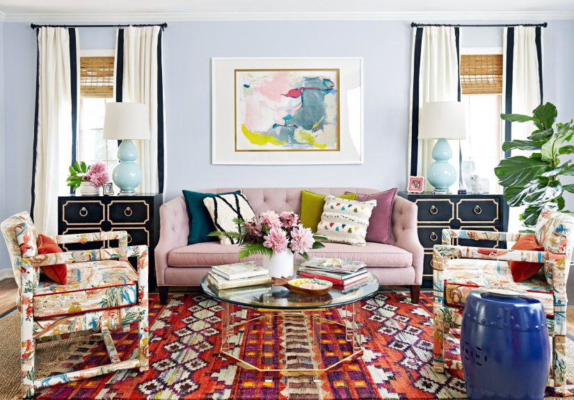
Over a sofa, bed, console, or credenza, aim for artwork (or a grouping) that spans roughly two-thirds the width of the furniture.
Not because the Decor Police will arrest youbecause it simply looks balanced to the human eye.
Example: Your sofa is 84 inches wide. Two-thirds of that is 56 inches. A gallery wall that spans about 55–65 inches will feel “right.”
On a blank wall: pick a centered rectangle to fill
For open walls (like a hallway end or dining room wall), choose a rectangle that’s visually centered, leaving consistent margins on the sides.
A common approach is to keep at least 6–10 inches of breathing room from nearby corners, trim, or large architectural features.
Choose a Layout Style That Matches Your Space
Your layout is the skeleton of the wall. Pick the style first, then arrange pieces to match it.
1) The Statement Piece
One oversized artwork can make a room look high-end fast. Use this when you want calm, minimal visual noise, or you’re working with one great piece.
2) The Pair or Diptych
Two pieces side-by-side creates symmetry and is perfect for bedrooms, above consoles, or flanking a mirror. Keep the gap consistent (more on spacing soon).
3) The Triptych
Three pieces in a row gives you instant rhythm. It’s a great solution above sofas when a single piece feels too small.
4) The Grid Gallery Wall
Clean, modern, and hard to mess up if you measure. Best for matching frame sizes or a consistent photo series.
5) The Salon-Style Gallery Wall
This is the “collected over time” lookmixed sizes, mixed frames, more personality. It’s also the layout most likely to look chaotic if you skip planning.
6) Picture Ledges or Picture Rails
If you want flexibility (or you’re allergic to commitment), ledges and rails let you swap art without new holes. Great for rentals and evolving collections.
The Three Rules That Make a Wall Look Instantly Professional
Rule #1: Hang at eye level (use the center, not the top)
A widely used gallery standard is to place the center of your artwork around 57–60 inches from the floor. That’s average eye level for most adults.
If you hang everything “a little higher for drama,” the drama you get is neck strain.
For a gallery wall, treat the entire grouping as one big piece: find the center of the whole arrangement and keep that around eye level.
Rule #2: Keep consistent spacing
Consistent spacing is the difference between “curated” and “yard sale energy.” A common sweet spot is
about 2–3 inches between frames (or between frame edges and nearby objects in the grouping).
Rule #3: Above furniture, don’t float it into outer space
When hanging art above a sofa or console, a helpful range is keeping the bottom of the frame roughly
7–10 inches above the top of the furniture (or slightly lower if you mainly view it while seated).
Mock It Up Before You Make Holes (Your Future Self Will Thank You)
Pros plan the layout before hammering. You should toounless you enjoy patching drywall as a hobby.
Method A: Floor layout + photo proof
- Measure your art zone on the wall.
- Tape a matching rectangle on the floor with painter’s tape.
- Arrange your frames inside the taped box.
- Take photos of your favorite layout so you can recreate it on the wall.
Method B: Paper templates (the “no regrets” method)
- Trace each frame on kraft paper or newspaper and cut it out.
- Label each cutout (so you don’t play “which one was the 8×10?” later).
- Tape the templates on the wall and adjust until it looks right.
- Mark nail points through the template, then hang for real.
A composition tip that saves salon-style walls
If your gallery wall feels “stripy,” look for long, empty channels of wall space running straight through it.
Designers often avoid these “rivers” by staggering edges and varying sizes so the gaps don’t line up like highways.
How to Arrange Art So It Looks Balanced (Even When It’s Mixed)
Use a visual “triangle”
For mixed-size arrangements, create a loose triangle of visual weightoften by placing the largest piece near the center or slightly off-center,
then balancing it with medium pieces on both sides.
Repeat something on purpose
Cohesion is usually created by repeating one element:
- Frame color: all black, all oak, all white, or a planned mix (like black + brass).
- Mat style: consistent mat widths can make even random prints feel unified.
- Color palette: pick 2–3 recurring colors across pieces (even subtly).
- Theme: all landscapes, all abstracts, all family photos, or “blue things that calm me down.”
Mixing frames without chaos
Want that eclectic look? Keep the shapes varied but the spacing consistent. Or keep frame colors consistent and vary frame profiles.
That way the wall feels collected, not accidental.
Hanging Hardware: Secure First, Pretty Forever
Flawless displays aren’t just alignedthey’re safe. Use hardware that matches both your wall type and the weight of the piece.
Know what’s on the back of your frame
- Sawtooth hanger: common for light frames; can be trickier to level perfectly.
- D-rings + wire: great for stability; allows fine adjustment.
- D-rings (no wire): two-point hanging can help keep large frames from tilting.
- French cleat: excellent for heavy or oversized pieces (extra stable and level-friendly).
Drywall basics (aka most homes)
If it’s light, a picture hook or nail may work. If it’s heavier, use a stud (best) or a properly rated drywall anchor.
A stud finder is not “extra.” It’s the difference between “secure” and “why is my frame slowly sliding down the wall?”
Plaster, brick, tile: special walls, special tactics
Plaster and masonry often require pre-drilling and specific anchors. Brick can sometimes use mortar-joint hangers for lighter items,
but heavier pieces usually need masonry hardware. When in doubt, follow hardware weight ratings and wall-type instructions.
Damage-free options (with realistic expectations)
Adhesive hanging strips can be great for lighter frames on smooth, properly prepared surfaces, but they come with rules:
follow cure times, avoid wallpaper, and don’t use them for valuable or irreplaceable pieces.
If your wall is textured, humid, freshly painted, or dusty, treat adhesive as “maybe” not “forever.”
Tools That Make You Look Like You’ve Done This Before
- Measuring tape: for spacing and centering.
- Level: physical or app-basedeither works if you actually use it.
- Pencil: mark lightly; you’re not carving runes.
- Painter’s tape: mockups, spacing guides, and quick alignment tricks.
- Stud finder: especially for heavy frames and mirrors.
- Paper templates: your best friend for gallery walls.
Lighting and Placement: The “Looks Good All Day” Checklist
A flawless wall display isn’t flawless if it’s a glare factory at 3 p.m.
- Avoid direct sun: rotate art or use protective glazing if fading is a concern.
- Angle matters: slight tilts and glossy prints catch glareespecially near windows.
- Consider picture lights: even one small light can make a wall feel intentional and high-end.
- Mind reflections: mirrors near art can double the clutter effect; balance them carefully.
Room-by-Room Art Arrangement Examples
Living room: above the sofa
Choose a statement piece or a wide gallery that spans roughly two-thirds the sofa width. Keep the bottom edge around 7–10 inches above the sofa back.
If you’re going salon-style, put your anchor piece near the center and build outward, keeping spacing consistent.
Hallway: the “gallery walk”
Hallways are perfect for consistent center height. Keep pieces aligned so the center of each artworkor the groupinghits that eye-level range.
Use smaller frames with consistent spacing to keep the corridor from feeling crowded.
Staircase walls: embrace the slope, don’t fight it
Pick one rule: either align the centers along the slope of the stairs or</em align the top edges for a clean line.
Mockups matter here because your eyes notice misalignment fast on diagonal walls.
Bedroom: above the bed
Keep art securely mounted, especially over headboards. A wide piece or calm triptych works well.
If you’re using a ledge, make sure it’s installed properly and the frames are stable.
Kitchen and bathroom: choose the right materials
Steam and splashes are real. Consider sealed frames, wipeable surfaces, and placement away from direct water exposure.
Small prints or a mini grid can make these spaces feel styled without overwhelming them.
Troubleshooting: Fix the “Why Does This Look Wrong?” Moment
If it looks too high
This is the most common issue. Lower the piece so the center sits closer to eye levelor lower still if it’s meant to be viewed while seated.
If it looks messy
Check spacing. If gaps vary widely, your eye reads it as accidental. Pick a spacing (2–3 inches is a common choice) and make it consistent.
If it feels cluttered
Reduce the number of pieces or introduce more negative space. Consider matching mats or frames to unify the mix.
Sometimes one larger piece plus one small companion looks better than six tiny items battling for attention.
If your salon wall has “rivers” of empty space
Shift one or two frames so the gaps don’t line up in long straight channels. Add a small piece where the wall feels like it’s “leaking blank space.”
Conclusion: Your Foolproof Plan for a Flawless Wall Display
A flawless wall display isn’t luck. It’s a method:
define the art zone, pick a layout style, use eye-level center height, keep spacing consistent, mock it up before you hang,
and choose hardware that won’t betray you in the middle of the night.
Once you’ve done it once, you’ll start seeing walls differentlyin a good way. (In a slightly obsessive way. Welcome to the club.)
Experiences from Real Homes: What People Actually Run Into (and How They Fix It)
The internet makes art arrangement look like a graceful montage: someone floats through a room with a tape measure, places frames on the wall,
and everything aligns perfectly as if the drywall itself is cooperative. In real life, arranging art for a flawless wall display is a series of tiny surprises
most of them harmless, some of them mildly ridiculous, and all of them fixable.
One common experience is the “I hung it… why does it feel like it’s in the clouds?” moment. People often place frames using the top edge as a guide,
especially if they’re thinking about “filling the wall.” The fix is almost always lowering the piece and re-centering it at eye level. When someone finally drops a frame
a few inches, the room instantly feels more comfortablelike the art joined the conversation instead of watching from the balcony.
Then there’s the spacing spiral: you start with two frames, eyeball a gap, add a third, and suddenly the gaps look different in every direction.
What usually happens next is a slow slide into measuring tape therapy. The moment you commit to a consistent spacing rule (many people choose about 2–3 inches),
the wall looks calmer. It’s like giving your frames a personal bubble so they can be near each other without being emotionally enmeshed.
Gallery walls also bring out the layout perfectionist. Lots of people do a floor layout, love it, then move it to the wall and realize it looks different
because walls are vertical and gravity is a critic. That’s when paper templates become a lifesaver. Taping outlines to the wall feels a little arts-and-crafts,
but it’s the fastest way to reduce “hole regret.” It’s also strangely satisfyinglike playing Tetris, but with your personality.
Another real-world classic: the mystery stud. You plan a symmetrical grid, but a stud shows up exactly where you don’t want the hook,
or worse, a stud is nowhere near where you need it for a heavy frame. People solve this by adjusting the layout slightly (often no one notices),
using proper anchors rated for the weight, or choosing two-point hanging so the frame stays level. The lesson is simple: build the plan around reality,
not the other way around.
Renters often share the “commitment issues” experience: they want a beautiful wall art arrangement, but not a security deposit tragedy.
That’s when picture ledges, lightweight frames, and careful adhesive-strip use can helpplus the mindset shift that perfection isn’t required.
A well-arranged set of lighter pieces can look just as polished as a wall full of heavy frames.
Finally, there’s the most relatable experience of all: the “one more frame” syndrome. Your gallery wall looks great… so you add one more piece…
and suddenly it looks crowded. The fix is usually editing, not adding: remove one small piece, increase margins, or swap two tiny frames for one medium frame.
Flawless walls aren’t made by filling every inch. They’re made by choosing what deserves the spotlightand letting the rest of the wall breathe.