Table of Contents >> Show >> Hide
- Why These 3 Decisions Matter Before You Buy a Single Thing
- Decision #1: Decide on Your Colors First
- Decision #2: Define the Feeling You Want the Room to Create
- Decision #3: Find Imagery That Inspires You
- How These 3 Decisions Shape the Rest of the Project
- Common Mistakes to Avoid Before Starting an Interior Project
- The Bigger Lesson Behind Nate Berkus’s Advice
- Extended Experiences: What These 3 Design Decisions Look Like in Real Life
- Conclusion
Starting an interior design project is a lot like going grocery shopping while hungry: you swear you only need one thing, and somehow you come home with six throw pillows, a lamp that looks like modern sculpture, and absolutely no plan. That is exactly why Nate Berkus’s advice feels so useful. Before you start buying, pinning, repainting, or dramatically announcing that the living room is “getting a total refresh,” he says there are three design decisions you need to make first.
They sound simple, but they are the kind of simple that quietly saves you money, decision fatigue, and the tragic purchase of a coffee table you already regret by the time it reaches your driveway. Berkus’s three starting points are these: decide on your colors, define the feelings you want to create, and gather imagery that inspires you. Those choices form the backbone of a room that feels intentional instead of random, personal instead of copy-and-paste, and polished instead of “I bought everything during one chaotic weekend.”
What makes this approach so effective is that it aligns with broader expert design principles. Great interiors usually start with a cohesive palette, a clear sense of mood, and a visual reference point that keeps the room from drifting into confusion. In other words, Berkus is not giving you trendy fluff. He is giving you a practical design filter that helps every later decision make more sense.
Why These 3 Decisions Matter Before You Buy a Single Thing
The biggest decorating mistake is not choosing the wrong rug or painting a wall the wrong shade of greige. It is starting without a framework. When there is no framework, every option looks possible, and that is where rooms go off the rails. One chair feels too formal, the sofa feels too casual, the artwork feels disconnected, and suddenly the whole room has the visual chemistry of strangers trapped in an elevator.
Berkus’s method works because it forces clarity early. Instead of asking, “What should I buy?” you ask, “What kind of room am I trying to build?” That shift changes everything. It also echoes a timeless design truth: homes feel better when they reflect the people living in them rather than whatever trend is making the loudest noise online.
That is especially important now, when inspiration is endless and patience is not. You can scroll through a hundred beautiful rooms in ten minutes, but beautiful does not always mean right for your home. A room can be gorgeous on a screen and still make no sense for your architecture, your routines, your budget, or your sanity.
Decision #1: Decide on Your Colors First
According to Berkus, color is the place to begin. That makes sense, because color affects almost everything else: paint, upholstery, rugs, drapery, art, tile, wood tones, and even how light behaves in the room. Once you settle on a palette, your choices stop feeling infinite and start feeling curated.
Think palette, not just paint
This step is bigger than choosing “white” and hoping for the best. You need a color story. That might be warm neutrals with olive accents, soft blue-grays with crisp white trim, or earthy browns with a little oxblood or black for contrast. The point is to decide whether the room leans warm, cool, moody, airy, grounded, or dramatic before you start shopping.
One of the smartest ways to do this is to look at what already exists in the space. Floors, fixed stone, tile, architectural details, and natural light are not minor characters. They are the cast. If your home has honey-toned wood floors, a palette of icy gray and blue may feel disconnected. If the room gets very little sunlight, a murky color that looked elegant online might end up feeling like a cave with a mortgage.
A practical rule is to pick a dominant base color, a supporting secondary color, and one accent tone. That gives you enough range to create dimension without turning the room into a paint-chip hostage situation. For example:
- Calm bedroom: soft taupe, warm white, muted sage
- Collected living room: creamy beige, tobacco brown, deep olive
- Fresh kitchen: off-white, dusty blue, brushed brass accents
The beauty of choosing your colors first is that it instantly narrows the field. A rug might be lovely, but if it fights your palette, it is not the rug. A lamp might be trendy, but if it introduces a random finish that confuses the room, it is not the lamp either. Color becomes your first and most reliable editor.
Decision #2: Define the Feeling You Want the Room to Create
Once you know the palette, Berkus says the next decision is emotional: how do you want the space to feel? This is where many people skip ahead and get into trouble. They focus on how a room should look and forget that they actually have to live in it.
A room that photographs well is not automatically a room that feels good at 8 p.m. on a Tuesday. Do you want the space to feel quiet and restorative? Energetic and social? Cozy and layered? Tailored and crisp? Relaxed and sun-washed? Those emotional targets are not fluffy design language. They directly shape what you should choose.
Mood determines materials
If the goal is cozy, you might choose nubby upholstery, warm wood, layered lighting, aged brass, and a rug with softness underfoot. If the goal is serene, you may want lighter contrast, cleaner silhouettes, fewer visual interruptions, and materials with subtle texture instead of loud pattern. If the goal is lively, richer color contrast, sculptural forms, and more dynamic art may make sense.
This is also where function enters the chat. A family room should not be designed like a museum if children, pets, snacks, and actual life are involved. A room can be beautiful and durable at the same time. In fact, it should be. A sofa that makes you afraid to sit down is not luxury. It is a very expensive source of anxiety.
Try writing down three mood words before you make any major purchase. For example:
- Living room: welcoming, layered, grounded
- Bedroom: restful, soft, uncluttered
- Dining room: intimate, warm, a little dramatic
Those three words become your decision-making test. If a piece does not support the mood, it probably does not belong. This is one of the easiest ways to prevent impulse buying and the all-too-common “Why does this room feel off?” mystery.
Decision #3: Find Imagery That Inspires You
Berkus’s third decision is to gather imagery that genuinely inspires you. Not imagery you think you should like. Not imagery that matches a trend forecast. Imagery that gives you an actual emotional reaction. A hotel lobby you loved. A photo of a Paris apartment. A cozy reading nook. A kitchen with a color palette you cannot stop thinking about. The point is to collect references that help you identify what you are drawn to.
Use inspiration to spot patterns
Most people say they like “everything,” but once they gather images, patterns emerge fast. Maybe you consistently save rooms with warm plaster walls, old wood, and vintage lighting. Maybe you love tailored spaces with contrast trim and clean-lined upholstery. Maybe every image features one sculptural statement piece and a quiet background. Congratulations, your taste was there all along. It just needed evidence.
This step is useful because it translates vague preference into visible direction. It also protects you from buying beautiful items that do not belong together. A mood board or image folder acts like visual guardrails. When you compare a potential purchase to your reference imagery, you can ask, “Does this move the room closer to the feeling and style I want, or is it just flirting with me under very flattering showroom lighting?”
One smart way to use imagery is to identify these elements across multiple saved rooms:
- repeated colors
- common materials like linen, oak, marble, iron, or leather
- furniture silhouettes
- lighting styles
- the overall balance between minimal and layered
Once you spot those patterns, you are no longer designing blindly. You are designing with a visual language.
How These 3 Decisions Shape the Rest of the Project
Here is where Berkus’s framework becomes especially powerful: every other design choice gets easier after these first three decisions are made. Layout becomes more logical. Materials become more coherent. Decorative details stop feeling random.
Furniture and layout
Your chosen feeling helps determine whether the room needs a formal arrangement, a relaxed conversation zone, or a flexible layout with multiple uses. Your imagery often reveals whether you prefer floating furniture, visible negative space, or a more collected arrangement built around a focal point.
Lighting
If you want warmth and intimacy, layered lighting is essential. That usually means a combination of overhead lighting, table lamps, floor lamps, and dimmable accent lighting. If you want freshness and clarity, brighter light levels and cleaner fixtures may fit better. Lighting should support the room’s mood, not sabotage it.
Textures and finishes
A grounded room might call for natural linen, oak, stone, clay, and hand-finished surfaces. A more polished room may lean into lacquer, tailored upholstery, crisp trim, and sculptural metal accents. Finish decisions are much easier when you already know the emotional destination.
The statement piece
Many successful rooms begin with one hero piece: an antique mirror, a dramatic light fixture, a vintage rug, an incredible chair, or a piece of art that anchors the room. Once your colors, mood, and imagery are clear, that hero piece becomes easier to identify. It no longer needs to carry the whole room by itself. It simply needs to lead the story.
Common Mistakes to Avoid Before Starting an Interior Project
Berkus’s advice also helps you dodge several classic design mistakes.
Buying everything at once
Rooms with soul usually look collected, not installed in one breathless Saturday. Give the room space to evolve. That does not mean moving at the speed of continental drift, but it does mean letting your decisions build on one another.
Choosing trend over connection
If you do not actually love the piece, the relationship will not improve once it is in your house. Design is not speed dating. The goal is long-term compatibility. Berkus has repeatedly emphasized the importance of choosing pieces you genuinely connect with, and that mindset is one of the clearest paths to a home that feels personal rather than temporary.
Ignoring scale and flow
Even a beautiful room falls apart if the proportions are wrong. Measure everything. Then measure again like your future self is begging you to. Consider how people move through the space, where the focal point lives, and whether the room feels balanced rather than crowded.
The Bigger Lesson Behind Nate Berkus’s Advice
The deeper point behind these three decisions is not really about decorating at all. It is about intention. Berkus’s best design advice tends to return to the same idea: homes should tell your story. That means the room should not begin with a shopping list. It should begin with a point of view.
When you start with color, mood, and imagery, you create a room that feels coherent from the inside out. You spend less money on random detours. You make fewer panicked decisions. And most importantly, you end up with a space that feels like it belongs to you, not just to your algorithm.
That is what separates a room that looks finished from a room that feels right. One is decorated. The other is designed.
Extended Experiences: What These 3 Design Decisions Look Like in Real Life
In real homes, Berkus’s three decisions tend to show up in ways that are surprisingly practical. Take a living room makeover that starts the way many do: with frustration. The homeowner thinks the room is bland, assumes the answer is a new sofa, and starts browsing online. But the real issue is not the sofa. It is the lack of direction. Once that homeowner pauses and decides on warm earth tones, a relaxed but elevated mood, and inspiration images filled with vintage wood, soft linen, and aged brass, the room changes course. Suddenly, the existing sofa can stay. The walls get a warmer paint color, a better rug is chosen, the lighting becomes softer, and the room finally feels intentional. Same room, smarter beginning.
A bedroom offers another good example. People often treat bedrooms like storage units with pillows, then wonder why they do not feel restful. But once they define the feeling firstsay, quiet, soft, and unclutteredthe choices become clearer. Shiny furniture starts to feel wrong. Busy artwork feels noisy. Bright white bulbs feel aggressive. Instead, the room moves toward layered bedding, muted color, warm lamps, and fewer but better objects. That emotional goal becomes a filter, and the room starts behaving like a bedroom instead of a multipurpose holding area for laundry and regret.
The imagery step is often where the biggest surprise happens. Someone may think they love modern interiors, but when they gather inspiration photos, they keep saving spaces with old rugs, dark wood, weathered ceramics, and traditional details. That discovery matters. It reveals the difference between what looks impressive online and what feels meaningful in real life. On the flip side, another person may think they want a cozy, collected room, only to realize all their favorite images are spare, tonal, and architectural. Again, that is useful. The images tell the truth faster than your shopping cart does.
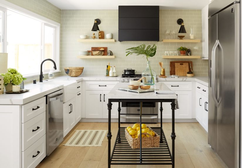
Even kitchens benefit from this process. Before choosing cabinet color, hardware, backsplash tile, or stools, the smartest move is still to ask those three questions. What are the colors? What should the room feel like? What images best reflect that mood? A kitchen that is meant to feel bright and social may lean into painted cabinetry, lighter counters, and airy pendants. One meant to feel grounded and timeless may go toward wood finishes, quieter stone, and understated hardware. Without those early decisions, it is easy to end up with a room made of individually nice choices that somehow refuse to become a nice room.
That is the real-world value of Berkus’s advice. It does not just help designers create prettier spaces. It helps regular people make fewer costly mistakes, trust their instincts, and build homes that feel more honest. And in a world full of trend noise and instant opinions, that kind of clarity is not just helpful. It is design sanity.
Conclusion
Nate Berkus’s three must-make design decisions are refreshingly unfancy: choose your colors, define your feeling, and gather your imagery. But do not let the simplicity fool you. These decisions can determine whether your project feels cohesive or chaotic, personal or generic, timeless or instantly dated. Before you buy the chair, sample the paint, or convince yourself that a neon boucle ottoman is “actually versatile,” step back and build the framework first. Your room will look better, function better, and feel much more like home.