Table of Contents >> Show >> Hide
- Why Brick and Paint Pairing Matters More Than You Think
- How to Choose the Best Exterior Brick and Paint Color Combinations
- The Best Exterior Brick and Paint Color Combinations by Brick Type
- 1) Red Brick + Warm White Trim + Black Accents
- 2) Red Brick + Greige Trim + Deep Green or Navy Door
- 3) Tan or Blond Brick + Crisp White Trim + Navy or Slate Blue Door
- 4) Brown Brick + Cream Trim + Soft Black or Bronze Details
- 5) Gray Brick + Bright White Trim + Charcoal or Black Door
- 6) Painted White Brick + Near-Black Trim + Natural Wood Accents
- 7) Painted Greige Brick + White Trim + Warm Metal Accents
- 8) Mixed Brick + Mortar-Matched Trim + One Bold Door Color
- Popular Exterior Brick and Paint Color Directions Right Now
- Before You Paint Brick, Read This First
- Pro Tips to Make Your Exterior Color Combination Look Expensive
- of Real-World Experiences With Exterior Brick and Paint Color Combinations
- Conclusion
Brick already brings texture, personality, and that “this house has stories” energy. But the right paint colors around it? That’s what takes a home from nice to whoa, slow down the car and look at that place. Whether your exterior is classic red brick, pale blond brick, gray brick, or a previously painted facade, the best exterior brick and paint color combinations come down to one thing: balance.
This guide breaks down how to choose colors that work with brick (not against it), how to match trim, shutters, and doors, and how to avoid the common mistakes that make exteriors look flat, mismatched, or accidentally chaotic. We’ll also cover prep and maintenance tips for homeowners considering painted brick, because curb appeal is fun, but peeling paint is not.
Why Brick and Paint Pairing Matters More Than You Think
Brick is not a blank canvas. It has undertones, mortar color, texture, and age variation. In other words, brick is the lead singer. Your trim, siding accents, shutters, and front door are the band. If they all try to be the star, the result feels noisy. If they support the brick’s undertones, the house looks polished and intentional.
The best combinations usually do at least one of these things:
- Repeat a tone already visible in the brick or mortar (warm beige, taupe, gray, cream, charcoal).
- Create contrast with a clean trim color so windows, columns, and details stand out.
- Add one accent color (often on the front door or shutters) for personality without overwhelming the facade.
- Coordinate fixed elements like the roof, stonework, gutters, concrete, and landscaping.
That last point is huge. You can pick a gorgeous paint color, but if it fights your roof shingles or concrete walkway, the whole look feels “off” even if no one can explain why.
How to Choose the Best Exterior Brick and Paint Color Combinations
1) Start With the Brick’s Undertone
Most brick falls into one of these families:
- Red/orange brick: warm, earthy, traditional
- Brown/tan/blond brick: soft, muted, often more suburban or mid-century
- Gray brick: cooler, modern, sometimes slightly blue or taupe
- Mixed brick: multicolor blends with red, brown, charcoal, and cream flecks
Once you identify the dominant undertone, choose trim and accent colors that either complement it (soft whites, warm greiges, muted greens) or contrast it with purpose (deep navy, black, charcoal, blue-gray).
2) Match the Mortar Before You Match the Brick
Here’s a pro trick that gets overlooked: mortar is the quiet hero of exterior color matching. If your trim color connects with your mortar tone, the entire facade looks more cohesive. This works especially well on busy multitone brick, where trying to match the brick itself can feel impossible.
If your mortar is light gray or creamy beige, use that as your starting point for trim and fascia. It creates a seamless transition and keeps the architecture looking clean instead of chopped into pieces.
3) Keep the Palette to 3 Main Colors
A reliable exterior formula is:
- Color 1: Brick (existing or painted brick)
- Color 2: Trim / fascia / soffits
- Color 3: Accent (door, shutters, garage, porch details)
You can add a fourth element if you have mixed materials (like brick + siding + stone), but for most homes, three main colors is the sweet spot. Anything beyond that can start to look like the house is wearing too many accessories.
4) Test Colors Outside at Different Times of Day
Exterior paint can shift wildly in sunlight. A warm white can look creamy at noon and slightly yellow at sunset. A gray can turn blue. A beige can suddenly read pink. Always sample large swatches on multiple sides of the houseespecially the front elevation and any side that gets heavy sun.
And yes, the same color can look different next to red brick versus gray brick. That’s not you imagining things. That’s undertones doing their thing.
The Best Exterior Brick and Paint Color Combinations by Brick Type
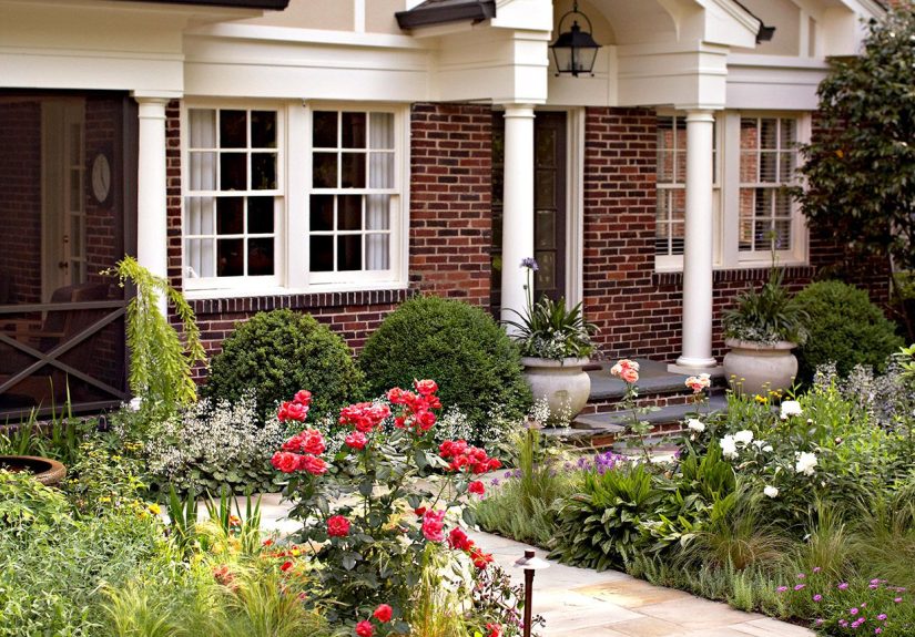
1) Red Brick + Warm White Trim + Black Accents
This is the classic for a reason. Warm white trim brightens the facade without fighting the brick’s red and orange notes, while black accents (shutters, door, lanterns, railings) add crisp contrast and a timeless finish.
Why it works: Red brick already carries a lot of visual texture. Warm white trim makes details pop, and black anchors the look so it feels updated instead of dated.
Best for: Colonial, traditional, Cape Cod, Georgian, and ranch homes.
2) Red Brick + Greige Trim + Deep Green or Navy Door
If bright white feels too sharp, greige is your best friend. A soft gray-beige trim color plays beautifully with red brick and looks more relaxed. Add a deep green or navy front door for character without going full “look at me” mode.
Why it works: Greige softens red brick and helps blend the facade into landscaping. The moody door color adds depth and curb appeal.
Best for: Homes with mature trees, traditional neighborhoods, and exteriors with bronze or black hardware.
3) Tan or Blond Brick + Crisp White Trim + Navy or Slate Blue Door
Light tan and blond brick can sometimes look washed out if paired with more beige. A crisp white trim creates definition, and a navy or slate-blue front door gives the palette a focal point. It feels clean, coastal-adjacent, and polished without being trendy.
Why it works: Tan brick is warm and subtle; white adds clarity. Blue accents bring contrast while still feeling classic.
Best for: Ranch homes, split-levels, and 1960s–1980s brick facades.
4) Brown Brick + Cream Trim + Soft Black or Bronze Details
Brown brick can look rich and handsome, but it needs the right supporting colors to avoid feeling heavy. Cream trim warms things up and keeps the look inviting. Soft black (or dark bronze) on doors, shutters, or garage trim adds structure and makes the architecture read more clearly.
Why it works: Cream harmonizes with earthy brick, while darker accents create definition and visual rhythm.
Best for: Tudor-inspired homes, traditional suburban homes, and brick homes with wood columns or natural-stained doors.
5) Gray Brick + Bright White Trim + Charcoal or Black Door
Gray brick often leans modern on its own. Pair it with bright white trim for a crisp, fresh look, then add charcoal or black accents for contrast. If your home has black windows, this combo practically styles itself.
Why it works: Cool gray brick loves clean contrast. Black accents make the palette feel intentional and slightly architectural.
Best for: Contemporary homes, updated ranches, and homes with metal roofing or black-framed windows.
6) Painted White Brick + Near-Black Trim + Natural Wood Accents
This is a favorite in modern farmhouse and updated traditional design. White-painted brick feels fresh and clean, while near-black trim gives the exterior a tailored edge. Add natural wood (front door, porch ceiling, or columns) to avoid a flat black-and-white look.
Why it works: White + black is high contrast and timeless, but wood adds warmth and texture so the exterior feels designed, not stark.
Best for: Farmhouse, transitional, and remodels that need a major curb-appeal upgrade.
7) Painted Greige Brick + White Trim + Warm Metal Accents
If plain white-painted brick feels too bright, a warm greige painted brick is a sophisticated alternative. Pair it with soft white trim, then add copper or aged brass lighting for a rich finish.
Why it works: Greige is versatile and less harsh than bright white. It complements both warm and cool surroundings and looks great with stone paths and wood doors.
Best for: Homes with mixed masonry, natural stone, or a lot of landscaping.
8) Mixed Brick + Mortar-Matched Trim + One Bold Door Color
Multicolor brick (red, brown, charcoal, cream mixes) can be tricky because no single paint color “matches everything.” The solution: use a trim color that matches the mortar, then pick one bold front door color like deep teal, heritage blue, or muted red.
Why it works: Mortar-matching calms the visual busyness of mixed brick, while a single accent color adds personality without chaos.
Best for: Older homes, heavily variegated brick, and facades with a lot of detail.
Popular Exterior Brick and Paint Color Directions Right Now
If you want your home to feel current without dating itself in two years, these are the color directions that keep showing up across paint brands, designers, and curb-appeal guides:
- Soft whites and warm whites: Clean, timeless, and easier to live with than icy whites.
- Greige and taupe: The reliable middle ground that plays nicely with most brick tones.
- Blue-gray accents: Especially good with red or tan brick.
- Nature-inspired greens: Olive, sage, and deep green work beautifully with masonry and landscaping.
- Charcoal and near-black: Great for doors, shutters, and trim when you want stronger contrast.
The goal isn’t to chase trends. It’s to use a trend direction that already fits your brick, architecture, and neighborhood. A dramatic black trim can look stunning on one home and way too harsh on another. Context always wins.
Before You Paint Brick, Read This First
Painting brick can look fantastic, but it’s a long-term decision. Brick is porous, and moisture management matters. If the brick traps moisture, paint can fail early and the masonry can suffer. That’s why prep and product choice matter more than the color swatch.
What to Check Before Painting Exterior Brick
- Moisture issues: Fix gutters, downspouts, grading, and leaks first.
- Brick condition: Cracked, spalling, or deteriorated brick should be repaired before painting.
- Mortar joints: Repoint failing mortar before coating the wall.
- Efflorescence: Remove white salt deposits and solve the moisture source before painting.
- Previous coatings: Glossy or failing old coatings need proper prep for adhesion.
Use the Right Paint System for Masonry
Exterior brick needs a masonry-appropriate, breathable system. Many paint manufacturers and masonry organizations stress this point because brick walls need to release moisture. Some homeowners choose mineral-based masonry paints or limewash-style finishes for breathability and a more natural look. Others use acrylic masonry systems designed specifically for brick and stucco.
Whatever route you choose, the checklist is the same: proper cleaning, dry substrate, compatible primer (if required), and a product designed for masonrynot leftover siding paint from the garage shelf.
Historic Homes Need Extra Caution
If your home is historic or in a preservation district, pause before painting original brick. Historic masonry can be character-defining, and preservation guidance often recommends careful maintenance and appropriate repair methods before major coating decisions. Translation: check local rules before turning your 1920s brick beauty into a weekend project.
Pro Tips to Make Your Exterior Color Combination Look Expensive
1) Paint the Trim, Not Just the Door
People often focus on the front door color and forget the trim. But trim is what frames every window and edge. Updating trim (and soffits/fascia) can dramatically modernize a brick exterior even if the brick stays unpainted.
2) Coordinate the Garage Door
A mismatched garage door can hijack the whole facade. If it’s front-facing, treat it as part of the color planeither match the body/trim or make it an intentional accent.
3) Use Black Carefully
Black is beautiful, but it’s strong. On warm red or brown brick, a soft black or charcoal often looks better than a true jet black. It still gives contrast, just without shouting.
4) Let Landscaping Help the Palette
Greenery, stone borders, and wood planters can make your color combination feel more complete. Exterior design is part paint, part architecture, part landscaping. Think of it as a team sport.
5) Try Digital Visualizers, Then Sample in Real Life
Paint-brand visualizers are fantastic for narrowing options, especially when you’re debating trim or door color. Use them. Then order samples or paint test boards, because real sunlight is the final boss of color decisions.
of Real-World Experiences With Exterior Brick and Paint Color Combinations
One of the most common homeowner experiences with brick exteriors is realizing that the “perfect” color in the store looks totally different once it touches the house. A lot of people start by choosing a trim color they love on a sample card, only to discover it looks too yellow, too blue, or too bright next to their brick. That’s not a failureit’s the normal part of exterior color selection. Brick has a strong visual influence, and it can shift the appearance of paint in ways that surprise even experienced DIYers.
Another common experience is that homeowners often underestimate how much the mortar affects the final look. People focus on the brick itself (especially if it’s multicolor), but once they test a trim color that echoes the mortar, the whole house suddenly looks more coordinated. This is one of those “small adjustment, huge payoff” moments that comes up again and again. It’s also why many designers recommend starting with the lightest neutral in the brick-and-mortar mix before moving to bolder accents.
Homeowners who decide to paint exterior brick also tend to share a similar lesson: the preparation phase takes longer than expected, but it’s absolutely worth it. Cleaning, drying time, repairing mortar, and fixing moisture issues are not the glamorous part of the project, but they are the part that protects the investment. People who rush into painting often end up frustrated later by peeling, patchiness, or uneven absorption. People who take the time to prep usually say the finish looks better and lasts longer.
There’s also a very real “neighborhood effect.” A color combination can look gorgeous in isolation and still feel wrong if it clashes with the surrounding homes. Homeowners who are happiest with their results usually choose colors that feel true to the architecture and the street rather than copying a trend from social media. For example, a soft warm white with deep green accents might look more natural in an established, tree-lined neighborhood, while a stark black-and-white combo may look perfect in a newer development with cleaner lines and modern roofs.
Another thing people notice after repainting trim or brick is how much the front door matters. Even when the rest of the palette is neutral, a well-chosen door color can make the whole house feel custom. Navy, deep green, muted red, and charcoal are frequent winners because they add personality without overpowering the brick texture. Homeowners often say the door color becomes their favorite part of the update because it’s a relatively small change with a big visual impact.
Finally, one of the best long-term experiences comes from homeowners who keep a simple record of what they used: paint brand, color names, sheen, and where each color was applied. It sounds boring in the moment, but when touch-ups are neededor when they decide to repaint years laterit saves a lot of guesswork. Exterior brick and paint color combinations look effortless when they’re done right, but behind every “wow” curb-appeal makeover is usually a homeowner who sampled carefully, prepped patiently, and chose colors that respected the brick instead of fighting it.
Conclusion
The best exterior brick and paint color combinations aren’t about copying the trendiest house on your feed. They’re about reading your brick’s undertones, matching the mortar and fixed materials, and using trim and accent colors to create contrast, warmth, and balance. Whether you keep your brick natural or paint it, a thoughtful palette can make your home feel more polished, more valuable, and a lot more “you.”
If you remember only one thing, make it this: sample first. Your future self (and your curb appeal) will thank you.