Table of Contents >> Show >> Hide
- Before We Start: An “Ick” Is Not a Crime
- The 34 Interior Design Icks
- 1) The Rug That’s Basically a Postage Stamp
- 2) The “Everything Is Pushed Against the Wall” Layout
- 3) No Clear Walking Path (AKA: The Obstacle Course)
- 4) A Coffee Table That’s In Another ZIP Code
- 5) Too Much Furniture for the Square Footage
- 6) The “All Matching Set” Syndrome
- 7) A Sofa That’s Too Small (or Too Huge) for the Room
- 8) Accent Chairs That Are Cute but Completely Useless
- 9) Wall Art Hung So High It Needs Oxygen
- 10) Tiny Art Over a Big Sofa
- 11) The Gallery Wall That Has No Plan
- 12) The TV That’s Mounted Way Too High
- 13) Cord Spaghetti on Display
- 14) “The Big Light” Is the Only Light
- 15) Bulbs With Mixed Color Temperatures
- 16) A Light Fixture That’s the Wrong Size
- 17) Curtains Hung Too Low (and Too Narrow)
- 18) Curtains That Stop Awkwardly Short
- 19) Outdated, Heavy Window Treatments That Eat the Light
- 20) A Color Palette That Has No Relationship to Itself
- 21) Gray Everything… With No Texture
- 22) The “Random Accent Wall” That Doesn’t Connect
- 23) Too Many Competing Patterns
- 24) Throw Pillows You Have to Remove to Sit Down
- 25) Faux Plants That Look Like They’ve Given Up
- 26) Cluttered Surfaces (Countertops, Nightstands, Every Flat Thing)
- 27) “Aspirational Clutter” That Lives Rent-Free
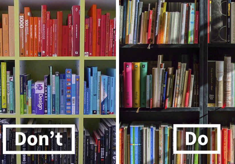
- 28) Open Shelving That’s Pure Chaos
- 29) The Kitchen “Appliance Parade”
- 30) A Backsplash That Looks Like It Quit Early
- 31) Bath Decor That Feels Like a Hotel… But Not a Nice One
- 32) Bedroom Layouts That Fight Sleep
- 33) Ignoring Sound (Echo-Chamber Chic)
- 34) Buying Before Measuring (The Classic)
- A Quick “Un-Ick” Cheat Sheet
- Real-Life “Called Out” Moments (Experiences) +
- Conclusion
“Ick” is a strong word. But if you’ve ever walked into a room and thought, something feels… offcongrats, you have interior-design instincts.
The good news? Most “design icks” aren’t moral failings. They’re just tiny mismatches between how a space looks and how it’s supposed to work.
This list is part playful roast, part practical fix-it guide. You’ll see the usual suspects (tiny rugs, “the big light,” art floating near the ceiling),
plus a few sneaky ones (curtains that visually shrink your windows, cord spaghetti, and a room that looks like it’s wearing five patterns at once).
If you feel called out… that’s the point. If you feel helped… even better.
Before We Start: An “Ick” Is Not a Crime
Interior design is personal. What one person calls “dated,” another calls “cozy.” What one person calls “clutter,” another calls “memories.”
So think of these as common decorating mistakes and home decor pet peevesthe kinds of things designers notice because they affect
comfort, flow, and proportion.
Each ick below includes a quick why + a realistic fix. No expensive makeover required (unless the fix is “stop buying random chairs you don’t have
space for,” which is technically free).
The 34 Interior Design Icks
1) The Rug That’s Basically a Postage Stamp
Why it’s an ick: A too-small area rug makes a room feel chopped up and cheaper than it is.
Fix: Go bigger. Aim for front legs of sofas/chairs on the rug, or size up until the seating zone feels “anchored.”
2) The “Everything Is Pushed Against the Wall” Layout
Why it’s an ick: It creates a sad furniture parade around the perimeter and leaves the center feeling empty.
Fix: Float key pieces a few inches (or more) off the wall, and build a conversation zone with a rug + coffee table.
3) No Clear Walking Path (AKA: The Obstacle Course)
Why it’s an ick: If guests have to shimmy sideways like they’re sneaking past a sleeping dragon, the flow is wrong.
Fix: Create natural “lanes” through the room. Move one piece of furniture and you often get the space back instantly.
4) A Coffee Table That’s In Another ZIP Code
Why it’s an ick: If you can’t set down a drink without leaning like you’re in a trust fall, it’s too far.
Fix: Pull it closer. Generally, you want it near enough to use comfortably without blocking movement.
5) Too Much Furniture for the Square Footage
Why it’s an ick: Crowding kills calm. Even pretty pieces look chaotic when there are too many of them.
Fix: Edit. Keep fewer, better pieces and leave breathing roomespecially around doorways and seating.
6) The “All Matching Set” Syndrome
Why it’s an ick: Matching sofa + loveseat + chair sets can feel showroom-y and flat.
Fix: Mix shapes and materials. Keep one unifier (color palette, wood tone, or style era), then vary the silhouettes.
7) A Sofa That’s Too Small (or Too Huge) for the Room
Why it’s an ick: Scale and proportion are the silent bosses of good design. Get them wrong and nothing looks “right.”
Fix: Measure first. Use painter’s tape to map dimensions on the floor before buying.
8) Accent Chairs That Are Cute but Completely Useless
Why it’s an ick: If a chair looks like sculpture but feels like sitting on a decorative triangle, people will avoid it.
Fix: Choose comfort-friendly seating for real life. You can still make it stylish with fabric, legs, or a great pillow.
9) Wall Art Hung So High It Needs Oxygen
Why it’s an ick: Art floating near the ceiling disconnects the room visually.
Fix: Hang at eye level, and keep it visually related to furniture below (not hovering like a lost balloon).
10) Tiny Art Over a Big Sofa
Why it’s an ick: It reads like you ran out of confidence mid-decorating.
Fix: Go larger, or group pieces. A good rule: the art arrangement should feel substantial relative to the furniture.
11) The Gallery Wall That Has No Plan
Why it’s an ick: Random spacing + random frame sizes can look like “I panicked and started hammering.”
Fix: Lay it out on the floor first. Keep spacing consistent, and repeat at least one frame finish to unify it.
12) The TV That’s Mounted Way Too High
Why it’s an ick: Neck strain is not a design aesthetic.
Fix: Aim for comfortable viewing height. If it must go above a fireplace, use a mount that pulls down and plan the whole wall so it feels intentional.
13) Cord Spaghetti on Display
Why it’s an ick: Cords instantly make a space feel unfinishedeven if everything else is gorgeous.
Fix: Use cord covers, shorter cables, cable boxes, or route cords behind furniture. Hide power strips like they owe you money.
14) “The Big Light” Is the Only Light
Why it’s an ick: Overhead-only lighting can feel harsh and flat (and it’s rarely flattering).
Fix: Layer lighting: overhead + table lamps + floor lamps + accent lighting. Mood = instantly improved.
15) Bulbs With Mixed Color Temperatures
Why it’s an ick: One corner looks like a cozy café, the other looks like a dentist’s office.
Fix: Choose consistent warmth across a room (generally warm/soft white for living spaces) and stick with it.
16) A Light Fixture That’s the Wrong Size
Why it’s an ick: A tiny pendant in a big room looks accidental; an oversized fixture in a tiny room feels like it’s yelling.
Fix: Scale lighting to the room. When in doubt, slightly larger usually looks more intentional than slightly smaller.
17) Curtains Hung Too Low (and Too Narrow)
Why it’s an ick: It visually shrinks your windows and can make ceilings feel lower.
Fix: Hang higher and wider to “frame” the window and make the room feel bigger.
18) Curtains That Stop Awkwardly Short
Why it’s an ick: High-water drapes can make a room feel unfinished.
Fix: Choose lengths that skim the floor (or intentionally puddle if that’s your style).
19) Outdated, Heavy Window Treatments That Eat the Light
Why it’s an ick: Your windows are a feature. Don’t smother them.
Fix: Swap to simpler panels, lighter fabrics, or shades that suit your home’s style and let daylight in.
20) A Color Palette That Has No Relationship to Itself
Why it’s an ick: If every item is a different “main character,” the room feels chaotic.
Fix: Pick a base palette (neutrals + 1–2 accent colors), then repeat those colors in a few places.
21) Gray Everything… With No Texture
Why it’s an ick: Monochrome can be chic, but flat gray-on-gray can read sterile.
Fix: Add texture: wood, linen, boucle, leather, woven baskets, plants, and layered textiles.
22) The “Random Accent Wall” That Doesn’t Connect
Why it’s an ick: A single dramatic wall can feel like a leftover decision from 2012 if the rest of the room doesn’t support it.
Fix: Either integrate the accent color/pattern elsewhere (pillows, art, rug) or go all-in with a cohesive plan.
23) Too Many Competing Patterns
Why it’s an ick: Pattern mixing is greatuntil it starts looking like your room is arguing with itself.
Fix: Limit to a few patterns with shared colors. Vary the scale (one large, one medium, one small) for balance.
24) Throw Pillows You Have to Remove to Sit Down
Why it’s an ick: Your couch is not a pillow storage unit with feelings.
Fix: Keep a few good ones. Mix sizes, and leave room for actual humans.
25) Faux Plants That Look Like They’ve Given Up
Why it’s an ick: Obviously fake greenery can cheapen the whole scene.
Fix: Choose one excellent faux plant or go real with low-maintenance options (or even a simple vase of branches).
26) Cluttered Surfaces (Countertops, Nightstands, Every Flat Thing)
Why it’s an ick: Visual noise makes a space feel smaller and more stressful.
Fix: Use the “one tray rule”: group essentials in a tray and clear the rest. Give items a home.
27) “Aspirational Clutter” That Lives Rent-Free
Why it’s an ick: The unused bread maker, the craft supplies for your future hobby, the workout gear from your “new era”
it quietly steals space.
Fix: Keep what you use now. Donate what’s for a fantasy version of your schedule.
28) Open Shelving That’s Pure Chaos
Why it’s an ick: Open shelves can look airyor like a store shelf after a small tornado.
Fix: Curate. Repeat a few materials (white dishes, wood boards, glass), and stash the messy stuff behind closed doors.
29) The Kitchen “Appliance Parade”
Why it’s an ick: Too many countertop gadgets can make even a nice kitchen feel cramped.
Fix: Store what you don’t use daily. If it comes out twice a year, it doesn’t deserve prime real estate.
30) A Backsplash That Looks Like It Quit Early
Why it’s an ick: Partial backsplashes can read as dated or unfinished.
Fix: If renovating, consider running the backsplash to the underside of upper cabinets (or higher) for a more intentional look.
31) Bath Decor That Feels Like a Hotel… But Not a Nice One
Why it’s an ick: Thin bath mats, tired accessories, and mismatched storage can make the bathroom feel bleak.
Fix: Upgrade the soft goods (mat, towels), unify finishes, and use closed storage for a calmer look.
32) Bedroom Layouts That Fight Sleep
Why it’s an ick: A bed jammed in a corner or poor lighting can make a bedroom feel more like a storage area than a retreat.
Fix: Center the bed if possible, add bedside lighting, and keep surfaces calmer than your email inbox.
33) Ignoring Sound (Echo-Chamber Chic)
Why it’s an ick: Hard surfaces everywhere can make a home feel loud and coldeven if it looks pretty.
Fix: Add soft absorbers: rugs, curtains, upholstered pieces, and textiles. Your ears will thank you.
34) Buying Before Measuring (The Classic)
Why it’s an ick: “It looked smaller online” is the official slogan of design regret.
Fix: Measure doorways, stairwells, and the space itself. Use painter’s tape to mock up dimensions before you click “buy now.”
A Quick “Un-Ick” Cheat Sheet
- Scale: Bigger rugs and properly sized lighting usually look more intentional.
- Placement: Art and TVs at comfortable height = instant upgrade.
- Lighting: Layer it. A room with lamps feels finished.
- Windows: Hang curtains higher/wider to make rooms feel larger.
- Clutter: Fewer surfaces packed with stuff = more calm and more style.
- Cohesion: Repeat colors/materials so the room feels like a “yes” instead of a “maybe.”
Real-Life “Called Out” Moments (Experiences) +
If you’ve ever fixed one of these icks, you know the emotional arc: denial, bargaining, a late-night measuring tape spiral, and then… peace.
Here are some extremely common “been there” moments people share when they realize their space is giving them side-eye.
The Tiny Rug Phase
A lot of people start with a small rug because it feels safer: lower price, easier to move, less commitment. Then the room never quite clicks.
The sofa looks like it’s hovering. The chairs look like they’re not invited to the same conversation. Finally, someone says the sentence that changes everything:
“Your rug is too small.” You size up, slide the front legs of the furniture onto it, and suddenly the room feels groundedlike it exhaled.
It’s not magic. It’s proportion doing what it does best: making everything look more expensive than it was.
The Great Curtain Revelation
Another classic: curtains hung right over the window frame because that’s where the hardware feels “supposed” to go. The result is subtle but powerful:
the window looks smaller, the ceiling looks lower, and the whole room feels a little tighter than it needs to. Then you see a tip about hanging curtains
higher and wider, and it’s like unlocking a cheat code. You move the rod up a few inches, extend it past the window, choose panels with enough width,
and suddenly the window looks granderlike it belongs in the room instead of just existing in it.
The “Big Light” Breakup
Plenty of homes have the same lighting storyline: one overhead fixture doing all the work, usually with a bulb that’s either too cold or too bright.
People don’t realize how much that affects mood until they add a floor lamp in a corner, a table lamp near the sofa, or a warm bulb that makes the room
feel inviting instead of interrogated. The funniest part? Once you experience layered lighting, you start avoiding the overhead switch like it’s a trap.
You’ll be walking into the room in the dark, reaching for the lamp like a seasoned stage manager. “Not today, big light.”
The Cord-Spaghetti Awakening
This one sneaks up on you because cords feel “normal” until you hide them. A living room can be styled beautifully, but if there’s a power strip
and five dangling wires under the TV, the illusion breaks. People try to ignore it… then they tidy it once and can’t unsee the difference.
Cord covers, shorter cables, and a hidden power strip instantly make the space feel finishedlike the room went from “setup” to “done.”
The Overdecorating Hangover
Sometimes the ick isn’t one bad choiceit’s too many okay choices. A candle here, a vase there, a little figurine that was “too cute to pass up,”
and suddenly every surface is busy. The room starts feeling smaller, and cleaning feels like a full-contact sport. Then comes the edit:
you keep what you love, group essentials on a tray, and put the rest away. People often describe the result as “lighter” or “calmer,”
like their home stopped shouting and started speaking in a normal indoor voice.
The point of these experiences isn’t to shame anyone (we’re all just doing our best with our budgets, rentals, and questionable past decisions).
It’s to remind you that good design is usually a series of small, doable adjustmentsespecially around lighting, scale, clutter, and placement.
Fix one or two icks, and your home will start feeling more like you meant it to look that way. Because you did.