Table of Contents >> Show >> Hide
- Why Certain Paint Colors Feel Like a "Forever Home"
- 1. Soot by Benjamin Moore
- 2. Abysse by Ressource Paint
- 3. Mole’s Breath by Farrow & Ball
- 4. Swiss Coffee by Benjamin Moore
- 5. Highland by Portola Paints
- How to Use These Colors Without Regretting Your Life Choices
- Final Verdict
- Experiences That Make These Colors Feel Even More Like a Forever Home
Some paint colors are a fling. They feel thrilling in the store, photogenic on Pinterest, and mildly suspicious by month three. Then there are the shades that feel like they’ve always belonged in your house—the ones that make the sofa look better, the wood floors look richer, and your entire space seem less like a temporary address and more like a place where real life can unfold.
That is the magic of a forever-home color. It isn’t just pretty. It is steady. It has enough personality to keep a room from feeling bland, but enough restraint to survive shifting trends, changing furniture, and your very human habit of suddenly deciding that the rattan era is over. Designer-approved paint colors tend to earn that status the hard way: by working in actual homes, with actual lighting, and actual people who do not redecorate every time a new color forecast drops.
If you want a palette that feels warm, grounded, and timeless, these five shades stand out for exactly that reason. They are dramatic without being exhausting, soft without being sleepy, and stylish without screaming, “I was chosen during a trend spiral at 11:47 p.m.” From a moody near-black to a creamy white and a sage-green chameleon, these are the colors that can make a space feel collected, comforting, and built to last.
Why Certain Paint Colors Feel Like a "Forever Home"
Before we get into the actual shades, it helps to understand what separates a forever-home paint color from a paint color that feels dated the second a new season starts. In design terms, longevity usually comes down to undertone, flexibility, and emotional temperature.
The best long-haul colors tend to have complexity. A flat black can feel harsh, but a black with blue undertones feels richer and more architectural. A plain white can look sterile, while a white with a little warmth feels settled and lived in. The same goes for greens, taupes, and blues: the shades that last are the ones with enough nuance to shift gracefully as daylight changes.
There is also the issue of compatibility. A forever-home color has to play nicely with wood tones, stone, metals, textiles, art, and whatever future version of you decides to buy a caramel leather chair. This is why creamy whites, mushroomy neutrals, moody blues, and earth-rooted greens stay popular. They provide atmosphere without boxing you into one decorating style forever.
And finally, timeless colors make people feel something good. They calm a room down. They make it feel layered. They create a backdrop that supports your life instead of demanding all the attention. In other words, they have taste—but also manners.
1. Soot by Benjamin Moore
If black paint makes you nervous, Soot is the shade that might talk you into a bold decision without ruining your peace. This is not a flat, one-note black. It reads as a soft, inky near-black with blue depth, which gives it a more tailored, sophisticated look than a harsher jet black.
That slight blue cast is what makes Soot feel classic rather than trendy. It has drama, yes, but it also has restraint. In a forever-home setting, that matters. You want a color that can create mood without turning the room into a stage set. Soot does that beautifully on cabinetry, built-ins, interior doors, and exteriors, where it adds weight and definition without feeling gimmicky.
Where it works best
Soot is especially striking in rooms that need architectural grounding. Think lower cabinets in a kitchen with warm brass hardware, a mudroom with polished stone floors, or a study where natural wood and leather can warm up the darkness. It can also be gorgeous in a dining room if the space gets decent light and you want that cocooning, intimate effect.
Why it feels timeless
Dark colors last when they are nuanced, and Soot absolutely is. It feels more like a heritage shade than a trend color. Because it sits between black and navy, it pairs well with creamy trim, warm whites, aged bronze, unlacquered brass, marble, and even earthy greens. It gives a room backbone. Every forever home needs a little backbone.
2. Abysse by Ressource Paint
Abysse is the kind of blue that makes people stop mid-sentence and say, “Wait, what color is that?” It is commanding, but not loud. Calm, but not sleepy. It carries the steady elegance of a classic blue while behaving almost like a neutral in the room.
That neutral quality is the secret sauce. Some blues can feel beachy, sporty, or nursery-adjacent if they lean too bright. Abysse avoids all that. It has depth and maturity, which makes it suitable for spaces where you want polish and comfort at the same time. It is an especially smart choice for living rooms, home offices, libraries, or dining areas where you want color with staying power.
Where it works best
Use Abysse where you want an enveloping color that still feels refined. In a home office, it can make the room feel focused and thoughtful. In a living room, it creates a collected atmosphere that works with antiques, contemporary furniture, or a mix of both. It also plays beautifully with warm woods, creamy upholstery, black accents, and natural linen.
Why it feels timeless
Blue has always had a special place in interiors because it is both familiar and elegant. The trick is choosing the right blue. Abysse avoids being too nautical, too pastel, or too trend-driven. It feels anchored. That makes it a forever-home color in the best sense: memorable enough to add character, restrained enough to live with for years.
3. Mole’s Breath by Farrow & Ball
Mole’s Breath may have one of the strangest paint names in circulation, but fortunately, the color is much prettier than the mental image. This deep mushroom-gray has the cozy, earthy appeal that designers love when they want a neutral with actual personality.
What makes this shade so effective is that it sits in that sweet spot between gray, taupe, and brown. It does not feel cold. It does not feel yellow. It does not scream for attention. It just quietly makes everything around it look better. Bedding looks softer against it. Wood looks richer. White trim looks crisper. Even a modest room can suddenly appear more intentional.
Where it works best
This is a fantastic bedroom color, especially if you want a room that feels restful without going pale and predictable. It also works well in dens, powder rooms, and smaller spaces that benefit from a little atmospheric depth. On kitchen islands, it brings just enough weight to balance lighter cabinetry or stone countertops.
Why it feels timeless
Mushroom tones have serious staying power because they behave like neutrals while still bringing warmth and depth. Mole’s Breath feels old-world and modern at the same time, which is not easy to pull off. It is one of those shades that can support a minimalist room, a traditional room, or a layered eclectic room without looking confused. That kind of adaptability is forever-home gold.
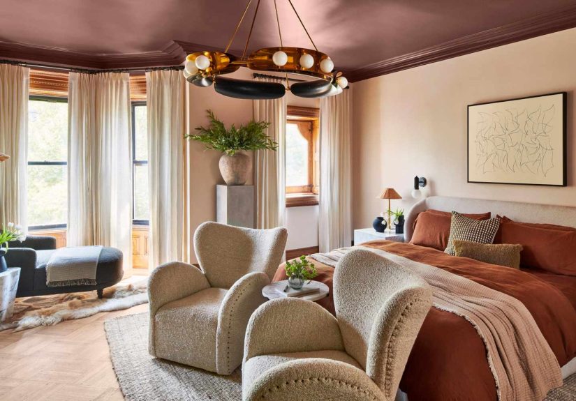
4. Swiss Coffee by Benjamin Moore
Swiss Coffee is the reliable overachiever of the group. It does not enter the room yelling. It enters with a good haircut, excellent manners, and the ability to make literally everyone else look more attractive. In paint terms, that means a warm white that brightens a space without tipping into sterile territory.
This is why warm whites remain so beloved. Homeowners often want the lightness of white, but not the hospital-corridor vibe. Swiss Coffee delivers softness and openness at the same time. It reflects light beautifully, helps hallways and connecting spaces feel more expansive, and provides a clean backdrop for everything from rustic wood beams to sleek contemporary furniture.
Where it works best
Swiss Coffee is especially effective in transitional spaces—hallways, corridors, stair landings, and open-plan living areas where one room flows into the next. It also works well in kitchens and family rooms if you want a backdrop that stays gentle throughout the day. Pair it with warm metals, textured fabrics, pale oak, walnut, or aged stone for a look that feels elevated rather than plain.
Why it feels timeless
Because it has the right amount of warmth, Swiss Coffee feels inviting instead of stark. It is a white that knows how to relax. In a forever home, that matters more than people think. White is not automatically timeless; the wrong white can feel icy, flat, or weirdly blue. The right one, though, becomes a flexible foundation you can build on for years.
5. Highland by Portola Paints
If you have been flirting with green paint but are not ready for something shouty, Highland is an excellent compromise. This deep, mossy olive has the grounded, natural presence that designers keep returning to when they want warmth, calm, and a little soul.
Green works so well in forever-home interiors because it behaves like a bridge between indoors and outdoors. It echoes foliage, stone, weathered wood, and other materials that already feel timeless. Highland, in particular, leans moody and earthy rather than fresh or minty, which makes it feel sophisticated and layered.
Where it works best
This color shines in guest rooms, powder rooms, reading nooks, and any space where you want a richer, quieter mood. It becomes even more compelling in textured finishes like Roman clay or limewash, where the natural movement of the surface gives the shade a lived-in, collected feel. It also works beautifully with plaster, linen, brass, dark woods, and vintage pieces.
Why it feels timeless
Earthy greens have become the grown-up alternative to plain gray. They still feel neutral enough to live with, but they bring much more warmth and character. Highland does exactly that. It is moody without being somber, nature-inspired without feeling theme-y, and elegant without trying too hard. Which, honestly, is the dream.
How to Use These Colors Without Regretting Your Life Choices
Even the best paint color can go sideways if you ignore undertones, lighting, or the surrounding finishes. The smartest move is to start by deciding whether your home leans warm or cool overall. Warm tones usually work better with creamy whites, mushroom neutrals, mossy greens, and brass. Cool tones tend to support icier whites, blue-leaning grays, and chrome. Mixing both can work, but only when done intentionally.
Always test large swatches on more than one wall and look at them in morning light, afternoon light, and lamplight. A color that feels sophisticated at noon can feel muddy at dusk, while a white that seemed perfect in the store can suddenly turn yellow, gray, or faintly haunted once it hits your walls.
It also helps to think about how a color will connect from room to room. Forever-home palettes feel cohesive, not matchy-matchy. Swiss Coffee can be the common thread that ties together Soot cabinetry, an Abysse office, a Mole’s Breath bedroom, and a Highland powder room. That kind of continuity makes the whole house feel designed rather than randomly assembled over several emotional weekends.
Final Verdict
If your goal is to make a home feel lasting, personal, and impossible to outgrow, skip the short-lived novelty shades and look for colors with depth, warmth, and flexibility. Soot gives you elegant drama. Abysse offers polished calm. Mole’s Breath creates cozy sophistication. Swiss Coffee delivers softness and light. Highland brings in grounded nature and quiet mood.
Together, these five colors prove that timeless design is not boring. It is simply better edited. A forever home does not need paint that begs for attention. It needs paint that makes everything—your furniture, your artwork, your lighting, your life—feel a little more settled and a lot more beautiful.
Experiences That Make These Colors Feel Even More Like a Forever Home
One of the most interesting things about living with timeless paint colors is that the experience changes after the first week, and usually in a good way. At first, people notice the color itself. By month two, they notice the feeling the room creates. That is usually the moment a house starts to feel less like a project and more like home.
Take warm whites like Swiss Coffee. Homeowners often choose them because they want a safe option, then end up loving them because the rooms feel softer, brighter, and more forgiving than expected. Morning light tends to make the walls feel creamy and fresh, while evening lamplight adds a gentle glow that makes furniture and skin tones look better. It is not a flashy color experience. It is a comforting one. And comfort tends to age very well.
Moody shades create a different kind of attachment. People who use Soot on cabinetry or built-ins often discover that the room suddenly feels more finished, as if the space finally put on real shoes instead of house slippers. The color adds weight and contrast, but because it is not a flat black, it usually feels tailored rather than severe. It also has a sneaky way of making brass, marble, and wood look more expensive. No one is mad at that.
Then there are the in-between colors like Mole’s Breath, which rarely shout for attention but become favorites over time. These are the shades people grow into. On day one, the reaction may be, “Oh, that’s subtle.” A few months later, the reaction becomes, “Why does every pillow, blanket, and piece of furniture look amazing in here?” That is the quiet power of a nuanced neutral. It does not perform like a trend. It supports like a really competent friend.
Blue and green shades often create the strongest emotional response. A room painted in Abysse can make daily routines feel a little more intentional. Working from home feels more focused. Reading at night feels calmer. Even a quick cup of coffee somehow feels cinematic, which is impressive for a wall color. Likewise, a green like Highland often makes a room feel restorative. Powder rooms become moodier and more memorable. Guest rooms feel thoughtful instead of leftover. Small spaces start to feel special rather than secondary.
Another experience people mention with forever-home colors is relief. Not excitement—relief. Relief that the color still works after the seasons change. Relief that the rug still matches. Relief that they do not need to repaint the second a trend report starts screaming about peach-brown, digital lavender, or some other suspiciously specific forecast. Timeless colors are not trend-proof in the sense that trends stop existing. They are trend-resistant because they are rooted in materials, light, and comfort instead of novelty.
That is really the deeper appeal here. A forever-home color does not just photograph well. It lives well. It lets the room evolve. It forgives style changes. It adapts when your furniture changes, when your taste matures, or when life gets messy and beautiful in the ways real homes always do. Over time, the best paint colors stop feeling like a decorating decision and start feeling like part of the architecture of your life. That is when you know you chose well.