Table of Contents >> Show >> Hide
- Quick style rules that make any display look “designer”
- 60+ ways to display art prints and photos
- A) Classic framed displays (timeless for a reason)
- B) Gallery wall layouts (the crowd-pleasers)
- C) Shelves, ledges, and leaning (easy to update, low-stress)
- D) No-frame (or “I will not pay $80 per frame” solutions)
- E) Renter-friendly and low-damage displays
- F) Unexpected places to display art (aka: your home has more walls than you think)
- G) 3D and mixed-media displays (photos can have friends)
- H) Modern and tech-friendly displays (yes, your photos can evolve)
- Room-by-room examples that actually work
- How to make it look cohesive (even if the art isn’t)
- At the end of the day: the best display is the one you’ll maintain
- Real-life experiences: what people learn after living with their art wall (the extra 500-ish words)
- Conclusion
You bought the prints. You printed the photos. You even ordered “the good frames” (the ones that don’t look like they came free with a pizza).
Now comes the part that makes otherwise-confident adults whisper, “Is this crooked?” for the rest of their natural lives.
This guide is your no-drama, high-style playbook for displaying art prints and photos in ways that look intentionalwhether your vibe is
clean and minimal, cozy and collected, or “I thrifted this frame in 2009 and I will be buried with it.”
You’ll get practical hanging rules, layout ideas, renter-friendly options, and 60+ display methods you can mix and match.
Quick style rules that make any display look “designer”
1) Hang at eye level (and don’t overthink it)
A classic museum-style rule is to place the center of the artwork around eye leveloften cited at roughly 57 inches from the floor.
If that doesn’t fit your room (kids’ art wall, super tall ceilings, low furniture), treat it as a starting point, not a law.
2) Over furniture? Give it breathing room
Above a sofa, console, or headboard, keep the bottom edge of the frame(s) roughly 6–8 inches above the furniture.
Too high and it looks like your art is trying to escape. Too low and it looks like it’s sitting down.
3) Plan first, patch later (ideally never)
The easiest way to avoid a “Swiss cheese wall” is to plan your arrangement before hammering anything:
lay pieces on the floor, trace frames on paper, or map the layout with painter’s tape.
4) Spacing is the secret sauce
A gallery wall looks calmer when spacing feels consistent. Aim for a uniform gap (often around 2 inches) unless you’re doing a tight salon-style hang.
If the spacing changes randomly, your wall starts to look like it’s glitching.
5) Treat groups like one big piece
When you’re hanging multiple frames, focus on the overall shape (rectangle, square, or organic cluster).
The wall reads the outline first, then the individual pieces second.
60+ ways to display art prints and photos
Pick a few ideas from each category to match your space, budget, and commitment level. (Commitment level matters. Some of us still have commitment issues
with throw pillows.)
A) Classic framed displays (timeless for a reason)
- Single statement piece: One oversized print centered on a wall for instant “gallery energy.”
- Diptych: Two matching frames side by sidegreat above beds, sofas, or dining benches.
- Triptych: Three coordinated pieces in a row for clean symmetry.
- Perfect grid: Same-size frames, same spacing, all aligned. Minimalists, rejoice.
- Salon-style stack: Two or three frames stacked vertically to fill narrow wall zones.
- Frame + mat upgrade: Add a mat to give smaller art a more elevated presence.
- Float mount look: Show a border around the print inside the frame for airy, modern style.
- Black frames, mixed art: Unifies a variety of photos/prints without looking matchy-matchy.
- Wood frames, mixed tones: Warm and collectedespecially good with travel photos and sketches.
- All-white frames: Brightens small rooms and makes color photos pop.
- Thin metal frames: Sleek, modern, and great for photography or line art.
- Ornate vintage frame: Put a modern print in it for a fun high-low contrast.
B) Gallery wall layouts (the crowd-pleasers)
- Anchored center: Start with a “hero” piece and build outward.
- Bottom-up build: Begin near furniture height and expand upward (helps with proportion).
- Staircase climb: Frames follow the angle of the stairs for a natural flow.
- Hallway timeline: A chronological photo story (kids, travel, pets, renovationschoose your saga).
- Theme wall: All landscapes, all family photos, all typography, all black-and-white, etc.
- Color story wall: Pieces share a palette (even if styles differ).
- Mixed mediums wall: Combine photos, prints, textiles, and small objects for depth.
- Frame “family” mix: Keep frames in one metal tone (brass, black, silver) but vary sizes.
- Oversized + minis: One large piece with smaller frames orbiting like loyal satellites.
- Corner wrap: Continue frames around a corner to connect two walls.
- Doorway frame: Surround a doorway with art to turn it into a focal point.
- Gallery over a bench: Add a slim bench under the cluster for a curated entry moment.
- Gallery above a console: Combine frames with a lamp and a bowlinstant “styled.”
- Gallery in a nook: Fill an awkward recess with small pieces for cozy charm.
C) Shelves, ledges, and leaning (easy to update, low-stress)
- Picture ledge: Swap prints seasonally without re-hanging.
- Double ledge stack: Two rows of ledges for layered depth.
- Long ledge as a “gallery rail”: Create a continuous display line.
- Leaning on a mantel: Classic, cozy, and zero nails in plaster.
- Leaning on a console table: Add a tall frame behind smaller frames for dimension.
- Kitchen shelf art: Small framed prints tucked among cookbooks and pottery.
- Bathroom ledge moment: Tiny art + a candle = spa vibes, no renovation required.
- Bookshelf back panel art: Place frames against the back of shelves for a layered look.
- Corner shelf display: Use a corner shelf to show a few rotating favorites.
- Window sill gallery: Small frames lined up (just protect from direct sun).
- Floor lean (oversized): Large piece on the floor against the wallbold, casual, modern.
- Rolling cart mini gallery: A moveable “art station” for prints you rotate often.
D) No-frame (or “I will not pay $80 per frame” solutions)
- Poster rails: Wood or magnetic rails that clamp the top/bottom of a print.
- Binder clips on nails: Industrial-cute and surprisingly polished with the right print.
- Bulldog clips on a rail: Clip art to a mounted strip for a studio vibe.
- Washi tape corners: Great for temporary displays and kids’ rooms.
- Photo wire with clips: String lights optional (but you know you want them).
- Cork board gallery: Pin rotating postcards, mini prints, and snapshots.
- Magnetic paint wall: Turn a section into a changeable art zone with magnets.
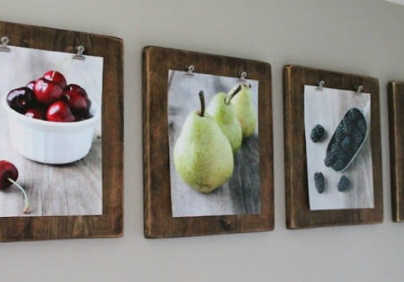
- Clipboards: Uniform size, instant structure, super easy swaps.
- Hanging pants hangers: Clip a print like it’s laundry, but make it fashion.
- Oversized bull clips on hooks: Minimal hardware, maximum flexibility.
E) Renter-friendly and low-damage displays
- Adhesive picture strips: Great for lightweight frames if you follow weight limits.
- Adhesive hooks for wires: Let the frame hang from a wire for fewer wall penetrations.
- Removable poster putty: Works best for small, lightweight paper prints.
- Tension rod gallery: In a niche or doorway, hang clips from a tension rod.
- Pegboard wall: Hang framed pieces and small objects with adjustable hooks.
- Lean-and-anchor: Lean art on furniture and add museum putty at the base for stability.
- Command-style ledges: Small ledges installed with adhesive for mini displays.
- Over-the-door frame rack: Hang lightweight frames on a slim over-door organizer.
F) Unexpected places to display art (aka: your home has more walls than you think)
- Above the toilet: One small framed print for instant bathroom personality.
- Inside a closet door: A hidden gallery that makes getting dressed less boring.
- Laundry room cheer-up wall: Because folding deserves a reward.
- Kitchen backsplash zone: Frame small prints in wipeable frames on a narrow wall section.
- On the side of a cabinet: Mini frames on the end panel of a pantry or built-in.
- Above the kitchen sink: Waterproof frame or acrylic front, and avoid steam-heavy spots.
- Stair landing focal piece: One bold artwork where people naturally pause.
- Behind open shelving: Lean prints behind objects for a layered “collected” look.
G) 3D and mixed-media displays (photos can have friends)
- Add a mirror: Breaks up flatness and bounces light.
- Include a small sconce: A gallery wall with lighting looks instantly intentional.
- Hang a textile piece: Woven art softens a frame-heavy arrangement.
- Plate wall mix-in: Plates + framed art = charming and old-world.
- Shadow boxes: Display keepsakes (tickets, flowers, small objects) alongside photos.
- Mini sculptural wall objects: Add a small mask, wall basket, or carved piece.
- Framed fabric: A swatch of vintage textile becomes art in seconds.
- Floating shelf + frames + object: One shelf, one frame, one objectsimple recipe.
H) Modern and tech-friendly displays (yes, your photos can evolve)
- Digital photo frame: Rotate memories without crowding every surface.
- Projector “art night” wall: Temporary giant art for parties or cozy evenings.
- Rotating seasonal set: Keep a small portfolio box and swap prints quarterly.
- QR memory label (optional): Discreet label near a photo that links to the story behind it.
Room-by-room examples that actually work
Living room
If you want calm: choose one large piece above the sofa. If you want personality: do a gallery wall anchored by one oversized print,
then mix in family photos and one unexpected texture (like a small woven piece).
Keep the overall gallery width roughly 2/3 the width of the sofa for good proportion.
Hallway and stairwell
Hallways love repetition. Try a simple grid of same-size frames, or a “timeline wall” of travel photos that pulls you from room to room.
Stairwells look best when frames follow the angle of the stairslike your art is taking the scenic route.
Bedroom
Above the bed, a diptych or triptych reads tidy and symmetrical. If you want cozier: add a picture ledge so you can swap prints without lifting
your mattress to find the measuring tape you lost in 2021.
Kitchen and dining
In kitchens, go smaller and sturdier. Think framed line drawings, vintage food prints, or a small gallery near a breakfast nook.
In dining rooms, a statement piece or a structured grid creates an “intentional” mood without yelling over the conversation.
Home office
Your background matters. A grid gallery wall looks clean on video calls. A shelf with leaning frames looks creative.
Add one piece that makes you laughbecause spreadsheets are already serious enough.
Kids’ rooms
Create a rotating “kid gallery” with clipboards or a ledge, so new masterpieces can replace older ones without a negotiation.
Bonus: you can retire the macaroni collage with dignity.
How to make it look cohesive (even if the art isn’t)
Choose your unifier
Cohesion can come from frame color, mat style, a palette, or even a repeating shape (like all rectangles).
Pick one unifier and let everything else vary.
Use mats strategically
Mats make small prints feel more important and help mismatched art sizes play nicely together.
If you want a crisp look, keep mat color consistent. If you want playful, vary mat colors but repeat them across the wall.
Light it like you mean it
Adding a picture light or even a nearby sconce gives your wall a purposeful “exhibit” vibe.
Also, lighting distracts from tiny imperfectionslike that frame you swear is straight (it is not).
Protect what matters
Keep valuable photos and prints out of harsh direct sun and humid zones. If a piece is truly precious, consider higher-quality glazing
options that reduce glare and help protect from light damage.
At the end of the day: the best display is the one you’ll maintain
The “perfect” gallery wall isn’t perfect because it follows rules. It’s perfect because it fits your lifeyour walls, your habits, your budget,
your willingness to patch holes, and your ability to ignore one slightly crooked frame without spiraling.
Real-life experiences: what people learn after living with their art wall (the extra 500-ish words)
Here’s the part nobody tells you when you’re knee-deep in frames and optimism: the first version of your display is rarely the final version.
In real homes, art walls evolve the way closets evolveslowly, then suddenly, then “how did I end up with five nearly identical black frames?”
That’s not failure. That’s a living space doing what it’s supposed to do: changing with you.
One of the most common experiences is discovering your swap tolerance. Some people love rotating prints with the seasons:
bright photography in summer, moody landscapes in winter, playful color for spring. Others want a set-it-and-forget-it wall that doesn’t require
a quarterly “frame audit.” Picture ledges, clipboards, and rail systems are great if you like change. A grid of identical frames is great if you
like peace.
Another real-world lesson: the wall will reveal your lighting reality. In daylight, that glossy photo looks sharp. At night,
it becomes a mirror that reflects your lamp like a tiny, judgmental sun. People often end up switching to lower-glare glazing or repositioning a lamp.
And once you add a small picture light or a nearby sconce, the whole display suddenly looks twice as expensivelike your wall hired a stylist.
People also learn that spacing is emotional. Too tight and it feels claustrophobic. Too wide and it feels scattered.
When spacing is consistent, your brain relaxes. When spacing is random, your brain starts doing math it didn’t consent to.
Many homeowners swear by using painter’s tape “spacers” or paper templates the second time aroundbecause the first time around is usually powered
by vibes and a slightly faulty measuring tape.
Then there’s the “above furniture” reality check. A gallery wall over a sofa can look incredible, but if it starts too high, it feels like the art
belongs to the room’s previous owner who was seven feet tall. Lots of people end up shifting everything down a few inches after living with it for a week.
That’s why planning on the floor (and taking a quick photo of your layout) is so helpful: it lets you judge proportions before you commit.
Finally, the most underrated experience: your walls become a memory system. A well-placed photo in the hallway doesn’t just decorate
it reintroduces you to your own life while you’re carrying laundry. A print in the office doesn’t just fill spaceit sets a tone while you work.
And once you start thinking that way, you stop asking, “Is this trendy?” and start asking the better question: “Does this make my home feel like me?”
That’s when your art display stops being a project and becomes part of how you live.
Conclusion
With a few layout rules and a menu of display options, you can turn any blank wall into something personal, polished, and easy to live with.
Start small if you want, go full gallery if you’re feeling brave, and remember: the only truly wrong way to hang art is the way that makes you
mutter “I hate it” every time you walk past it.