Table of Contents >> Show >> Hide
- How to Choose the Right Backsplash (Without Overthinking It)
- 75 Kitchen Backsplash Ideas for Every Style and Budget
- Timeless Classics (That Never Get Weird at Resale Time)
- Fresh Takes on Subway Tile (Because Subway Doesn’t Have to Be Basic)
- Patterns and Shapes That Do the Most (In a Good Way)
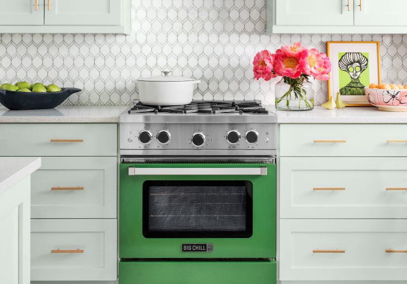
- Color Moments (For Kitchens That Refuse to Be Boring)
- Stone and Slab Looks (A.K.A. the “No-Grout-Line” Dream)
- Texture and Mixed Materials (For Depth You Can Feel)
- Budget-Friendly and Renter-Friendly Wins (Stylish, Not Stressful)
- Design Details That Make It Look Custom (Even If It Wasn’t)
- Maintenance Tips That Keep Your Backsplash Looking “New Kitchen” Fresh
- Real-World Experiences: What Backsplash Projects Are Actually Like (The Fun, the Oops, and the “Worth It”)
- Conclusion
A kitchen backsplash is basically your kitchen’s “jewelry”: small-ish, highly visible, and somehow capable of making the whole outfit look expensive.
It also has a real jobprotecting walls from splatters, steam, and the occasional spaghetti-sauce incident that absolutely “didn’t happen.”
Whether you’re renovating from scratch or giving your kitchen a glow-up on a weekend budget, the right backsplash can add color, texture, and personality
without demanding a full remodel.
Designers are leaning into everything from artisanal, slightly imperfect tiles (hello, handcrafted charm) to sleek slab “countersplash” looks that run up the wall
for a seamless, easy-to-wipe finish. At the same time, renter-friendly options like peel-and-stick tiles, painted patterns, and beadboard are having a moment
because not every kitchen upgrade needs a contractor and a second mortgage.
How to Choose the Right Backsplash (Without Overthinking It)
Start with your “non-negotiables”
- Heat + grease zone: Behind the range, prioritize materials that clean easily (porcelain, ceramic, slab stone/engineered surfaces, or stainless).
- Water zone: Behind the sink, pick something water-friendly and easy to maintain (and consider a durable grout or fewer grout lines).
- Daily reality: If you cook often, tiny tiles + lots of grout can mean more scrubbing. If you love the look anyway, choose darker grout or a stain-resistant grout strategy.
Match (or intentionally clash) with what you already have
- Countertops: Busy stone patterns pair nicely with simpler tiles; plain counters can handle a bolder backsplash.
- Cabinets: Warm wood loves earthy tiles (terracotta, creamy zellige, warm whites). Painted cabinets can handle contrast (navy + white, sage + cream, black + brass vibes).
- Hardware/fixtures: Think of metal finishes as supporting actorsbrass warms up cool tile, chrome sharpens modern looks, and black can make everything feel graphic and intentional.
Budget cheat sheet (general guidance)
- Budget-friendly: Ceramic subway tile, simple porcelain, beadboard, paint + stencil, peel-and-stick.
- Mid-range: Glass tile, mosaics, higher-end porcelain, specialty shapes (scallop, kit-kat/finger tile).
- Investment: Handmade tile, natural stone slabs, custom mosaics, full-height slab or stone wrap details.
75 Kitchen Backsplash Ideas for Every Style and Budget
Timeless Classics (That Never Get Weird at Resale Time)
- Classic white subway tile, offset brick pattern: Crisp, clean, and basically the “little black dress” of backsplashes.
- White subway tile with dark grout: Adds definition and hides everyday life (aka cooking) better than bright white grout.
- Vertical stacked subway tile: A modern twist that makes ceilings feel tallerno ladder required.
- Beveled subway tile: Subtle dimension that catches light and looks polished without screaming for attention.
- Herringbone with classic rectangles: Traditional shape, elevated layoutlike wearing sneakers with a blazer.
- Penny round mosaic in white or cream: Soft, vintage-friendly, and especially charming in farmhouse or cottage kitchens.
- Simple matte porcelain tile in warm white: Minimalist, forgiving, and easy to pair with almost any countertop.
- Neutral zellige-look tile: That handcrafted, slightly wavy vibewithout committing to the splurge version.
- Square tiles in a grid (4×4 or 5×5): Clean lines that feel quietly retro in the best way.
- Marble mosaic strip as an accent band: A little luxury goes a long wayespecially when you keep it simple.
Fresh Takes on Subway Tile (Because Subway Doesn’t Have to Be Basic)
- Oversized subway tile (like 4×12): Bigger tile = fewer grout lines = less maintenance drama.
- Skinny “kit-kat”/finger tiles: Sleek, modern, and surprisingly versatilefrom Japandi to glam.
- Subway tile in a straight stack: Feels more contemporary than offset brick, especially in modern kitchens.
- Subway tile turned vertical in a tight grid: Perfect if you want subtle pattern without loud colors.
- Subway tile in a diagonal layout: Instant movement and personalityeven in plain white.
- Subway tile with a soft handmade edge: Adds warmth and avoids the “too perfect” look.
- Glossy subway tile in a moody color: Navy, forest, charcoaldramatic without being chaotic.
- Subway tile with mixed sheen (matte + gloss): Texture you notice only when sunlight hitslike a design Easter egg.
- Subway tile framed with a pencil trim: Old-school detail that looks especially good in traditional kitchens.
- Subway tile extended behind open shelves: Makes shelves look intentional instead of “I ran out of upper cabinets.”
Patterns and Shapes That Do the Most (In a Good Way)
- Chevron layout with stone or porcelain: Elegant movement that can make a simple kitchen feel custom.
- Basketweave mosaic: Classic pattern, tailored vibegreat with marble-look porcelain for durability.
- Hex tiles (small or large): Works for modern, vintage, and everything in between.
- Scallop/fish-scale tile: Playful texture that looks amazing in coastal or eclectic kitchens.
- Arabesque tiles: Curvy and decorativeperfect when the rest of the kitchen is calm and neutral.
- Diamond tiles in a tight pattern: A crisp geometric look that pairs well with slab counters.
- Elongated hex tiles: A little unexpected, especially in warm neutrals or soft greens.
- Terrazzo-look porcelain tile: Speckled charm without the “please don’t stain” anxiety.
- Patchwork-style tile (coordinated colors): Choose a cohesive palette so it reads curated, not chaotic.
- Geometric mosaic in a single color family: Pattern-forward but still easy to live with.
- Micro-mosaics (tiny tiles) in a gradient: A subtle ombré effect that feels boutique-hotel fancy.
- Large-format geometric print tile: Great for statement kitchensuse it like wall art you can wipe clean.
- Moroccan-inspired pattern tile: Best when you repeat one or two colors from the countertops or cabinets.
- Striped tile pattern using two shapes: Example: thin finger tiles + squares for a custom look.
- Mix-and-match shapes (circle + square): Looks intentional when you keep the color palette tight.
Color Moments (For Kitchens That Refuse to Be Boring)
- Sage green tile with warm wood: Calm, organic, and basically the visual version of a deep breath.
- Navy blue tile with brass hardware: Classic, rich, and surprisingly timeless.
- Black tile with light grout: Graphic contrast that makes white cabinets look extra crisp.
- Soft blush tile for a retro nod: Pairs beautifully with warm metals and creamy counters.
- Terracotta tile for earthy warmth: Perfect with cream cabinets, butcher block, or rustic woods.
- Two-tone tile (top half lighter, bottom half darker): A clever way to add depth without a busy pattern.
- Color-blocked backsplash behind the range: Make the cooking zone the “feature wall” of the kitchen.
- Monochrome tile in multiple shades: Think three blues or three greensdimension without shouting.
- Bright, happy yellow in small doses: Great as an accent stripe or a short run behind a coffee station.
- Bold grout as the color pop: White tile + colored grout can be surprisingly playful and budget-friendly.
Stone and Slab Looks (A.K.A. the “No-Grout-Line” Dream)
- Full-height marble slab backsplash: Big-impact luxurykeep everything else simple so the veining shines.
- Quartz slab “countersplash”: Clean, consistent, and easier to maintain than porous natural stone.
- Porcelain slab that mimics marble: The high-end look with extra durability (and fewer worries).
- Quartzite slab for natural drama: If your countertop is quieter, let quartzite do the talking.
- Bookmatched slab panels: Symmetry that looks like artbecause it kind of is.
- Extend the countertop material up 4–6 inches: A simple countersplash detail that reads upscale.
- Waterfall slab behind the range: A statement moment that also wipes clean like a champ.
- Stone wrap onto the side wall: Great for corner ranges or open layoutsadds intention and polish.
- Full-height slab only on one wall: Balance cost and impact by spotlighting the main cooking wall.
- Stone backsplash with a thin brass edge trim: A small detail that makes it feel custom-built.
Texture and Mixed Materials (For Depth You Can Feel)
- Ribbed/fluted tile in a neutral color: Subtle texture that adds sophistication in modern kitchens.
- 3D cube tiles (tone-on-tone): Visual interest without needing a loud color.
- Glass tile that reflects light: Especially helpful in small kitchens that need brightness.
- Crackled-glaze ceramic tile: Adds vintage charmjust make sure it’s properly sealed if required.
- Mother-of-pearl mosaic accents: Glam without going full disco ball (unless you want to).
- Metal mosaic with stainless accents: Great for modern/industrial kitchens and easy-clean zones.
- Thin brick veneer backsplash: Warm, rustic texturetry a light limewash look for softness.
- Stone veneer (ledger panels): Best as an accent arealike behind a hood or bar nook.
- Mix stone + glass mosaic: Adds sparkle and depth; keep counters and cabinets calmer.
- Mirrored tile for a small-space boost: Reflects light and makes the room feel biggerlike a polite optical illusion.
Budget-Friendly and Renter-Friendly Wins (Stylish, Not Stressful)
- Peel-and-stick “subway” panels: Fast makeover; look for thicker options with convincing texture.
- Peel-and-stick mosaics (fish scale or hex): A statement look without groutchoose heat-rated products near stoves.
- Adhesive tile mats (instead of thinset): Cleaner install for DIYers who prefer less mess and faster setup.
- Painted backsplash in a washable satin finish: Simple, modern, and shockingly effective when done neatly.
- Stenciled “tile” pattern over paint: The vibe of patterned tile for the price of paint (and patience).
- Beadboard backsplash: Classic cottage look; paint it for a bright, clean finish.
- Shiplap-style panels: Great for farmhouse kitchensseal edges well near sinks.
- Wallpaper sealed behind clear acrylic: Pattern drama + wipeable surface = best of both worlds.
- Laminate panels that mimic stone: Budget-friendly and low maintenance; great for quick refreshes.
- Stainless sheet backsplash: Restaurant-clean look, surprisingly practical, and excellent behind ranges.
Design Details That Make It Look Custom (Even If It Wasn’t)
- Take tile to the ceiling on one focal wall: Makes the kitchen feel taller and more finished.
- Create a framed “panel” behind the range: Border tile or trim makes it look intentional and high-end.
- Wrap tile into a windowsill area: A clean, water-friendly detail that looks built-in.
- Add a narrow ledge/shelf within the backsplash: Perfect for oils, spices, or a tiny plant that thinks it’s helping.
- Tile the range hood face: Instant focal pointespecially with handmade-look tile or a bold pattern.
- Use a contrasting grout width: Slightly wider lines can feel vintage; tighter lines feel modern and sleek.
- Pick an intentional grout color: Match tile for seamless calm, or contrast for graphic pop.
- Run the backsplash behind open shelving brackets: It’s a small move that reads like a designer thought of it (because… they would).
- Use trim pieces to create clean edges: Metal profiles or bullnose edges make DIY installs look pro.
- Coordinate outlets and switches: Use matching cover plates or outlet strips to keep the backsplash looking uninterrupted.
Maintenance Tips That Keep Your Backsplash Looking “New Kitchen” Fresh
- Clean gently and often: Mild cleaner + soft cloth beats harsh scrubbing that can dull finishes.
- Watch the grout: If you have traditional grout lines, inspect them periodically and address cracks early.
- Seal where appropriate: Some grout and natural stone may need sealing to resist stains and moisture.
- Plan for your habits: If you cook messy (no judgment), consider fewer grout lines, darker grout, or slab-style surfaces.
Real-World Experiences: What Backsplash Projects Are Actually Like (The Fun, the Oops, and the “Worth It”)
People often underestimate how much a backsplash changes the entire kitchen moodright up until the moment it’s installed and suddenly the room looks “finished.”
One of the most common experiences homeowners share is that the backsplash becomes the bridge between cabinets and countertops. If those two elements feel like they’re
arguing (say, cool gray counters and warm wood cabinets), the backsplash can play referee with a warm white tile, a softly patterned neutral, or a subtle texture
that ties both sides together. It’s a surprisingly powerful middle layer.
Another frequent lesson: grout is not a background character. People pick tile, fall in love, install it… and then realize grout color is doing
50% of the visual work. Light grout can look seamless and airy, but it shows stains more easily in heavy-use kitchens. Dark grout can look crisp and graphic, but it
demands straighter lines and careful cleanup. Many DIYers say the “aha” moment is testing grout colors with a few sample tiles under their actual kitchen lighting
because what looks perfect in a store can look totally different at 8 p.m. under warm under-cabinet lights.
Budget-friendly projects have their own set of real-life wins. Renters and remodelers on a tight timeline often love peel-and-stick options because the transformation
is fast and visually dramatic. The experience tends to be best when they treat prep like the main event: cleaning thoroughly, degreasing the wall, drying it fully,
and using a level to keep the first row straight. The most common “oops” story is starting slightly crooked and watching that tiny tilt become a full-on lean by tile
number twelvelike a design version of the Tower of Pisa. The fix is simple: take time on the first row, measure twice, and don’t rush the layout.
For bigger renovations, slab-style backsplashes often deliver that “wow” factor people were chasingespecially behind ranges or on a feature wall. The experience
tends to be: fewer grout lines to clean, a more seamless look, and a feeling that the kitchen jumped up a price tier. The tradeoff people mention is planning:
veining direction, where seams land, and how the stone or porcelain pattern lines up at corners. When it’s planned well, it looks like a single, intentional piece
of art. When it’s not, it can feel visually choppyso the “worth it” stories almost always involve careful layout decisions upfront.
Finally, there’s the emotional part of backsplash choices that doesn’t show up on a mood board: how the kitchen feels during everyday life. Warm, textured tiles
(like handmade-look ceramics) often make kitchens feel inviting and lived-in. Glossy finishes bounce light and can make mornings feel brighter. Patterned tiles can
make a small kitchen feel personal and expressivelike it has a point of view. The most consistent real-world takeaway? People rarely regret choosing a backsplash
they genuinely love, as long as they match it to their cleaning tolerance and cooking habits. In other words: pick pretty, but pick practical pretty.
Conclusion
The best backsplash isn’t “the trendiest”it’s the one that fits your kitchen, your budget, and your real life (yes, including your real life mess).
If you want timeless, stick with warm whites, simple shapes, and classic layouts. If you want personality, lean into color, texture, and patternthen keep the rest
of the finishes calmer so the backsplash can shine. And if you want maximum impact for minimal cash, renter-friendly options can absolutely deliver a glow-up that
looks way more expensive than it was.