Table of Contents >> Show >> Hide
- What Is an Ambigram?
- Tools and Materials You’ll Need
- How to Make an Ambigram in 9 Simple Steps
- Step 1: Choose the Right Word or Phrase
- Step 2: Write the Word Normally and Upside Down
- Step 3: Map Letter Pairs and Problem Spots
- Step 4: Study Simple Letter Shapes and Symmetry
- Step 5: Start Rough Sketches of Each Letter Pair
- Step 6: Combine the Letter Pairs into a Full Word Sketch
- Step 7: Rotate, Test, and Refine (Over and Over)
- Step 8: Clean Up the Design and Add Style
- Step 9: Final Checks and Real-World Testing
- Helpful Tips for Better Ambigram Design
- Real-World Uses for Ambigrams
- My Ambigram-Making Experiences and What You Can Learn
- Conclusion: Turning Words Upside Down, One Step at a Time
If you’ve ever flipped a logo upside down and realized it still reads perfectly, you’ve just met an
ambigram. These clever word designs are part typography, part puzzle, and part optical illusion.
The best part? You don’t need to be a professional calligrapher or logo designer to make one. With a pencil, some
patience, and a bit of creative problem solving, you can learn how to make an ambigram at home in just a few simple
steps.
In this guide, we’ll walk through how to make an ambigram in 9 simple steps, from picking the right word to
polishing your final design. Along the way, you’ll learn the basic types of ambigrams, get practical lettering
tips, and see how to avoid common beginner mistakes. Ready to turn your words upside down (literally)?
Let’s dive in.
What Is an Ambigram?
An ambigram is a word, phrase, or number that can be read in more than one way depending on how it’s viewed. Often,
it reads the same when rotated 180 degrees (upside down), but some ambigrams reveal a different word, phrase, or
design when flipped or mirrored. Think of it as a visual pun: one drawing, two readings.
Common Types of Ambigrams
-
Rotational (180°) ambigram: The design reads as the same word (or a different word) when turned
upside down. This is the most popular style for tattoos and logos. -
Mirror ambigram: The word can be read in a mirror, either vertically (left/right) or
horizontally (top/bottom). -
Figure–ground ambigram: One word is formed by the shapes of the letters, while another hides in
the negative space around or between them. -
Chain or circular ambigram: Letters connect continuously so the word can be repeated around a
circle or along a path.
For your first project, a simple 180° rotational ambigram of one word is the most beginner-friendly
starting point.
Tools and Materials You’ll Need
You don’t need a fancy studio setup. Start with:
- Pencil and good eraser (you’ll use this a lot)
- Plain paper or a sketchbook
- Ruler or grid paper (helps with alignment and symmetry)
- Fine-tip black pen or marker for the final lines
- Optional: tablet or computer with vector or drawing software (Illustrator, Procreate, Affinity Designer, etc.)
Once you learn the process on paper, you can refine your ambigram digitally for use as a logo, tattoo, or poster.
How to Make an Ambigram in 9 Simple Steps
Step 1: Choose the Right Word or Phrase
Not every word wants to be an ambigram. Some play nicely; others fight you the whole way. For your first attempt,
pick:
- Short words (3–6 letters are ideal)
- Words with repeated or symmetrical letters (like noon, pod, swims)
- Words that matter to you: a name, a hobby, a favorite word
You can also create a two-word ambigram, where word A reads normally and word B appears when the
design is flipped. For example, “Love / Hate” or “Home / Away.” That’s more advanced but a fun challenge once you
understand the basics.
Step 2: Write the Word Normally and Upside Down
On your paper, draw a horizontal guideline. Above the line, write your word in clear block letters the way you’d
normally read it. Below the line, write the same word upside down so that the letters line up vertically with the
letters above.
Try these variations:
- All uppercase vs. all lowercase
- Different simple fonts: serif, sans serif, script-like
- Looser, more handwritten versions where shapes can bend and stretch
This step helps you see how each letter might rotate into another letter: for example, n can become
u, p can become d, and m can hint at
w when flipped.
Step 3: Map Letter Pairs and Problem Spots
Now, treat your word like a puzzle. When the word rotates 180°, each letter must transform into another letter (or
part of a letter). Draw lines or brackets between matching positions:
- First letter ↔ last letter
- Second letter ↔ second-to-last letter
- Middle letter ↔ itself (for odd-length words)
Make quick notes next to each pair:
- “Easy” pairs: ones that already look similar when flipped, like n/u, m/w,
b/q, p/d, o/o. - “Tricky” pairs: letters with very different shapes, like r/s or k/t.
Highlight the tough pairs. These will need the most creativity when you start sketching your ambigram design.
Step 4: Study Simple Letter Shapes and Symmetry
Before you dive into the ambigram itself, spend a minute studying how basic letters behave when flipped:
- Round letters (o, s, x, z) often look similar rotated.
- Vertical strokes (l, i, t) can hide inside other letters or extend into decorative flourishes.
- Serifs and curves can be exaggerated to “fake” parts of another letter when rotated.
Think of the alphabet as raw material rather than fixed shapes. You’re allowed to stylize letters as long as they
stay readable. Ambigram design lives in that sweet spot between legibility and illusion.
Step 5: Start Rough Sketches of Each Letter Pair
Now the fun part: sketching. Under your previous notes, draw a series of small boxes, one for each letter pair. In
every box, experiment with turning the first letter into the second letter when rotated.
For each box:
- Draw the letter pair bigger than normal to give yourself room to play.
- Add extra curves or strokes if they help hint at the flipped letter.
- Let parts of one letter grow into the nextshared lines are your best friends.
Don’t aim for perfection yet. These rough “mini-designs” are just to discover which letter shapes feel promising.
Step 6: Combine the Letter Pairs into a Full Word Sketch
Once you have a few promising pair sketches, it’s time to assemble a full ambigram prototype:
- Draw a fresh set of guidelines for the whole word.
- Pick your favorite solution for each letter pair and place them side by side.
- Adjust the spacing so the word feels balanced and connected.
At this stage, your ambigram might look a bit awkward. That’s normal. Focus on two questions:
- Can you still read the word in its normal orientation?
- When you rotate the sketch 180°, can you recognize the letters (even if they’re a little weird)?
If the answer is “barely,” you’re still on track. Ambigrams nearly always look rough before they look magical.
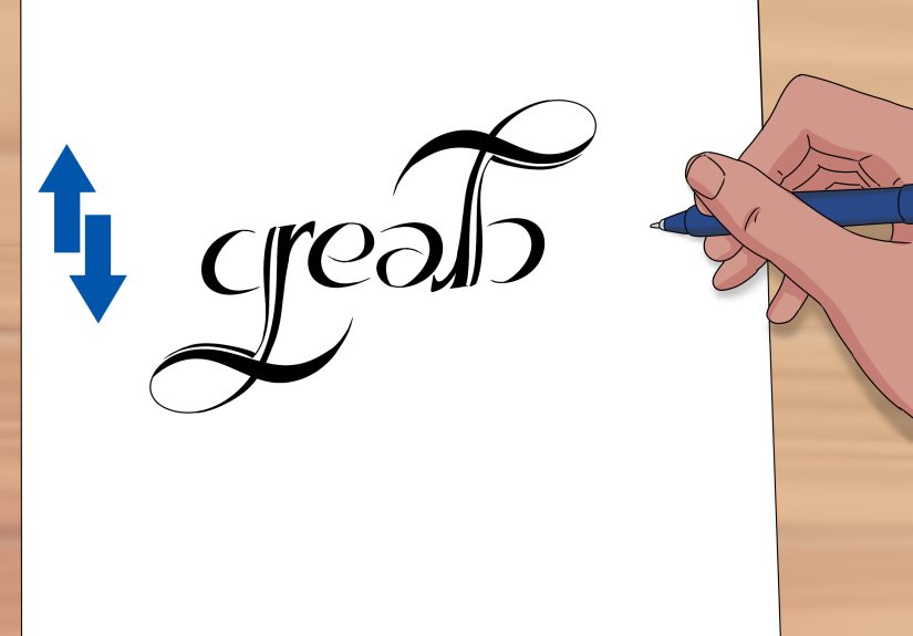
Step 7: Rotate, Test, and Refine (Over and Over)
This is where your eraser earns its keep. Hold your paper up, rotate it 180°, or snap a photo with your phone and
flip it. Look critically at each rotated letter:
- Which letters are hard to recognize at first glance?
- Which transitions between letters feel clumsy or cramped?
- Where could a small curve, serif, or flourish improve readability?
Make small adjustments, flip again, repeat. Ambigram artists often go through many iterations before finding a
design that “clicks.” Be patientthis is less like typing a word and more like solving a visual puzzle.
Step 8: Clean Up the Design and Add Style
Once your basic ambigram works in both orientations, it’s time to give it style. Trace your final pencil sketch onto
a clean sheet or over it with a fine-tip pen:
- Thicken downstrokes and thin out upstrokes for a calligraphic look.
- Use consistent line weight for a modern, geometric style.
- Add simple decorative elements (like small swashes or dots) that help connect letters rather than distract.
If you’re working digitally, scan or photograph your drawing and import it into a vector program. There, you can:
- Use curves and anchor points to smooth jagged lines.
- Adjust symmetry precisely with copy-and-flip tools.
- Test color palettes to see how your ambigram could work as a logo or tattoo concept.
Step 9: Final Checks and Real-World Testing
Before you declare victory, test your ambigram like a real design:
- Show it to a friend without explaining it and ask, “What does this say?” right-side up and upside down.
- Shrink it down to see if it still reads at small sizes (important for logos and social icons).
- Print it out and pin it somewhere you’ll walk past. If you still like it after a few days, it’s a keeper.
If people can read the word within a second or two in both orientations, you’ve nailed the balance between clever
and clear. Congratulationsyou’ve officially created your own ambigram.
Helpful Tips for Better Ambigram Design
1. Prioritize Legibility Over Cleverness
The temptation is to force a super-complex ambigram just because it’s technically possible. But if nobody can read
it without squinting and tilting their head, the design fails. Always ask: “Would someone who’s never seen this word
before still be able to read it?”
2. Use Calligraphy or Lettering Practice
Practicing basic calligraphy or hand lettering helps you understand how letters can be stretched, bent, and decorated
while still feeling like letters. The more comfortable you are with letterforms, the easier ambigrams become.
3. Start with “Friendly” Letter Pairs
Some letter pairs are naturally ambigram-friendly. For beginners, choose words that include:
- n/u, m/w, b/q, p/d
- Symmetrical letters like o, s, x, and z
These give you a head start and reduce frustration so you can focus on style instead of fighting the alphabet.
4. Embrace Imperfection (Especially at First)
Professional ambigram artists sometimes spend days on a single design. Your first one absolutely does not need to be
tattoo-level perfect. Treat each attempt as a fun experiment; each word you try will teach you something new about
how letters behave when flipped.
5. Build a Small “Ambigram Sketch Library”
As you practice, save your rough experiments. Over time, you’ll build a personal library of letter solutions:
- How you turned e into a
- A clever way to make t resemble r when rotated
- A particularly nice m/w shape
You can reuse and adapt these tricks in future designs, speeding up your process and giving your ambigrams a
recognizable style.
Real-World Uses for Ambigrams
Ambigrams aren’t just an art challenge you do once and forget about. They show up in:
- Logos and branding: Companies use ambigrams to create memorable, conversation-starting logos.
- Tattoos: Ambigram tattoos are popular for words with deep personal meaningnames, values, and
phrases that “flip” into something related. - Book covers and posters: Ambigrams instantly signal mystery, duality, and clever design, making
them perfect for thrillers, fantasy, or sci-fi themes. - Personal art and gifts: Custom ambigrams of a couple’s names or a favorite phrase make unique
prints and cards.
Once you’ve learned how to make an ambigram, you’ll start seeing opportunities for them everywhereon merchandise,
album covers, and even city logos.
My Ambigram-Making Experiences and What You Can Learn
The first time I tried to make an ambigram, I confidently picked a long, complicated word with all the “difficult”
letters you can imagine. Ten minutes later, I had a page full of chaos: broken strokes, unreadable shapes, and
something that looked less like lettering and more like an alien language. The lesson hit quicklyambigrams are
absolutely doable, but they reward strategy and patience more than brute force.
When you start working through your own designs, you’ll probably experience a similar arc. At first, your brain
wants each letter to stay rigid and “correct.” You might feel guilty bending a letter too far from the standard font
you’re used to. Over time, though, you’ll learn that the alphabet is surprisingly flexible. A lowercase
n can stretch into something that reads as a u when turned upside down. A
p can grow a graceful curve that becomes the stem of a d after rotation. You start
thinking less about letters as fixed symbols and more as shapes you can sculpt.
One of the most valuable experiences you’ll have is watching someone else interact with your ambigram for the first
time. Hand them your drawing without any explanation. If they immediately recognize the word right-side up, that’s a
great sign. When you flip it and they say, “Wait, it still says the same thing?” you’ve hit the payoff moment. If
they squint and guess incorrectly, don’t be discouraged. That reaction is just extra feedback telling you where to
simplify, clarify, or adjust spacing.
You’ll also get a feel for just how important rhythm is in the flow of your letters. On paper, you might have a
technically correct ambigram where each letter works on its own, but the whole word still feels clunky. Maybe one
letter is too tall, or a flourish crowds the next letter. The more you redraw and refine, the more you start seeing
your ambigram as one continuous shape rather than a lineup of individual symbols. That shift in perspective is a
big step forward in both ambigram design and lettering in general.
Another real-world lesson: digital tools are powerful, but they’re not a shortcut to creativity. Moving your sketch
into a vector program lets you polish curves and perfect symmetry, but the core ideathe clever way one letter turns
into anotherstill has to be discovered by you. Think of software as your finishing studio, not your main
problem-solver. Many artists still swear by sketching ambigrams on paper first because it encourages faster, freer
experimentation without worrying about anchor points and bezier curves.
Over time, you’ll notice your own style emerging. Some people lean into bold, blocky ambigrams that look like
geometric logos. Others prefer flowing script styles where swashes do a lot of shape-shifting work. You might find
that you love two-word ambigramswhere one word flips into anotherbecause they feel like little visual riddles.
Whatever direction you grow in, each new ambigram becomes both a design and a diary entry: a record of what you
were thinking about, who you made it for, and how your skills evolved.
Most importantly, making ambigrams teaches you to enjoy the process of trying, failing, adjusting, and trying again.
There’s a small thrill every time a scribble suddenly becomes a workable solution. That experienceturning something
confusing into something cleveris exactly what makes ambigrams so addictive. Once you’ve created your first one
using these nine simple steps, don’t stop there. Challenge yourself with different words, languages, and styles.
Before long, you’ll have a whole collection of designs that prove you really can turn your world upside down and
still make perfect sense.
Conclusion: Turning Words Upside Down, One Step at a Time
Learning how to make an ambigram is less about memorizing rules and more about training your eyes to see letters as
flexible shapes. With a good word choice, basic mapping of letter pairs, lots of sketching, and a willingness to
experiment, you can create designs that read clearly right-side up and upside down. Start simple, stay playful, and
don’t be afraid of ugly draftsevery messy page is a step closer to that “aha” moment when your ambigram finally
clicks.
Whether you’re designing a logo, planning a tattoo, or just exploring typography for fun, ambigrams are a rewarding
way to stretch both your creativity and your problem-solving skills. Grab a pencil, pick a word, and see what
happens when you flip your perspectiveliterally.