Table of Contents >> Show >> Hide
- Why “Calming” Paint Is More Than Just a Color Name
- The 5 Paint Colors to Avoid for a Calming Space
- What to Watch Out for (Even If the Color Itself Is “Calming”)
- What to Use Instead for a Relaxing, Calming Space
- How to Choose the Right Paint Color Without Regret
- Conclusion
- Experience Notes: Real-Life Lessons from Trying to Create a Calming Space (Added 500+ Words)
If your dream room vibe is “deep exhale” and your current wall color is “energy drink in paint form,” we need to talk.
Creating a calming space is not just about buying a beige paint chip and calling it a day. Color affects how a room feels, but so do saturation, undertones, sheen, lighting, and how much of the color you use. That’s why some shades that look gorgeous in a showroom (or on social media) can feel oddly stressful once they’re covering four walls and staring back at you at 10 p.m.
In this guide, we’ll break down five paint colors (or color families) to avoid when your goal is a soothing, restful roomespecially in bedrooms, bathrooms, reading nooks, and low-traffic living areas. And because this is a judgment-free zone, we’ll also cover what to use instead, so your space can still have personality without vibrating at the frequency of a casino lobby.
Why “Calming” Paint Is More Than Just a Color Name
Paint brands love cozy names: Cloud Whisper, Soft Linen, Misty Meadow. Lovely. But a calming room is usually created by a combination of factors:
- Color temperature: Cooler or balanced hues often feel more restful than hot, high-energy tones.
- Saturation: Highly saturated colors grab attention fast. That can be excitingbut not always relaxing.
- Undertones: A “white” can read creamy and cozy or icy and clinical depending on the undertone.
- Finish: Gloss and semigloss bounce more light and glare, which can make a color feel louder.
- Lighting: Morning sun, north-facing light, warm bulbs, and LED brightness all change how paint looks and feels.
So no, there isn’t one “bad” color forever. But there are colors that are more likely to sabotage a peaceful atmosphere if used carelessly.
The 5 Paint Colors to Avoid for a Calming Space
1) Bright Red (and Red-Orange Walls)
Let’s start with the obvious extrovert in the room: bright red. Red can be dramatic, romantic, stylish, and full of personality. It can also make a room feel busy, especially when used wall-to-wall in a space that’s supposed to help you unwind.
High-energy reds and red-oranges tend to feel stimulating rather than soothing. In a dining room or powder room, that intensity can be fun. In a bedroom, meditation space, or quiet reading corner? It may feel like your walls are asking you to “circle back” on an urgent email.
Why it backfires in calm spaces:
- It visually dominates the room.
- It can feel warmer and more activating than you want at night.
- It reduces the sense of softness and visual quiet that calming interiors usually rely on.
Use instead: If you love earthy warmth, try a muted terracotta, clay, dusty rose-brown, or warm taupe. These give you warmth without the “alarm bell” effect.
Example: A small bedroom with bright red walls can feel boxed in and intense. Swap to a clay beige or cinnamon-taupe and keep red in pillows or art instead. Same personality, much less chaos.
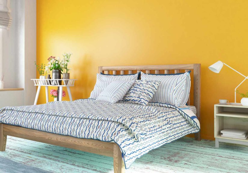
2) Bright, High-Saturation Yellow
Yellow gets marketed as cheerfuland to be fair, it absolutely can be. But bright yellow walls can quickly cross the line from sunny to overstimulating, especially in rooms meant for rest.
This is one of the biggest paint-color traps: you imagine “soft morning light,” but the finished room reads “school bus with opinions.” Strong yellow can feel visually loud, especially when sunlight hits it directly. In the evening, it can shift in weird ways depending on your bulbs and make the room feel harsher than expected.
Why it backfires in calm spaces:
- It reflects light intensely and can feel glaring.
- It tends to stay “on,” even when you want the room to feel settled.
- It can clash with natural wood tones, cool bedding, and gray furnishings if the undertone is too sharp.
Use instead: Think buttercream, wheat, oatmeal, or a warm cream with a yellow undertone. You’ll still get warmth and brightness, just with a softer landing.
Pro tip: If you love yellow, use it in accentsthrows, art, flowers, lampshades, or one small piece of furniturerather than full walls.
3) Neon or Highly Saturated “Statement” Colors
Neon coral. Electric lime. Hot pink. Cobalt that practically glows. These shades can be fabulous in branding, fashion, a kids’ play corner, or a one-off accent moment. But for a calming room paint color, they usually do the opposite of calm.
The issue here isn’t just hueit’s saturation. Highly saturated colors demand attention. They energize a room, create contrast, and keep your eyes moving. That can be exciting in a creative studio, but a bedroom or spa-like bathroom usually benefits from less visual intensity.
Why it backfires in calm spaces:
- It can feel visually jarring, even if you personally love the color.
- It makes it harder for other design elements to “rest.”
- It often looks more intense on a full wall than on a small swatch.
Use instead: Choose a muted version of the same color family. Love green? Try sage, olive-gray, or eucalyptus instead of neon lime. Love pink? Try dusty rose, blush-beige, or violet-white. Love blue? Try smoky blue, gray-blue, or blue-green rather than electric cobalt.
Good design rule: Save intense colors for accents (pillows, trim details, artwork, a chair, or a painted interior shelf) so they add life without hijacking the whole room.
4) Stark Bright White (Especially Cool, Crisp Whites)
This one surprises people. White is supposed to be peaceful, right? Sometimes, yes. But stark, bright white paintespecially cool whites in a room with lots of natural lightcan feel less “serene retreat” and more “medical exam room with better curtains.”
White is not a single color. Some whites are creamy and soft. Others are crisp, blue-leaning, and ultra-reflective. In a calming space, the wrong white can create glare, exaggerate shadows, and make the room feel sterile instead of cozy.
Why it backfires in calm spaces:
- It can look harsh under bright daylight or cool LEDs.
- It may amplify contrast with dark furniture, making the room feel sharper.
- It often lacks the warmth people expect from a “peaceful neutral.”
Use instead: Try warm whites, off-whites, or soft greige-whites. These shades still feel clean and airy, but they add depth and comfort.
Example: If your bedroom has big south-facing windows, a bright white may feel blinding by noon. A warm white or creamy neutral can soften the light and make the room feel more inviting throughout the day.
5) Flat, Very Dark Hues in the Wrong Room (Black, Deep Charcoal, Inky Purple)
Before the dark-paint fans come for me: moody colors can absolutely be beautiful. In fact, some deep greens, smoky blues, and warm charcoals can feel cocoon-like and sophisticated. The problem is when homeowners choose a very dark, flat color without considering light, room size, undertones, and function.
A super-dark wall color can feel grounding in one room and oppressive in another. If the room gets little natural light, has low ceilings, or already feels cramped, dark paint may absorb too much light and make the space feel heavy rather than calm.
Why it backfires in calm spaces:
- It can make a room feel smaller or more closed-in.
- It may look muddy or gloomy if lighting is poor.
- It can shift your room from “restful cocoon” to “slightly dramatic cave” faster than expected.
Use instead: If you want mood without overwhelm, choose a muted deep green, brown-based charcoal, dusty navy, or warm pewter. These colors can feel rich and calm when paired with soft lighting, warm wood, and textiles.
Smart workaround: Keep walls lighter and bring depth through curtains, bedding, rugs, art, and furniture. You get the moody look without committing your entire wall surface to darkness.
What to Watch Out for (Even If the Color Itself Is “Calming”)
Shiny Finishes That Add Glare
You can choose the perfect soft sage and still end up with a room that feels weirdly loud if you use a high-gloss finish. Glossy paint reflects more light, which can make walls feel brighter and more active than intended. For most calming spaces, matte, flat, eggshell, or soft satin finishes are safer choices (depending on durability needs).
Too Much of One Intense Shade
Even a generally “good” color can feel overwhelming when drenched across every wall, ceiling, trim, and built-in with no contrast. Calm often comes from balancea restful main color, supportive neutrals, texture, and a few thoughtful accents.
Ignoring Undertones and Lighting
This is the classic paint regret story. You picked a soft gray online. It dried blue. Or purple. Or somehow mint at 4 p.m. Always test paint samples on multiple walls and check them in morning, afternoon, and nighttime lighting before committing.
What to Use Instead for a Relaxing, Calming Space
If you’re avoiding the five troublemakers above, what should you use? In general, these color families are the safest starting point for a relaxing room paint color palette:
- Soft blues: smoky blue, gray-blue, pale blue, blue-green
- Muted greens: sage, eucalyptus, olive-gray, mossy green
- Warm neutrals: greige, taupe, mushroom, beige, sand
- Warm whites: creamy white, linen white, soft ivory
- Grounded darks (used carefully): deep teal, brown-charcoal, muted forest green
The goal is not to make your room boring. It’s to create a backdrop that lets your body and brain stop working overtime. You can still add contrast and personality through bedding, art, wood tones, lighting, and textiles.
How to Choose the Right Paint Color Without Regret
1. Start with the Room’s Job
Ask: Is this room for sleeping, working, socializing, or getting ready in a hurry? A calming bedroom and a lively breakfast nook should not necessarily wear the same outfit.
2. Test at Least 3 Shades
Paint sample patches (not just peel-and-stick chips if possible) and compare them side by side. The “winner” is usually not the one you expected in the store aisle.
3. Check Morning and Night
A color that looks dreamy at 11 a.m. may look dingy or fluorescent at 9 p.m. under lamps. Test in real life, not just ideal lighting.
4. Coordinate with Fixed Elements
Flooring, tile, countertops, and major furniture aren’t cheap to replace. Make sure your wall color supports those elements instead of starting a cold war with them.
5. Use Bold Colors as Accents
If your soul needs hot pink, I support you. Just maybe give it a throw pillow instead of 220 square feet of wall space.
Conclusion
When you want to create a calming space, the paint colors to avoid are usually the ones that feel too intense, too bright, too shiny, or too harsh for the room’s purpose. That includes bright reds, high-saturation yellows, neon statement shades, stark bright whites, and very dark hues used without enough light or balance.
The good news: you don’t have to choose between calm and character. Soft, nuanced colorsespecially muted blues, greens, warm whites, and earthy neutralscan create a peaceful atmosphere while still looking stylish and intentional. Test your paint, trust your lighting, and remember that the best calming room is the one that makes you exhale when you walk in.
Experience Notes: Real-Life Lessons from Trying to Create a Calming Space (Added 500+ Words)
I’ve seen the same pattern play out again and again in real homes: people say they want a calming space, but what they really buy first is a color that looks exciting on a tiny sample card. It’s completely understandable. Paint chips are small, store lighting is weird, and bold colors can feel “designer” in the moment. Then the room gets painted, and suddenly the walls are the loudest thing in the house.
One of the most common examples is bright yellow. A homeowner imagines a warm, cheerful bedroom that feels like morning sunshine. After painting, though, the room ends up feeling more stimulating than restfulespecially when daylight bounces off the walls. The fix is rarely to abandon warmth entirely. Usually, the best outcome comes from shifting to a softer cream, butter, or sand tone. The room still feels welcoming, but people stop describing it as “a lot.” That phrase alone tells you everything.
Bright white is another big one. People often assume white automatically equals calm, minimal, and clean. Sometimes it does. But in real spacesespecially bedrooms with large windows or cool LED bulbscrisp white can feel harsh. I’ve heard people say things like, “It looks unfinished,” or “It feels sterile,” even when the room is beautifully furnished. In many of those cases, switching to an off-white with a gentle warm undertone transforms the room without changing anything else. Same furniture, same layout, totally different mood.
Dark paint also creates a lot of strong reactions. Some people absolutely love a moody room, and when it works, it really works. But the success stories usually have a few things in common: good lighting, layered textures, and a color with enough warmth or softness in the undertone. The rooms that fail are often the ones where a very dark flat color is used in a small, low-light room without enough contrast. Instead of “cozy,” the result feels heavy. Repainting to a muted medium toneor keeping the dark mood in textiles and decor insteadusually restores balance.
Another real-world lesson: sheen matters more than people expect. Even a calm color can become visually noisy if the finish reflects too much light. I’ve seen soft sage and pale blue look almost aggressive on walls when paired with a shiny finish and bright bulbs. A lower sheen often solves the problem immediately. It softens glare, reduces visual activity, and makes the color feel more grounded.
Finally, the most helpful experience-based rule is this: don’t choose paint in isolation. The calmest rooms usually come from palettes, not single colors. A muted wall color, warm wood, soft fabric, and a few darker accents will almost always feel more soothing than a “perfect” paint color slapped into a room full of competing tones. In other words, calm is a team sport. And your walls should be the steady teammatenot the one sprinting around the room yelling for attention.