Table of Contents >> Show >> Hide
- What a SaaS Resource Center Should Include (and What It Should Not)
- Step-by-Step: How to Build a Resource Center That People Actually Use
- Step 1: Define the mission (yes, your help center needs a job description)
- Step 2: Map your audiences and intent (a.k.a. who’s panicking right now?)
- Step 3: Audit what you already have (your best article might be hiding in Slack)
- Step 4: Design your information architecture (IA) like a product feature
- Step 5: Build your content types and templates (so everything doesn’t look like a different website)
- Step 6: Write for scanners, not scholars (clarity beats cleverness)
- Step 7: Make search excellent (because navigation is optional and search is inevitable)
- Step 8: Bake in SEO (without turning your docs into keyword soup)
- Step 9: Add feedback loops and analytics (treat it like a living product)
- Step 10: Establish governance (because “we’ll update it later” is a lie we tell ourselves)
- Best Practices That Separate “Helpful” From “Help, I’m Trapped”
- Specific Examples of Resource Center Content That Moves Metrics
- Common Mistakes (So You Don’t Accidentally Build a Maze)
- Field Notes: of Real-World Experience Building SaaS Resource Centers
Your SaaS product is amazing. Your onboarding email is charming. Your UI is sleek. And yet… customers still ask:
“Where do I click?” “Why is it doing that?” “Is this a bug, or am I the bug?” (Spoiler: usually neither.)
A great SaaS resource center answers those questions before they become support tickets, churn risks,
or passive-aggressive comments in your next QBR.
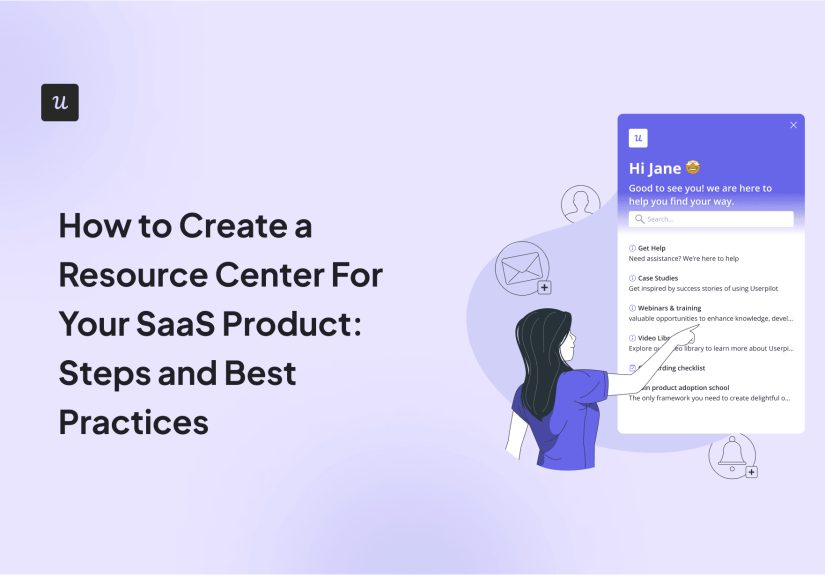
Think of a resource center as your product’s “help brain” a centralized, searchable place where customers can
learn, troubleshoot, and level up. It’s part knowledge base, part help center, part
customer education, and part “please don’t make me open a ticket for this.” Done right, it improves
activation, reduces support load, and quietly boosts SEO because it’s packed with helpful content people actually search for.
What a SaaS Resource Center Should Include (and What It Should Not)
A resource center is not “a pile of articles.” It’s an intentional content hub built to support the
customer journey: evaluation → onboarding → adoption → expansion. The exact mix depends on your product (developer tool
vs. HR platform vs. analytics suite), but most high-performing centers include:
- Getting started guides (setup, first success, onboarding checklists)
- How-to articles (task-based, step-by-step)
- FAQs (short answers to common questions)
- Troubleshooting (errors, edge cases, known limitations)
- Release notes (what changed, why it matters)
- Product documentation (features, permissions, settings)
- Tutorials (videos, walkthroughs, interactive lessons)
- Templates & examples (especially for B2B workflows)
- Developer docs (API references, code samples, SDK guidesif applicable)
What it should not include: vague “thought leadership” that doesn’t help users do anything. If your article
can’t answer a question, complete a task, or unblock a workflow, it belongs on your blog… or in a nice digital scrapbook.
Step-by-Step: How to Build a Resource Center That People Actually Use
Step 1: Define the mission (yes, your help center needs a job description)
Start with a simple statement: “This resource center exists to help [who] accomplish [what] faster
with [your product].” Be specific. “Help customers” is noble but vague. Try:
“Help admins set up SSO and permissions without contacting support” or
“Help analysts build their first dashboard in under 20 minutes.”
Then pick 2–4 measurable goals. Examples: reduce tickets about onboarding, improve trial-to-paid conversion,
increase feature adoption, or cut time-to-first-value. Your goals will guide what you build first and what you ignore
(politely) until later.
Step 2: Map your audiences and intent (a.k.a. who’s panicking right now?)
Resource centers fail when they assume “all users are the same.” They aren’t. Common SaaS audiences include:
evaluators (pre-purchase), end users (doing tasks), admins (configuring), champions (training others), and developers
(integrating). Each group searches differently and needs different levels of detail.
Create an intent list for each audience:
learn (what is this feature), do (how to complete a task),
fix (why did it break), and decide (which plan/permission setting is right).
This prevents the classic mistake of writing ten “overview” pages and zero “how do I…?” pages.
Step 3: Audit what you already have (your best article might be hiding in Slack)
Before writing new content, gather existing knowledge:
support macros, onboarding emails, sales enablement docs, internal SOPs, training decks, and “that one engineer’s
Notion page that everyone bookmarks.” You’ll find repeated questions those are your first articles.
Pro tip: Pull the top ticket tags and top search queries (if you have them). If 18% of your tickets are “invite teammates,”
your resource center should not bury “Invite teammates” under “Account management > Collaboration > People stuff.”
Put it where humans would look.
Step 4: Design your information architecture (IA) like a product feature
Your information architecture is how content is organized: categories, subcategories, naming, and navigation.
Great IA makes answers feel “obvious.” Bad IA makes users rage-scroll and then contact support anyway, just to spite you.
A practical approach:
- Start with 5–8 top-level categories (simple is kind)
- Group by user goals (onboarding, billing, integrations) rather than internal team structure
- Keep depth shallow (most answers should be 2–3 clicks away)
- Use consistent naming (“Set up” vs. “Configure” vs. “Enable” pick one)
Add “popular” and “recommended” sections to reduce decision fatigue. If customers have to think too hard, they’ll choose
the easiest path: “Contact support.” Humans are efficient like that.
Step 5: Build your content types and templates (so everything doesn’t look like a different website)
Standardize formats. This makes content faster to create and easier to scan. At minimum, create templates for:
how-to, troubleshooting, FAQ, and concept/overview.
Here’s a simple “How-to” template that works across most SaaS products:
- What you’ll accomplish (one sentence)
- Before you start (permissions, prerequisites, plan limits)
- Steps (numbered, one action per step, scannable)
- Expected result (what success looks like)
- Common issues (top 2–5 pitfalls)
- Related articles (next steps and adjacent tasks)
Step 6: Write for scanners, not scholars (clarity beats cleverness)
Your resource center is not a novel; it’s a rescue boat. Make content scannable:
short paragraphs, descriptive headings, bullets, and clear step-by-step instructions.
Use the same voice as your product: friendly, confident, and not allergic to verbs.
Also: define terms once, then stay consistent. If your UI says “Workspace,” don’t call it an “Organization” in docs
unless you enjoy chaos.
Step 7: Make search excellent (because navigation is optional and search is inevitable)
Users will search. Even if your navigation is perfect. Even if you personally hand-deliver a printed table of contents.
Invest in search quality:
- Add synonyms (e.g., “invoice” and “receipt”)
- Include common misspellings (yes, people will type them)
- Optimize titles and summaries so results are meaningful
- Use filters (product area, role, content type) for larger libraries
- Surface “no results” suggestions (related articles, contact options)
If your SaaS has in-app search or a help widget, connect it to the same content so customers get answers without leaving the product.
That’s how self-service support becomes a real experience, not a slogan.
Step 8: Bake in SEO (without turning your docs into keyword soup)
Resource centers can rank extremely well because they match real intent:
“how to reset password,” “integrate with Slack,” “export CSV,” and so on. To make content search-friendly:
- Use clear page titles that match how users search (task-based wording)
- Write descriptive headings (H2/H3) that mirror questions
- Use clean URLs (short, readable, consistent)
- Add internal links between related content using descriptive anchor text
- Avoid duplicate content (use canonical URLs when needed)
- Ensure pages are crawlable (don’t lock everything behind a login)
If you publish both marketing and support content, coordinate them. You don’t want three pages competing for
“SaaS onboarding checklist” because Google will pick a favorite and it may not be the one you like.
Step 9: Add feedback loops and analytics (treat it like a living product)
The fastest way to improve a resource center is to measure what happens after people use it. Track:
- Top searches and “no results” queries
- Top viewed articles (and bounce/back-to-search rates)
- Deflection signals (did views correlate with fewer tickets?)
- Article feedback (“Was this helpful?” plus a comment box)
- Content freshness (last updated dates, change logs)
Then run a simple monthly cadence: fix broken/old content, expand the top 10 articles, create new content for the top “no results” searches,
and prune anything nobody uses. Yes, pruning. Your goal is usefulness, not content hoarding.
Step 10: Establish governance (because “we’ll update it later” is a lie we tell ourselves)
Resource centers decay when ownership is unclear. Decide:
- Who owns the taxonomy (usually Support Ops or Content)
- Who writes and reviews (Support, Product, Engineering, CS)
- How updates happen (release notes workflow, doc PRs, review cycles)
- What “done” means (style guidelines, screenshots, versioning)
If your product changes weekly, your docs need a process that changes weekly. If your product changes quarterly,
congratulations you’re going to sleep more than the average SaaS team.
Best Practices That Separate “Helpful” From “Help, I’m Trapped”
Lead with tasks, not features
Users don’t wake up thinking, “I would like to engage with the permissions engine.” They think,
“I need to stop interns from deleting dashboards.” Name content by the job-to-be-done:
“Restrict access to dashboards” beats “Permissions Overview.”
Make every page a good landing page
Many visitors will arrive from Google or an in-app link, not your homepage. Each article should stand alone with:
context, prerequisites, and next steps. Avoid “as mentioned above” unless you enjoy sending readers on scavenger hunts.
Use examples that match reality
If you show sample data, make it realistic: actual-looking emails, believable company names, plausible fields.
Especially for APIs and integrations, show end-to-end examples not just “curl goes brrrr.”
Be honest about limits and edge cases
Customers don’t churn because a feature has a limitation. They churn because they discovered the limitation after wasting three hours.
Put plan limits, permissions requirements, and known constraints where users can see them early.
Design for both findability and discoverability
People either find what they’re looking for (search/navigation) or discover it while exploring.
Use both: strong search and clear categories for findability; “recommended,” “related,” and curated learning paths for discoverability.
Specific Examples of Resource Center Content That Moves Metrics
Activation: “First success” playbooks
Create a short, guided path to the first meaningful outcome. For example:
“Connect your data source → build a dashboard → schedule a report.” Keep it tight, celebratory, and role-specific.
If customers can hit “aha!” quickly, they stick around longer.
Support deflection: Error-message companion pages
If your app throws errors, create dedicated pages for the most common ones. Include:
what it means, why it happens, how to fix it, and what to send support if it persists.
Bonus points if the error message links directly to the exact page.
Expansion: Use-case libraries and templates
For B2B SaaS, “how-to” isn’t just clicks it’s workflows. Publish templates and playbooks:
onboarding checklists, campaign structures, dashboard layouts, policy templates, and integration recipes.
These help customers get more value and create internal champions.
Common Mistakes (So You Don’t Accidentally Build a Maze)
- Too many categories that sound alike (“Accounts,” “Users,” “Teams,” “Organizations,” “Workspaces”… pick a lane)
- Overusing screenshots that go stale every time the UI moves two pixels
- Writing only for experts (or only for beginners) segment by role and level
- Hiding everything behind login (hurts SEO and blocks evaluation-stage users)
- Not maintaining (outdated docs quietly destroy trust)
Field Notes: of Real-World Experience Building SaaS Resource Centers
After watching a few SaaS resource centers grow from “three articles and a dream” into full-blown learning libraries,
here’s what experience teaches you that no checklist can fully capture: a resource center is a cultural artifact.
It reflects how your company thinks about customers, clarity, and ownership. If your internal processes are messy, your
help content will eventually become a museum of contradictions (“Click Settings” vs. “Go to Preferences,” featuring a
screenshot from 2022 that looks like it was taken on a toaster).
The best turning point is usually when a team stops treating docs as “support chores” and starts treating them as
“product accelerators.” The mindset shift is subtle but powerful: instead of writing an article because tickets exist,
you write an article because successful customers exist and you want more of them. That’s when content becomes proactive.
You build guided onboarding paths. You publish integration recipes before a partner launch. You add a troubleshooting
page the same day a new feature ships, because you already know the top three ways it’ll confuse people.
Another pattern: the first version of your taxonomy will be wrong. Not “a little off.” Wrong.
You’ll organize content the way your org chart is organized. Then customers will search for “export data” and somehow end up in
“Advanced Analytics > Data Frameworks > Output Artifacts.” They will not be amused. The fix is not to debate the taxonomy
harder in a meeting. The fix is to watch behavior: search logs, click paths, “no results” queries, and feedback comments.
Customers will tell you what the information architecture should bemostly by ignoring the one you built.
On writing style, experience teaches restraint. You want to be friendly, but you can’t be vague.
“Easily configure your workspace” is warm and useless. “Go to Settings → Workspace → Branding” is cold and helpful.
The sweet spot is both: give direct steps, then add small “why this matters” notes. People love when you explain consequences:
“If you change this setting, it affects all new users.” That reduces fear and prevents accidental disasters.
One more lesson: every resource center eventually needs a “content ops” routine, even if you’re small.
Without a cadence, content decays. UI labels change. Features move. Permissions logic evolves.
The teams that win set a lightweight rhythm: monthly cleanup, quarterly audits, and a release-note-to-docs pipeline
so new features don’t launch into a documentation vacuum. And yes, someone has to own it. “Everyone owns it” quickly turns into
“no one owns it,” which is how you get an article titled “How to Invite Users (NEW)” sitting next to “Inviting Team Members (Updated)”
while support quietly cries in the background.
The good news: when you get it right, you feel it everywhere. Fewer repetitive tickets. Faster onboarding.
Better product adoption. Customers sound more confident. And the resource center becomes a competitive advantage:
prospects trust you more because you explain things clearly. In SaaS, clarity isn’t just niceit’s revenue. And also fewer emails.
Which, honestly, is priceless.