Table of Contents >> Show >> Hide
If you think architectural art sounds like homework with nicer paper, Maja Wronska is here to lovingly prove you wrong. Her watercolor paintings do not treat buildings like static objects or sterile design exercises. They treat them like living characters with moods, memories, and the occasional main-character glow. A cathedral can feel hushed and cinematic. A bridge can look like it is stretching awake at sunrise. A city block can seem one coffee away from telling you its life story.
That is the real charm of beautiful architectural watercolors by Maja Wronska. They are technically sharp, emotionally loose, and wildly good at turning streets, facades, skylines, and landmarks into scenes you do not simply look at. You enter them. You drift through them. You mentally cancel your afternoon and decide you now belong in Venice, Chicago, Paris, or New York.
In an online world crowded with fast images and disposable scrolling, Wronska’s work has staying power. Her paintings feel handcrafted, observant, and deeply personal. They celebrate architecture without making it feel cold. They celebrate watercolor without making it feel fragile. And they remind viewers that cities are not just made of steel, stone, and geometry. They are made of atmosphere.
Who Is Maja Wronska?
Maja Wronska is a Polish architect, illustrator, and watercolor artist whose work centers on cities and architecture. That background matters. A lot. You can see it in the way her paintings understand proportion, perspective, structure, and the visual rhythm of urban spaces. She is not merely painting pretty buildings because they happen to be photogenic. She understands how those buildings stand, how they relate to streets and light, and why certain silhouettes feel iconic the instant you see them.
That architectural foundation gives her paintings a rare kind of confidence. The lines feel intentional. The compositions feel built, not guessed. Even when a wash blooms softly across the paper or a sky melts into a dreamy haze, the bones of the image stay strong. It is the visual equivalent of wearing a tailored coat with paint splatters on it. Refined, expressive, and somehow cooler because it is not trying too hard.
Her portfolio spans famous landmarks, neighborhood scenes, urban facades, bridges, museums, train stations, and street corners. Some works focus on instantly recognizable destinations. Others find beauty in places that feel more lived-in and less postcard-polished. That mix is part of her appeal. Wronska can paint a globally famous skyline, then turn around and make an ordinary block look like the sort of place you want to move to immediately.
Why Her Architectural Watercolors Stand Out
An architect’s eye keeps the paintings grounded
Plenty of artists can make a city look pretty. Fewer can make it feel structurally convincing while still staying loose and lyrical. Wronska does both. Her background in architecture gives her a command of perspective and construction that keeps complex scenes readable even when the color is exuberant. Domes, towers, rooflines, arches, and windows do not dissolve into decorative chaos. They hold together.
That structural discipline is one reason her work feels so satisfying. The viewer gets the freedom and surprise of watercolor, but also the clarity of skilled draftsmanship. It is a lovely balancing act. One half says, “Look at this gorgeous accident of pigment.” The other half says, “Yes, and every balcony is exactly where it should be.”
Her colors do more than decorate
In Wronska’s paintings, color is not there to fill in outlines like a polite coloring book. It carries mood. It suggests weather. It builds time of day. It lets a city breathe. A skyline can glow with sunset warmth. A rainy street can blur into cool grays and blues. A facade can catch pink light that makes stone look almost edible. Her palette choices often feel emotional before they feel descriptive, and that is a big part of why the paintings linger in your mind.
She is especially effective at turning light and shadow into narrative devices. Instead of simply recording what a building looks like, she suggests what it feels like to stand in front of it. Sunlight stretches. Rain softens edges. Evening windows begin to hum. The architecture stays precise, but the atmosphere becomes the story.
The looseness is where the magic sneaks in
Watercolor has a built-in unpredictability, and Wronska uses that quality intelligently. Rather than fighting the medium into stiff obedience, she lets it create softness around the rigid geometry of the built world. That contrast is delicious. Clean architectural lines meet blooming washes, crisp detail meets spontaneous color, and suddenly a familiar building feels less like documentation and more like memory.
That is why her paintings often feel dreamlike without tipping into fantasy. The buildings are still recognizably themselves. A city remains anchored in reality. But the watercolor introduces just enough instability to make the scene shimmer. It is reality plus emotion, which is honestly the better version of reality anyway.
Beautiful Cities, Bigger Mood
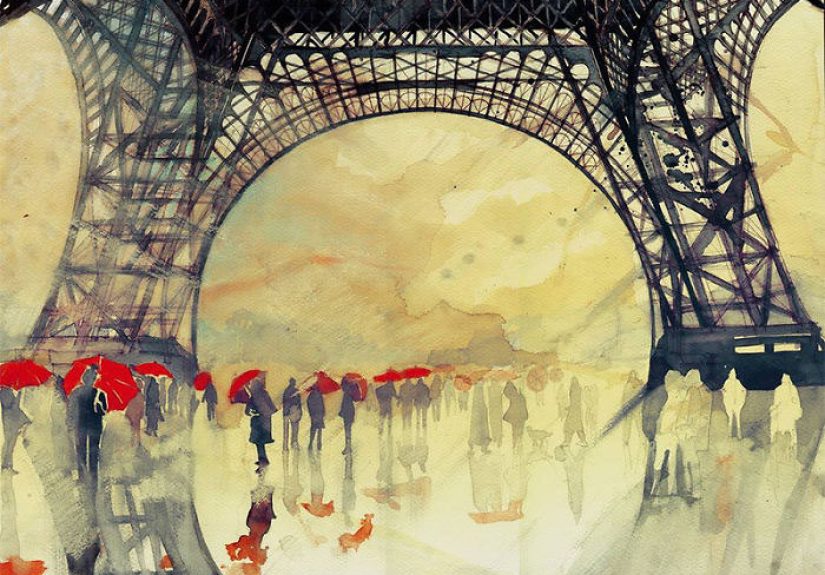
One of the most appealing things about Maja Wronska watercolor paintings is the range of places she chooses to interpret. Her work moves across Europe and the United States, capturing famous skylines, beloved monuments, and richly textured urban corners. New York and San Francisco appear with the kind of glow that makes you want to start pricing flights you absolutely do not need to buy. Venice shows up again and again because, frankly, watercolor and Venice are a dangerously effective combination. Paris, Florence, Barcelona, Cologne, Seville, Santorini, and other destinations all become stages for her mix of architectural control and painterly atmosphere.
Yet these works do not feel like travel brochure art. They are too observant for that. Wronska is interested in more than recognizable landmarks. She notices the emotional personality of a place: the density of windows, the weight of a bridge, the softness of evening light on stone, the way a skyline becomes theatrical when the sky shifts color. She understands that cities are built forms, yes, but also emotional environments.
Her American city paintings are especially interesting because they show how flexible her style is. A European cathedral asks for one kind of drama. A modern skyline asks for another. Wronska adapts without losing herself. Her visual voice remains consistent even as the architecture changes from ornate and historical to sleek and contemporary. That is harder than it looks. Many artists can paint in a style. Fewer can make that style travel well.
How She Turns Buildings Into Feeling
The process begins with drawing
Wronska has discussed starting with a detailed pencil sketch before applying watercolor. That first stage matters because it creates the framework that allows the later freedom to work. The structure comes first, then the atmosphere arrives. It is a smart method for architectural watercolor because it protects the integrity of the scene without suffocating its spontaneity.
You can feel that sequence when you look closely at her paintings. The bones are secure. The energy is layered on top. Nothing looks flimsy, yet nothing feels overworked. It is an elegant combination of planning and release.
Layer by layer, the city starts breathing
Her paintings often read like a conversation between control and fluidity. Detailed sketching lays down the logic of the place. Then watercolor builds the emotion of the place. Layer by layer, facades gain warmth, skies gather movement, and streets begin to pulse. The result is not just a faithful representation of architecture. It is architecture translated into lived experience.
This is also why the paintings work so well as images online and as prints in homes. They have immediate visual impact from a distance, but they reward closer looking. From across a room, you catch the mood and color. Up close, you see the drawing, the structure, the tiny decisions, and the sharpness of observation tucked inside the washes.
Then came motion
One of the most compelling developments in her body of work is the move into animated watercolor. Instead of treating watercolor as a strictly traditional medium, Wronska has scanned finished paintings and digitally animated selected elements. Lights switch on, windows glow, daylight fades, and city scenes subtly shift from still image to moving atmosphere.
That evolution says a lot about her approach. She clearly respects traditional painting, but she is not interested in trapping it inside a museum voice. Her animated works make the case that watercolor can be contemporary, playful, and fully at home in digital culture. In other words, watercolor does not need to sit quietly in the corner with a lace handkerchief. It can absolutely learn new tricks.
Why People Connect With Her Work So Quickly
There is a reason Wronska’s art has circulated so widely online and found fans across creative communities. The work is accessible without being simplistic. You do not need formal training in architecture or painting to enjoy it. The images hit instantly. The colors pull you in. The locations feel familiar or aspirational. The craftsmanship earns respect even from viewers who could not draw a convincing cube if you bribed them with pastries.
Her art also taps into several kinds of desire at once. There is the travel desire, obviously. There is the design desire, because the paintings are beautiful objects. There is the nostalgia desire, because watercolor tends to soften and deepen memory. And there is the city-lover desire, which is really just the urge to believe that buildings are capable of tenderness.
That combination gives her work unusual reach. Architecture fans appreciate the precision. Art lovers appreciate the color handling. Travelers appreciate the sense of place. Casual viewers appreciate that the paintings are gorgeous and not remotely intimidating. Everybody wins.
The Experience of Looking at Beautiful Architectural Watercolors By Maja Wronska
Spending time with Wronska’s paintings feels a little like traveling without the logistical nonsense. No boarding passes. No delayed trains. No overpriced airport sandwich pretending to be a meal. Just the best part: the sensation of arriving somewhere visually rich and emotionally open.
Her work creates an experience that is both immediate and layered. At first glance, you notice the beauty. The color grabs you. The skyline or facade reads clearly. The scene feels inviting. But then the longer you stay with the painting, the more your attention shifts from what the place is to how the place feels. That is where the experience deepens.
A church front is no longer just architecture. It becomes silence, age, weather, and scale. A city street becomes movement, routine, passing time, and changing light. A skyline becomes ambition mixed with atmosphere. Wronska’s greatest strength may be that she paints places as emotional containers. The buildings hold memory, rhythm, and mood.
That is especially powerful for viewers who love cities. Cities are rarely experienced as neat collections of structures. They are felt through fragments: the warm reflection in a window at dusk, the way rain dulls one street and electrifies another, the tension between a monumental building and the tiny people crossing in front of it. Wronska understands that urban beauty is not only about design. It is about encounter.
Her watercolors also recreate the way memory edits reality. When we remember a place we love, we do not remember every literal detail with photographic neutrality. We remember the glow, the weather, the color cast, the angle, the emotional temperature. We remember the drama of the sky, the mood of the stone, the particular way a building looked when we turned a corner and suddenly saw it whole. Wronska’s paintings work in that same register. They are accurate enough to recognize, but emotional enough to feel remembered.
There is also a calming quality to the experience of viewing her work. Even when the subject is a dense city, the paintings do not feel frantic. They feel composed. They slow you down. You notice structure. You notice air. You notice how much visual pleasure lives in repeating windows, layered rooftops, and shifting shadows. It is a useful reminder that cities can overwhelm us in person, yet become deeply beautiful when translated through attention.
And perhaps that is the secret at the center of these paintings: attention. Wronska looks hard at places. She studies them enough to understand their structure, then paints them generously enough to reveal their mood. The viewer receives both gifts. You get the discipline of architecture and the freedom of watercolor. You get the city as object and the city as atmosphere. You get beauty, yes, but also interpretation.
That is why her work resonates beyond art trends or social media novelty. It offers a richer visual experience than a quick snapshot, but it never loses the instant appeal that makes people stop scrolling. It feels crafted, sincere, and alive. And in a visual culture that often pushes images past us at high speed, that kind of experience is worth lingering over.
Final Thoughts
Beautiful architectural watercolors by Maja Wronska succeed because they bridge worlds that do not always meet gracefully. They unite architecture and emotion, structure and spontaneity, traditional watercolor and digital experimentation, famous landmarks and personal atmosphere. Her paintings are disciplined without being dry, expressive without becoming chaotic, and beautiful without feeling generic.
That combination explains why her work continues to attract such broad admiration. It appeals to people who love design, people who love travel, people who love cities, and people who simply want to look at something that feels human-made in the best possible sense. Her art reminds us that buildings are not just engineered objects. In the right hands, they can become luminous stories.
And Wronska’s hands are very much the right hands. She paints cities the way some writers describe old friends: with clarity, affection, and just enough drama to make you want one more chapter.