Table of Contents >> Show >> Hide
- The Classic Color Designers Keep Coming Back To
- Why Warm White Never Goes Out of Style
- What “Warm White” Actually Means
- Designer-Approved Shades in This Timeless Family
- How To Use This Color Without Making the Room Look Boring
- When a Very Light Taupe Makes More Sense
- Mistakes That Can Make a Timeless Color Feel Dated
- How To Know You Picked the Right One
- Experiences Homeowners Often Have With This Timeless Color
If living room paint colors had a high school reunion, warm white would arrive looking annoyingly flawless. Not overdone. Not trying too hard. Not wearing a trend that should have stayed in 2018. Just calm, polished, and quietly confident. While bold colors have their moment and cool grays had a very long season in the spotlight, designers keep coming back to one reliable favorite for living rooms: a soft, warm white.
Not the blinding white that makes a room feel like a dentist’s office. Not the yellowy cream that turns strange at sunset. And not the icy gray-white that can make comfortable furniture look like it is being punished. The shade designers love most lives right in the sweet spot: creamy, light-reflective, neutral, and just warm enough to feel welcoming.
That is why this classic living room paint color never seems to go out of style. It adapts. It flatters natural light. It works with antiques, modern furniture, family-friendly layouts, minimalist styling, and rooms full of books, baskets, dogs, and the occasional mystery throw blanket no one remembers buying. In other words, it is not just pretty. It is practical.
If you are choosing a timeless color for a living room and want something that will still look smart years from now, warm white is the designer-approved answer worth taking seriously.
The Classic Color Designers Keep Coming Back To
When designers talk about timeless living room paint, they often land on slightly different names but the same visual idea: warm white, creamy white, soft off-white, or a whisper-of-taupe neutral. These are the shades that feel clean without looking cold and elegant without feeling stiff.
The reason this category wins again and again is simple. A living room has to do a lot. It has to look good in daylight, lamplight, cloudy weather, and whatever strange lighting situation happens when one bulb burns out and nobody replaces it for three weeks. It also has to support everything else in the room, from rugs and art to wood tones, metal finishes, upholstery, and seasonal decor. Warm white handles all of that with almost suspicious ease.
Designers often describe these shades as “soft,” “inviting,” “versatile,” and “never-fail” for a reason. They do not demand attention, but they make everything around them look more intentional. That is the secret sauce of a timeless living room. The walls are not the loudest thing in the room, yet the whole room falls apart without them.
Why Warm White Never Goes Out of Style
1. It works with almost every design style
Warm white is one of the rare paint choices that can slide into nearly any decorating style without looking confused. Love traditional living rooms with crown molding, tailored upholstery, and classic art? Warm white looks graceful. Prefer modern spaces with clean lines, black accents, and low-profile furniture? Warm white looks crisp. More into rustic, coastal, farmhouse, bohemian, or transitional spaces? Warm white still shows up and behaves beautifully.
That flexibility matters because most people do not completely redesign their living room every two years. Furniture changes. Decor evolves. Tastes mature. The walls need to keep up. Warm white is like the friend who can go to brunch, a wedding, or a hardware store run without needing a costume change.
2. It softens a room without making it look dull
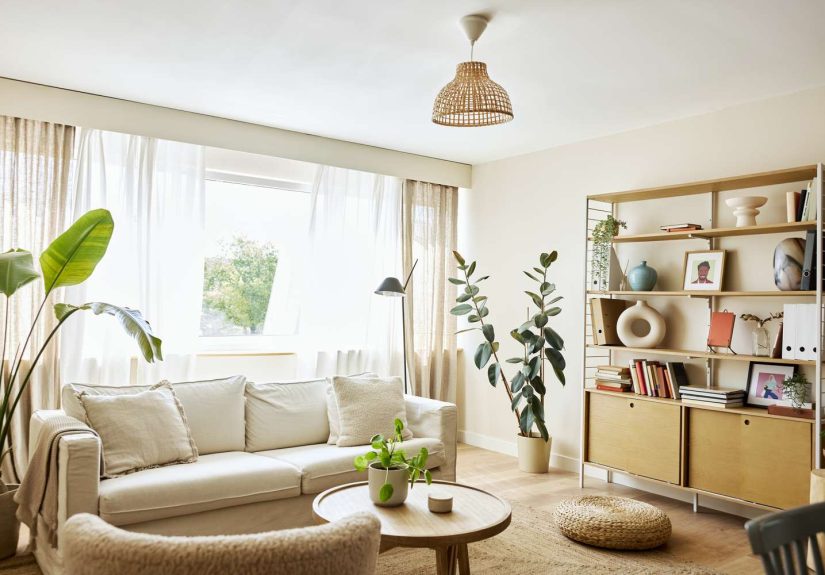
Stark white can look sharp and fresh in the right setting, but in many living rooms it reads cold, flat, or overly modern. Warm white solves that problem. It brings a little softness to the walls, which makes the room feel more relaxed and more lived-in. The result is polished, not precious.
This is especially important in living rooms, where comfort matters just as much as style. A timeless room should look inviting at 10 a.m. with sunshine pouring in and equally inviting at 9 p.m. when the lamps are on and everyone is half-buried in pillows.
3. It reflects light in a flattering way
One reason warm white keeps winning is that it plays nicely with natural light. In bright rooms, it feels airy and open. In dimmer rooms, it can still bounce light around without becoming harsh. That makes it a reliable option for many living room layouts, whether you have huge windows, one moody corner window, or a setup that seems to receive light only on alternating Tuesdays.
Because it is not overly cool, warm white also tends to flatter skin tones, fabrics, wood furniture, and art better than colder whites. That might sound dramatic for a wall color, but paint changes how everything else is perceived. In design, the background is never just the background.
4. It pairs beautifully with natural materials
Another reason warm white feels enduring is that it highlights the materials people continue to love year after year: wood, linen, wool, leather, stone, rattan, ceramic, and aged brass. These materials add texture and character, and warm white gives them room to shine without competing with them.
If your dream living room includes a walnut coffee table, creamy curtains, a vintage rug, a stone fireplace, or even just a decent-looking basket that hides the remote controls, warm white gives all of it a more elevated backdrop.
What “Warm White” Actually Means
Warm white is not one exact color. It is a family of shades. Some lean creamy. Some carry subtle beige or taupe undertones. Some have a touch of gray that keeps them from feeling too sweet. The best version for your living room depends on your light, flooring, trim, and furniture.
That is why designers often recommend testing a few trusted shades instead of choosing one based on a tiny online paint swatch that looks different every time your screen brightness changes. In real rooms, undertones do the heavy lifting.
Look for whites described as soft, creamy, off-white, or neutral rather than crisp, brilliant, or ultra-bright. The goal is warmth with restraint. You want the room to feel welcoming, not buttery. Sophisticated, not sterile.
Designer-Approved Shades in This Timeless Family
While the broader category matters more than one exact formula, several well-known shades show up repeatedly in designer conversations because they capture this classic look so well. Popular examples include Benjamin Moore White Dove, Swiss Coffee, and Seapearl; Sherwin-Williams Pure White, Greek Villa, and Accessible Beige; and soft whites such as Cloud White, Pointing, and Slipper Satin.
Notice the pattern? None of these colors are trying to be the iciest white in the universe. They all have a little softness, a little depth, or a little creamy warmth. Even Accessible Beige, which sits closer to a very light warm neutral than a true white, is often loved because it gives the same timeless effect when a room needs slightly more body.
If your living room has a lot of bright natural light, a warm white with a subtle gray or taupe undertone can help the room stay balanced. If your space is darker or north-facing, a creamier white may feel cozier and more flattering. If your trim is bright white, a warmer wall color can create a gentle contrast. If your trim is also soft white, the whole room can feel beautifully enveloped.
How To Use This Color Without Making the Room Look Boring
There is a common fear that choosing warm white means settling for a room with all the excitement of plain toast. That only happens when the paint is expected to do all the work. Timeless rooms are rarely built from color alone. They are built from layers.
Layer texture generously
In a warm white living room, texture becomes the star. Think boucle chairs, linen drapes, woven shades, wood tables, chunky throws, matte pottery, aged brass lighting, and rugs with visible character. When the wall color is quiet, texture keeps the room from feeling flat.
Bring in contrast through furniture and accents
Warm white looks especially rich when paired with medium or dark wood, black metal, deep green, navy, camel leather, charcoal, or earthy terracotta. These touches add structure and visual interest without ruining the calm mood.
Use art and books to give the room personality
Timeless does not mean bland. A soft white living room can support bold art, colorful books, sculptural lamps, and meaningful decor far better than many trend-driven wall colors. It acts like a gallery backdrop, but one that still knows how to relax.
Consider painting more than just the walls
For a designer-finished look, some homeowners paint the walls, trim, and even ceiling in related soft-white tones. This creates a seamless effect that feels cozy, elevated, and quietly luxurious. It is one of the easiest ways to make a living room feel intentional instead of pieced together one errand at a time.
When a Very Light Taupe Makes More Sense
There is one important twist in the timeless-paint conversation. Some designers say that if your living room does not look its best in white, the next-best classic is a very light taupe. This is especially helpful in rooms with limited natural light, lots of beige fixed finishes, or architectural details that need a little more warmth to feel connected.
A feather-light taupe can deliver the same long-lasting appeal as warm white while adding slightly more depth. It still reads neutral. It still plays well with many styles. It just has more visual weight, which can make a large room feel grounded or a shadowy room feel less chilly.
So yes, warm white is the headline act. But very light taupe is the excellent understudy who knows all the lines and rarely disappoints.
Mistakes That Can Make a Timeless Color Feel Dated
Choosing a white that is too cold
If the paint leans icy blue or sterile gray, the room can feel less timeless and more temporary. That look has fallen out of favor in many homes because it often feels flat and unwelcoming.
Ignoring undertones in the room
Your flooring, fireplace stone, sofa fabric, and trim all influence how paint reads. A warm white that looks lovely on a sample card can turn odd if it clashes with pink-beige tile or orange-toned wood.
Forgetting about lighting
Paint always changes throughout the day. Test samples on multiple walls and check them in morning light, afternoon light, and evening lamplight. Otherwise, your “perfect timeless neutral” may become your “why does this wall look mildly green after sunset” situation.
Skipping contrast and texture
Even the best warm white needs help. Without texture, art, contrast, or layered materials, the room can fall flat. The fix is simple: add visual depth through furnishings and finishes rather than trying to make the wall color do gymnastics.
How To Know You Picked the Right One
The right timeless living room paint color does not scream for attention when you walk in. Instead, the whole room feels calmer, brighter, and more cohesive. Your furniture looks better. Your artwork feels more intentional. Your wood tones look richer. The room suddenly has that mysterious “finished” feeling that usually makes people think a designer was involved.
And perhaps the biggest sign of all: you stop thinking about repainting every time a new trend shows up online. A good warm white does not beg for validation. It just keeps working.
Experiences Homeowners Often Have With This Timeless Color
One of the most common experiences people report after painting a living room warm white is surprise. Not because the room becomes wildly dramatic, but because it feels better in subtle ways they did not expect. The space often looks cleaner without feeling stark, bigger without feeling empty, and calmer without feeling sleepy. It is the kind of transformation that sneaks up on you. On day one, you notice the fresh walls. By week two, you realize the whole room seems more expensive, and nothing else changed except the paint.
Another familiar experience is finally understanding the role of undertones. Many homeowners start by thinking white is just white, then quickly discover that paint has a mischievous side. One sample may look beautiful in the store and oddly pink at home. Another may seem elegant at noon and suspiciously gray by dinner. That is why people who end up happiest with warm white almost always spend time testing samples. They live with them for a few days, watch them in changing light, and compare them against trim, floors, and upholstery. It is not glamorous, but it saves a lot of regret and a shocking amount of muttering.
There is also the experience of seeing existing furniture in a new way. A brown leather chair suddenly looks richer. A wood coffee table appears more custom. Ivory curtains finally make sense. Even inexpensive decor can look more refined against the right warm white backdrop. This is one reason designers love timeless neutrals so much: they do not just decorate a room, they elevate what is already there.
Families often appreciate this color choice for practical reasons, too. In a real living room, life happens. Kids build blanket forts. Pets claim the best chair. Guests set down drinks in places that make coasters feel personally insulted. Warm white has a forgiving quality that works in this kind of daily-use space. It still feels polished, but it is less intimidating than a highly stylized color choice that only looks perfect when nobody is actually living in the room.
People also tend to notice that seasonal decorating becomes easier. Warm white works with spring greens, summer blues, autumn rust tones, and winter metallics without needing a new wall color every few months. The room can shift with pillows, branches, books, throws, and art rather than a full repainting project that destroys an entire weekend and possibly a favorite sweatshirt.
Then there is the long-term experience, which may be the most important one of all. Trendy colors often create excitement at first and fatigue later. Warm white usually does the opposite. At first, some people worry it is too safe. Over time, they appreciate that it keeps giving them freedom. They can change rugs, swap sofas, repaint built-ins, or update lighting without starting over from scratch. It becomes a dependable foundation rather than a design obstacle.
In many homes, that is the real test of timelessness. Not whether a color looks good in a photo, but whether it still feels right after birthday parties, movie nights, furniture rearranges, holiday decor, and a dozen small style changes. Warm white passes that test because it is not trying to dominate the room. It is there to support it. And in design, the choices that age best are often the ones confident enough to do their job quietly.
So if your goal is a living room that feels current now and still beautiful years from today, warm white earns its reputation honestly. It is classic without being boring, polished without being precious, and versatile without feeling generic. In a world full of short-lived trends and dramatic before-and-after reveals, that kind of staying power is refreshingly hard to beat.