Table of Contents >> Show >> Hide
- Why Some 2022 Kitchen Colors Still Work
- 1. Warm White and Soft Cream
- 2. Sage Green and Gray-Green
- 3. Navy Blue and Smoky Indigo
- 4. Greige, Taupe, and Other Warm Neutrals
- 5. Soft Black and Charcoal
- How to Choose the Right One for Your Kitchen
- Final Thoughts
- Extra Experiences: What People Learn After Living With These Kitchen Colors
If 2022 taught kitchen design anything, it is this: people were officially over rooms that felt like sterile waiting areas with better snacks. Homeowners wanted color, but not chaos. They wanted warmth, but not yellow overload. They wanted style, but also something they would not regret every time they reached for the coffee mugs. That is exactly why several kitchen colors that surged in 2022 have managed to stick around.
The shades with real staying power were never the loudest ones. They were the colors that felt calm, flexible, and easy to live with. They worked with wood, stone, brass, black hardware, mixed metals, open shelving, and just about every “I swear this backsplash looked different in the showroom” moment. In other words, the winners were the colors that looked trendy without behaving like a trend.
Below are five of the most popular kitchen colors of 2022 that still feel fresh today, along with practical advice on where they work best, what they pair with, and why they continue to show up in kitchens that feel current instead of dated.
Why Some 2022 Kitchen Colors Still Work
Not every trend survives contact with real life. Some colors look amazing in a magazine spread and then become a daily argument with your lighting. The shades that have lasted since 2022 did so because they solve real design problems. They soften hard surfaces, make kitchens feel more inviting, add personality without making the room feel busy, and adapt well to both modern and traditional cabinetry.
Another reason these colors have endured is that they sit in the sweet spot between timeless and expressive. They are not flat, boring defaults, but they are also not the kind of shades that scream, “This kitchen was definitely remodeled during a very specific three-month Pinterest phase.” That balance matters, especially in a room as expensive and heavily used as the kitchen.
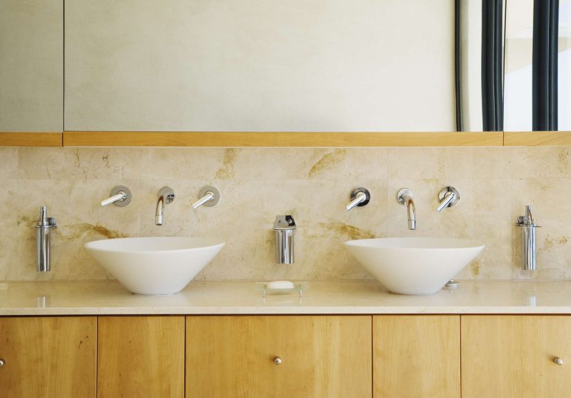
1. Warm White and Soft Cream
Why it still works
White kitchens never truly leave, but the version that keeps winning is not the icy, blinding white that makes your toaster look nervous. The lasting favorite is warm white or soft cream. This color family feels cleaner, gentler, and more welcoming than stark white, and it works across farmhouse, traditional, transitional, coastal, and modern kitchens.
Warm white cabinets reflect light beautifully, which is especially helpful in smaller kitchens or layouts with limited natural light. They also create a soft backdrop for countertop veining, handmade tile, wood accents, and statement lighting. If your goal is a kitchen that looks polished without feeling cold, this is the shade that quietly does the heavy lifting.
Best ways to use it
Warm white is ideal for full cabinetry, especially if you want a bright kitchen that still feels lived in. It also works well on walls when paired with painted lower cabinets or a wood island. For added depth, use slightly different whites on the walls, trim, and cabinets so the room feels layered rather than flat.
This color looks especially good with natural oak, walnut stools, unlacquered brass hardware, marble-look quartz, and handmade zellige-style tile. It is the kitchen equivalent of a crisp white shirt that somehow also knows how to relax on weekends.
Who should choose it
Pick warm white if you want flexibility, strong resale appeal, or a kitchen that can evolve over time. It is also a smart choice if you like to change decor seasonally. With this shade, your kitchen can shift from spring-fresh to holiday-cozy without demanding a full identity crisis.
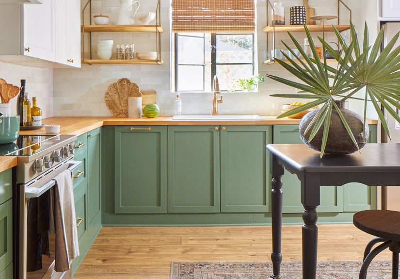
2. Sage Green and Gray-Green
Why it still works
If 2022 had a kitchen-color celebrity, it was some version of sage, eucalyptus, olive mist, or gray-green. And honestly, the hype made sense. These shades bring color into a kitchen without making the room feel loud. They connect beautifully to nature, play well with wood and stone, and act almost like a neutral when used thoughtfully.
Gray-green works because it has enough softness to calm a space and enough depth to keep it interesting. It can feel earthy, elegant, modern, or cottage-inspired depending on the finish, hardware, and surrounding materials. That kind of versatility is exactly why it stayed relevant instead of fading into the trend graveyard with avocado appliances and questionable sponge-paint walls.
Best ways to use it
This shade is especially effective on lower cabinets, a kitchen island, or full cabinetry in spaces with good natural light. It also shines in kitchens that already include warm wood floors or beige-toned stone. If your room feels a little too beige, a muted green can wake it up without shouting.
Pair sage green with creamy white walls, brass or bronze hardware, white oak shelving, and off-white backsplashes. For a moodier take, add soapstone-inspired counters or darker wood accents. For a lighter feel, bring in pale quartz and simple pendants.
Who should choose it
Choose sage or gray-green if you want personality without drama. It is perfect for people who say they love color, but then get suspicious if the paint chip looks too cheerful. It is also excellent for transitional kitchens, where classic details and modern finishes need a middle ground.
3. Navy Blue and Smoky Indigo
Why it still works
Deep blue has had an unusually impressive run in kitchen design because it behaves like a classic neutral with a little more charisma. Navy and smoky indigo feel grounded, sophisticated, and timeless in a way that brighter blues often do not. They add contrast, make cabinetry look more tailored, and give a kitchen a polished designer feel without requiring a trust fund.
Blue also has broad appeal because it pairs with so many materials. It looks sharp with marble, warm brass, matte black, nickel, wood tones, white walls, and even subtle green undertones. That makes it one of the easiest “bold” colors to live with over time.
Best ways to use it
Navy is particularly strong on lower cabinets or islands, where it adds weight and structure to the room. In larger kitchens, it can also work beautifully on full-height cabinetry, especially when balanced with lighter walls and counters. If you want contrast but do not want your kitchen to feel dark, try a two-tone setup with warm white uppers and navy lowers.
Smoky indigo works well in both traditional shaker cabinets and sleeker slab-front designs. It is also a fantastic choice if you want to highlight an island as the visual center of the room. Think of it as the kitchen version of a blazer: classic, useful, and instantly better with the right accessories.
Who should choose it
Go with navy if you want a richer look than white or beige but still care about longevity. It is especially good for homes that lean coastal, traditional, or modern classic. It is also a smart compromise for households where one person wants “something interesting” and the other person wants “something safe.”
4. Greige, Taupe, and Other Warm Neutrals
Why it still works
Warm neutrals have quietly become the adults in the room. While cool gray once dominated kitchen makeovers, many homeowners discovered that it could feel flat, chilly, or oddly disconnected from the warm woods and natural materials they actually loved. Greige and taupe fixed that problem.
These colors are subtle, but not dull. They bring enough pigment to create dimension while still functioning as easy backdrops. They help a kitchen feel cozy, layered, and expensive in that understated way that suggests someone definitely knows the difference between quartzite and quartz.
Best ways to use it
Greige is one of the safest choices for full cabinetry if you want something more distinctive than white but less committed than green or blue. Taupe also works well on walls, especially in open-concept homes where the kitchen needs to blend smoothly into living and dining spaces.
These shades look best when paired with warm wood, creamy whites, textured tile, and brass or aged bronze hardware. They can also soften black accents, which keeps the overall look crisp without becoming stark.
Who should choose it
Choose greige or taupe if you want a timeless neutral with more warmth and depth than standard gray. It is ideal for resale-minded updates, family kitchens, and spaces where you want calm rather than contrast. It is not flashy, but it rarely disappoints. That is a pretty strong résumé for a paint color.
5. Soft Black and Charcoal
Why it still works
Black in the kitchen never really disappeared, but the version with staying power is softer and more nuanced than pure jet black. Think charcoal, ink, graphite, or black with warm undertones. These shades create drama and definition without making the room feel like a cave or a very stylish thunderstorm.
Soft black works because it adds contrast and sophistication. It highlights millwork, makes hardware pop, and gives even simple cabinetry a more architectural look. Used strategically, it can anchor a kitchen and make lighter materials look even better.
Best ways to use it
This color is often strongest on lower cabinets, islands, pantry cabinetry, or window trim. In kitchens with lots of natural light, it can also look beautiful on full cabinetry, especially when paired with warm counters, wood flooring, and lighter walls. The key is balance. Soft black wants company. Give it texture, warmth, and contrast.
Pair it with white oak, walnut, brass, creamy paint, natural stone, or handmade tile. Avoid building an all-black kitchen unless the space has excellent light and serious design discipline. Most kitchens do better with a little contrast and a lot less drama.
Who should choose it
Pick charcoal or soft black if you want a bold kitchen that still feels classic. It works especially well in modern, urban, industrial, and transitional spaces. It is also a clever way to make a kitchen feel more custom without relying on trendy color combinations that may age poorly.
How to Choose the Right One for Your Kitchen
Before you fall in love with any paint color, look at what is not changing in your kitchen. Your floor, countertop, backsplash, and natural light matter more than the trend cycle. A gorgeous online color can turn strange in a room with northern light, orange-toned floors, or a backsplash that insists on being the main character.
Here are a few smart rules to keep in mind:
Sample first, always
Paint large swatches and check them in morning, afternoon, and evening light. Kitchens are notorious for making a perfectly nice color look unexpectedly moody, washed out, or weirdly minty.
Consider undertones
Warm white, gray-green, navy, taupe, and charcoal all come in many versions. One green may look earthy; another may lean icy. One taupe may feel cozy; another may turn pink. Undertones are sneaky little things, and they absolutely matter.
Think about maintenance
Darker colors can show dust, fingerprints, and flour more than people expect. Lighter colors can show scuffs. Mid-tone colors often hit the practical sweet spot. The most stylish kitchen in the world still has to survive pasta night.
Match the mood you want
Want bright and breezy? Warm white. Calm and natural? Sage green. Tailored and polished? Navy. Soft and elevated? Greige. Bold and architectural? Charcoal. Your kitchen color should support how you want the room to feel, not just how you want it to photograph.
Final Thoughts
The kitchen colors from 2022 that remain on trend are not hanging on because of nostalgia. They are lasting because they are genuinely useful. They bring warmth, flexibility, and style to one of the hardest-working rooms in the house. That is what real staying power looks like.
If you want the safest long-term pick, warm white and greige are hard to beat. If you want the sweet spot between trend and timelessness, gray-green and navy are the stars. If you want a little drama with your dinner prep, soft black or charcoal can absolutely deliver. The best choice depends on your space, your light, and your tolerance for paint samples taking over the kitchen table for a week.
But one thing is clear: the most enduring kitchen colors are the ones that feel layered, livable, and a little bit personal. The trendiest kitchen in the neighborhood is fun for a season. The kitchen you still love three years later? That is the real win.
Extra Experiences: What People Learn After Living With These Kitchen Colors
One of the most interesting things about kitchen color is that opinions change after people actually live with the space. At first, homeowners often choose paint the way they choose dessert: emotionally, quickly, and with heroic confidence. Then daily life arrives with grocery bags, fingerprints, crumbs, dim weather, bright morning light, and that one family member who somehow splashes coffee on vertical surfaces. That is when the real personality of a color shows up.
People who choose warm white usually love how open and clean the room feels, but they quickly learn that not all whites behave the same. A soft creamy white tends to feel comfortable all day long, while a colder white can start to feel harsh under LEDs or in winter light. Many homeowners say that once they added wood stools, a textured runner, or warmer hardware, the kitchen finally clicked. In other words, white may be simple, but it still likes a supporting cast.
Those who go with sage or gray-green often describe a different experience: the kitchen feels calmer almost immediately. There is something about a muted green that takes the edge off busy mornings. It can make a kitchen feel connected to the outdoors, even when the “outdoors” is mostly a driveway and one heroic potted basil plant. Over time, people also notice that this color hides everyday life better than bright white does. It softens visual clutter, and that turns out to be a major quality-of-life perk.
Navy kitchens usually win people over because they feel richer in person than they do on a tiny paint chip. Homeowners often say the color makes the cabinetry look more custom and substantial. The surprise lesson, though, is lighting. In a bright kitchen, navy feels crisp and classic. In a darker room, it can look moodier and more dramatic than expected. That is not necessarily a bad thing, but it does mean navy works best when people test it honestly instead of optimistically.
Greige and taupe tend to become favorites for people who were afraid of making a mistake. Once installed, these colors often feel easier to live with than trendier picks because they change beautifully throughout the day. In morning light they may feel airy; by evening they feel cozy. Homeowners also discover that warm neutrals make it easier to change wall art, bar stools, and accessories without creating visual conflict. It is the low-drama friend of kitchen colors, and sometimes that is exactly what a room needs.
Charcoal and soft black bring the biggest “wow” factor, but they also teach the fastest lessons about balance. People who love them usually pair them with warm woods, lighter counters, or plenty of natural light. When they do, the result feels elegant and grounded. When they do not, the kitchen can start to feel heavier than planned. The experience many homeowners report is that dark paint looks best when the room has texture around it. Stone, wood grain, handmade tile, and warm metals keep the darker shade from feeling flat.
Perhaps the biggest real-life takeaway is that the best kitchen color is rarely the one that looks most exciting for five minutes on a phone screen. It is the one that keeps working on regular Tuesday mornings, messy Saturday afternoons, and late-night snack runs. That is exactly why these 2022 colors continue to last. They do not just photograph well. They live well.