Table of Contents >> Show >> Hide
- Popular Decorating Styles (and How to Recognize Them in the Wild)
- How to Choose Your Decorating Style (Without an Identity Crisis)
- Decorating Themes: The “Vibe” Layer That Makes a Room Feel Like You
- The Design Recipe: Color, Texture, Pattern, Scale, and Lighting
- Room-by-Room Examples: Styles and Themes in Real Spaces
- Mixing Styles: How to Do It on Purpose
- Common Decorating Mistakes (and Easy Fixes)
- Conclusion: Your Home, But With a Plan
- Real-Life Decorating Experiences (What People Learn the Fun Way)
If decorating a home feels like trying to order coffee in a new city (“I’ll have a… medium… hot… furniture?”), you’re not alone. The good news: you don’t need a design degree or a Pinterest PhD. You just need two things: a decorating style (your home’s “design language”) and a theme (the story you’re telling).
Think of style as the grammarmodern, traditional, farmhouse, industrial. It shapes the bones: silhouettes, materials, finishes. Theme is the plotcoastal calm, desert warmth, moody library, playful color-pop. It shapes the vibe. When you get both working together, your rooms stop feeling like random shopping receipts and start feeling like a home.
Popular Decorating Styles (and How to Recognize Them in the Wild)
Decorating styles are basically fashion eras for your houseexcept your house doesn’t have to worry about low-rise jeans coming back. Here are the most common styles people use as their “base layer,” plus what to steal from each one without committing to a full makeover.
Modern vs. Contemporary (Yes, They’re Different)
Modern typically points to early-to-mid 20th-century roots: clean lines, honest materials, and less fuss. Contemporary means “of the moment,” so it evolvesoften featuring neutral palettes, streamlined shapes, and a tidy, intentional feel. If modern is a classic leather jacket, contemporary is whatever your cool friend is wearing right now (and somehow pulling off).
Minimalist
Minimalism is “less, but better.” It favors breathing room, simple forms, and a calm palette. The trick is keeping it warm: mix matte finishes, natural wood, and textured textiles so it feels like a homenot a showroom where you’re afraid to exhale.
Scandinavian
Scandinavian style is minimalism’s cozy cousin. It leans light and airythink pale woods, soft neutrals, and practical furniture. Texture does the heavy lifting: wool throws, woven rugs, linen curtains, and anything that says, “Yes, we enjoy winteremotionally and aesthetically.”
Japandi
Japandi blends Japanese and Scandinavian influences into something calm, warm, and organic. You’ll see low-profile furniture, natural materials, quiet neutrals, and handmade-feeling ceramics. It’s minimal, but never coldlike a spa that also serves good coffee.
Mid-Century Modern
Mid-century modern is the poster child for “timeless cool.” Look for: tapered legs, low profiles, warm woods (like walnut), and simple geometric shapes. Add one statement piecelike a sleek credenza or iconic lounge chairand your room instantly understands the assignment.
Traditional
Traditional interiors lean on symmetry, classic details, and a sense of history. Think: curated antiques, rich woods, tailored upholstery, and patterns that feel established rather than trendy. If your dream home smells faintly like a library and good decisions, traditional might be your lane.
Transitional
Transitional is the bridge between traditional and contemporary: classic comfort with cleaner lines. It’s great if you want a space that feels polished but not preciouslike you can host a dinner party and put your feet up afterward.
Farmhouse and Modern Farmhouse
Farmhouse style often features practical, straightforward comfortrustic textures, simple shapes, and a “welcome in” warmth. Modern farmhouse sharpens the look with cleaner lines and contrast (often black-and-white accents), but it still leans cozy. One note: a little farmhouse goes a long wayyour house doesn’t need to cosplay as a barn to feel inviting.
Rustic
Rustic is grounded and natural: reclaimed wood, stone, leather, and hearty textures. The best rustic rooms balance rugged materials with a few refined touchesotherwise it can drift into “cabin souvenir shop.”
Industrial
Industrial style borrows from warehouses and factories: exposed brick, visible metal, concrete, raw wood, and utilitarian shapes. The secret to making it livable is softnessadd plush seating, layered textiles, and warm lighting to keep it from feeling like you’re waiting for a forklift.
Coastal
Coastal style should feel relaxed and understatedmore “easy ocean breeze,” less “gift shop seashell explosion.” Expect light tones, comfortable materials, and natural textures like rattan, linen, and weathered wood.
Bohemian
Boho is eclectic, layered, and personal. It loves pattern, texture, vintage finds, and global influence. The difference between “effortless boho” and “thrift store tornado” is editing: repeat a few colors and keep a consistent undertone.
Eclectic
Eclectic design mixes styles and erason purpose. It works when there’s a unifying thread: a consistent palette, repeated shapes, or a shared mood. Think “curated mix,” not “I bought everything I’ve ever liked.”
Maximalist
Maximalism is bold color, pattern, collections, and personalitylayered with intention. Done well, it feels rich and lived-in; done poorly, it looks like your room is yelling (and you’re not sure why). The fix is structure: anchors (big solids) plus controlled chaos (smaller bursts).
Art Deco / Hollywood Regency
These styles love glamour: geometric shapes, high-contrast palettes, metallic accents, lacquer, velvet, and drama. If you’ve ever wanted your living room to feel like it has theme music, say hello.
How to Choose Your Decorating Style (Without an Identity Crisis)
You don’t have to pick one style and pledge allegiance forever. Start with a “base style” that fits your space and lifestyle, then sprinkle in accents like seasoning (not like you tripped into the spice aisle).
Ask These 3 Questions
- What does my home’s architecture want? A sleek condo often supports modern/contemporary. A craftsman or colonial may love traditional/transitional.
- How do I actually live? If you have kids, pets, or a serious relationship with red wine, choose durable fabrics and forgiving finishes.
- What’s my clutter tolerance? Minimalist styles require strong editing habits. If you love treasures, look at eclectic or controlled maximalism.
Try the 80/20 Rule
Aim for 80% of the room to speak your base style (furniture shapes, big materials, main palette) and 20% to be playful: art, accent chairs, pillows, lighting, and decor. That way, your room feels intentionalbut not locked in.
Decorating Themes: The “Vibe” Layer That Makes a Room Feel Like You
A theme isn’t a costume. You don’t need to decorate your bathroom like a literal beach. (Unless you truly want to bathe in nautical enthusiasm.) Instead, themes work best when they’re mood-based and expressed through color, texture, and a few signature pieces.
Theme Ideas That Work in Almost Any Style
- Organic/Nature-Inspired: earthy colors, wood tones, stone, woven textures, leafy shapes.
- Quiet Luxury: tonal neutrals, elevated materials, fewer but better objects, subtle shine.
- Color-Pop Playful: mostly calm base with one bold color repeated in 3–5 places.
- Moody Library: deep hues, layered lighting, rich textures, art that feels collected.
- Global Traveler: handcrafted pieces, textiles, baskets, and artkept cohesive by palette.
- Desert Warmth: warm whites, clay tones, woven materials, soft curves, sun-baked vibes.
The Design Recipe: Color, Texture, Pattern, Scale, and Lighting
Styles and themes are the headline. The recipe is what makes it taste good. Here’s how designers make rooms look pulled together even when they mix styles.
Color: Use a Simple Ratio So You Don’t Overthink It
A classic guideline is the 60-30-10 approach: 60% dominant color (walls, large rug, big sofa), 30% secondary color (drapes, accent furniture), and 10% accent color (pillows, art, accessories). You can do this with neutrals and wood tones, toonot just paint chips.
Warm vs. Cool (and Why Undertones Matter More Than You Think)
Warm colors (reds/oranges/yellows) tend to feel energetic and inviting; cool colors (greens/blues/purples) often feel calming. Neutrals can lean warm or cool depending on undertonesso “white” is rarely just white.
Two pro moves: test paint in your room’s lighting and check it at different times of day, and choose colors based on how the room is used. Social spaces often benefit from warmer tones; private spaces can feel great in cooler, quieter hues.
Texture: The Shortcut to “Designer” Without Buying All New Stuff
Texture is what keeps neutral rooms from feeling flat and colorful rooms from feeling chaotic. Try stacking textures in three categories:
- Soft: curtains, pillows, throws, upholstered seating
- Hard: wood, metal, stone, glass
- Natural: rattan, jute, linen, leather, clay
Example: a Scandinavian living room might use a pale wood coffee table (hard), a wool rug (soft), linen curtains (natural), and a matte ceramic lamp (natural/hard). Instant warmth, zero drama.
Pattern: Pick a “Lead Singer,” Not a Whole Choir
Pattern works best when one pattern is the star (a rug or wallpaper), and smaller patterns support it (pillows, art). If you’re nervous, keep patterns in the same color family or repeat one color across them.
Scale: The Silent Reason a Room Feels “Off”
Scale is not glamorous, but it’s powerful. Common fix: go bigger than you think with rugs and art. A too-small rug makes furniture look like it’s awkwardly hovering. A too-small art piece makes your wall look lonely.
Lighting: Always Layer It
Great rooms rarely rely on one overhead light. Layering is the goal: ambient (overall), task (reading/cooking), and accent (highlighting art, shelves, texture). This makes a space more functional, more flattering, and significantly less “interrogation-room chic.”
- Living room: ceiling fixture + floor lamp + table lamp + optional picture light
- Kitchen: pendants + under-cabinet lighting + toe-kick or in-cabinet accent lighting
- Bathroom: overhead + mirror lighting + a dimmable option for nighttime
Room-by-Room Examples: Styles and Themes in Real Spaces
Living Room
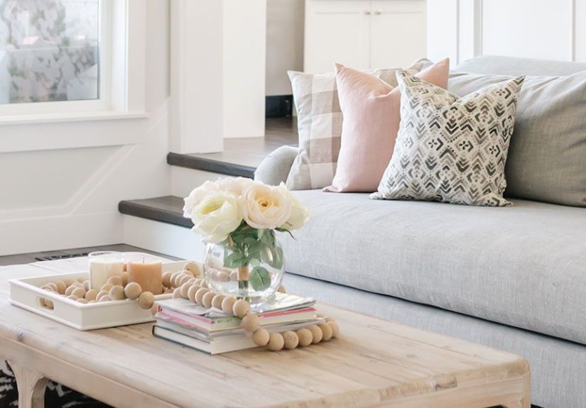
Transitional + Quiet Luxury theme: start with a comfortable, tailored sofa in a neutral tone, add a warm wood coffee table, and layer in texture (bouclé pillow, woven rug, linen curtains). Finish with one elegant accentlike a brass floor lamp or a sculptural vase.
Industrial + Cozy Loft theme: pair a metal-and-wood shelf with a soft sectional, add a vintage rug for warmth, and use amber-toned bulbs and layered lamps to soften hard surfaces.
Boho + Global Traveler theme: choose a grounded base (neutral sofa, simple coffee table), then layer textiles: one patterned rug, a couple of mixed pillows, and a basket wall or woven artkept cohesive with a repeating color like terracotta or indigo.
Bedroom
Japandi + Spa Calm theme: keep the palette soft (warm whites, oatmeal, gentle gray-beige), choose low-profile nightstands, add paper or linen shades, and include one tactile statement: a chunky knit throw or a textured headboard. Keep decor minimal but meaningfultwo great prints beat twelve random frames.
Kitchen
Kitchens are increasingly designed to feel connected to the rest of the homecohesive materials, calmer palettes, and thoughtful lighting. If you want a timeless approach, start by deciding your “anchor”: cabinetry tone (white oak/walnut/painted), then choose counters and hardware to support it.
Modern Farmhouse + Warm Welcome theme: use simple cabinet fronts, warm neutrals, black accents in moderation, and natural textures (wood stools, woven pendants). Skip the “everything is shiplap” momenttry one feature wall or ceiling detail if you love it.
Organic Modern + Nature-Inspired theme: lean into creamy whites, sage/earth tones, stone textures, and matte finishes. Add layered lighting (pendants + under-cabinet + a soft evening option) so the room works for cooking and hanging out.
Bathroom
Coastal + Boutique Hotel theme: choose soft tones, simple tile, and a few texture momentslike a woven basket, a linen shower curtain, or light oak vanity. Add mirror lighting and dimmers to keep the space flattering (and less “8 a.m. reality check”).
Mixing Styles: How to Do It on Purpose
Most beautiful homes mix styles. The key is giving the mix a backbone. Try these guardrails:
- Keep a consistent palette across the room (or the whole house) so styles feel related.
- Repeat materials (wood tone, metal finish, stone family) in at least 3 places.
- Match “visual weight”a chunky rustic table needs equally grounded companions, not spindly delicate side chairs.
- Edit aggressively: if everything is a statement, nothing is.
Common Decorating Mistakes (and Easy Fixes)
- Buying matching sets: Mix pieces for depth. Keep cohesion with color and finish, not clones.
- Ignoring lighting: Add lamps. Add dimmers. Your future self will thank you.
- Picking paint first: It’s often easier to choose paint after you’ve selected the big items (rug, sofa, counters).
- Going too theme-heavy: One or two “theme signals” is enough; let color and texture do the rest.
- Forgetting function: A gorgeous chair that no one sits in is just an expensive coat rack.
Conclusion: Your Home, But With a Plan
Decorating styles and themes aren’t rulesthey’re tools. Choose a base style that fits your home and life, layer in a theme that reflects your mood, and use the design recipe (color, texture, scale, lighting) to tie it all together. The goal isn’t perfection. It’s a space that feels like you live there… happily.
Real-Life Decorating Experiences (What People Learn the Fun Way)
Below are real-world style scenarios inspired by common home projectsbecause nothing teaches faster than a room that almost worked. Consider these your “I learned this so you don’t have to” highlights.
1) The “We Painted Everything White” Phase
A classic: someone loves clean, bright rooms and paints walls, trim, and sometimes even the ceiling the same white. In photos, it looks fresh. In real life, it can read flatespecially if the lighting is cool and the floors are also light. The fix usually isn’t “more stuff,” it’s more texture: a warmer rug, linen curtains, a wood coffee table, and a few matte ceramics. Suddenly the room feels intentional instead of unfinished. The lesson: white isn’t a design planit’s a starting line.
2) The Rug That Was (Sadly) Too Small
People often buy a rug that fits the coffee table, not the room. Then the furniture looks like it’s tiptoeing around the edges. In many living rooms, the upgrade is simply sizing up so at least the front legs of the sofa and chairs sit on the rug. Once the rug anchors the seating area, everything else gets easier: the space feels bigger, and the layout looks “done.” The lesson: scale decisions are boring… until they make your room look expensive.
3) The One-Overhead-Light Trap
You know the look: one ceiling light blazing like a stadium, casting dramatic shadows and making everyone look tired. People add nicer furniture and wonder why the room still feels harsh. Once they layer lightingmaybe a floor lamp near the sofa, a table lamp by a reading chair, and a softer bulbthe room instantly feels warmer and more usable. Bonus: dimmers turn “movie night” into “actual ambiance” in about two seconds. The lesson: lighting is decor you can feel.
4) The Open-Plan “Why Does This Feel Chaotic?” Mystery
Open layouts are greatuntil the living area, dining space, and kitchen all compete for attention. A common solution is color zoning: not necessarily different wall colors, but a consistent palette with subtle boundaries. For example, one dominant neutral runs through the whole space, then the living room gets a deeper secondary color via the rug and pillows, while the dining area repeats that same color in art or upholstery. Add consistent metal finishes (all brushed brass, or all matte black), and suddenly the open plan reads cohesive instead of random. The lesson: repetition is what makes “mixed” look “designed.”
5) The Farmhouse-to-“Wait, Is This Too Much Shiplap?” Realization
Many people fall in love with modern farmhouse because it feels friendly and familiar. But when every wall becomes a feature wall, the charm can flip into theme-park territory. The fix is choosing one hero momentlike a simple accent wall or a warm wood beamthen balancing with cleaner, quieter surfaces. Swap a few overly rustic accessories for timeless pieces (a classic lamp, a solid rug, simple drapery) and the style matures fast. The lesson: farmhouse is a flavor; it doesn’t need to be the entire meal.
6) The “I Love Color but I’m Afraid” Breakthrough
A lot of people want color, but don’t trust themselves. What helps is a formula: start with a neutral base, pick one confident color, then repeat it in small dosesart, pillows, a vase, maybe a single accent chair. People are usually shocked by how “safe” it feels once the color shows up in a few places. And if they want to go bigger later (a painted door, a moody powder room), the room already has a plan. The lesson: you don’t need braveryyou need a system.