Table of Contents >> Show >> Hide
- What Is “After Lowry Wallpaper” Exactly?
- Why This Wallpaper Style Works So Well in Modern Interiors
- Design DNA: The Lowry Influence Without the Museum Label
- Best Rooms for After Lowry Wallpaper
- How to Style After Lowry Wallpaper Without Making the Room Look Too Busy
- Wallpaper Materials and Finish: What to Consider Before You Buy
- Installation Tips for a Crisp, Professional-Looking Finish
- After Lowry Wallpaper vs. Other Pattern Styles
- How to Get the Look If the Original Product Is Hard to Find
- Conclusion: Is After Lowry Wallpaper Worth It?
- Extended Experience Notes (500+ Words): Living With a Lowry-Inspired Wallpaper Look
Some wallpapers whisper. After Lowry Wallpaper looks like it has a story, a weather report, and a train schedule all at onceand somehow that’s exactly the charm. If you found this title and wondered whether it refers to a specific product, a style, or a whole mood board of smoky industrial geometry, the honest answer is: a little of all three.
Public product listings describe After Lowry Wallpaper as a design linked to Marianne Smink/Smink Things and inspired by the cityscapes of artist L.S. Lowrytranslated into abstract blocks, muted tones, and an urban, slightly wabi-sabi rhythm. That’s a fantastic jumping-off point for a deeper conversation about how to use Lowry-inspired wallpaper in real homes today: what makes it visually special, where it works best, how to style it, and how to avoid turning your room into “accidentally gloomy warehouse chic.”
This guide breaks down the design language, placement strategy, installation realities, and long-term styling ideasso you can make the pattern look intentional, timeless, and very much you.
What Is “After Lowry Wallpaper” Exactly?
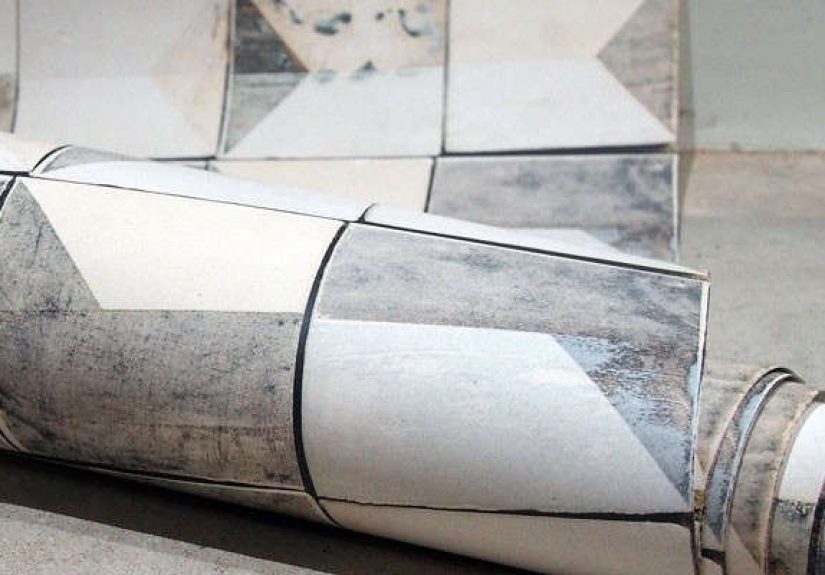
At its core, After Lowry Wallpaper is an abstract, geometric wallcovering associated with Marianne Smink’s design work. Older product coverage describes the wallpaper version as a repeating pattern built from angled blocks in grays, browns, and creams, visually echoing industrial architecture and the layered order-and-randomness found in city streets.
The name points to L.S. Lowry, the British painter known for industrial scenes, restrained palettes, and crowded urban compositions. Even if you’ve never stood in front of a Lowry painting, you probably know the feeling: rows of buildings, soft haze, structure with humanity tucked inside it. A wallpaper inspired by that world naturally leans into:
- Muted neutrals and earthy grays
- Architectural geometry (rectangles, diagonals, block forms)
- A textured, imperfect, handmade visual vibe
- A balance of repetition and surprise
Translation: it’s the kind of wallpaper that feels artistic without screaming, “Look at me, I’m a feature wall!” (Even though, yes, it can absolutely be a feature wall.)
Why This Wallpaper Style Works So Well in Modern Interiors
1) It behaves like art, not just decoration
Designers often talk about wallpaper as a way to “frame” a room the way art does. Lowry-inspired wallpaper is especially good at this because it already carries a compositional quality: blocks, lines, and tonal relationships create visual movement without needing a floral repeat or oversized mural. It gives a room structure.
2) It plays nicely with today’s materials
The palette associated with After Lowrygrays, off-whites, warm browns, clay tonesworks naturally with wood, matte black metal, brushed brass, linen, wool, and plaster finishes. In other words, it fits right into contemporary, transitional, Scandinavian, and soft-industrial interiors.
3) It’s moody without being dark for the sake of drama
There’s a difference between “moody and layered” and “my living room now looks like a cave.” The strength of this style is that it relies on tone variation rather than just deep color. That means you can get depth without sacrificing all available happiness.
Design DNA: The Lowry Influence Without the Museum Label
If you want to style After Lowry Wallpaper well, it helps to understand the visual vocabulary behind it. Lowry’s work is often associated with industrial landscapes, simplified forms, and restrained color relationships. A Lowry-inspired wallcovering borrows that spirit and translates it into interior design language:
- Repetition with interruption: patterns repeat, but feel organic rather than mechanically perfect.
- Urban geometry: the wallpaper can suggest buildings, rooftops, windows, and stacked forms without literally depicting them.
- Tonal subtlety: the pattern often reads differently across morning, afternoon, and evening light.
- Atmosphere over literal imagery: it evokes a place and feeling, not a postcard scene.
That last point matters. This wallpaper doesn’t need to “match” your room in an obvious way. It needs to support the emotional tone of the space.
Best Rooms for After Lowry Wallpaper
Entryway or Hallway
Hallways are perfect for design choices that might feel too bold in a main living area. A Lowry-inspired geometric pattern can turn a transitional zone into a memorable one. Add a slim console, a vintage mirror, and a warm lamp, and suddenly your hallway looks like it has opinions.
Dining Room
Dining rooms benefit from layered visual texture because people usually spend time sitting and noticing details. This wallpaper style creates depth without overpowering a table setting. It pairs especially well with oak or walnut furniture, black chairs, and ceramic centerpieces.
Powder Room
Small room, big payoff. Powder rooms are the easiest place to use a more artistic wallpaper concept because the footprint is small and the commitment feels manageable. If you’re curious but cautious, this is your test kitchen.
Home Office or Studio Nook
Geometric, city-inspired wallpaper can create a focused atmosphere in a workspace. It feels more intellectually “alive” than plain paint but less distracting than high-contrast prints. If your Zoom background matters (and it does), this is a strong candidate.
Bedroom Accent Zone
Instead of wallpapering every wall, consider using After Lowry Wallpaper behind the bed, wrapping just the headboard wall and a bit of the ceiling line or alcove. The result can feel cocooning and curated rather than busy.
How to Style After Lowry Wallpaper Without Making the Room Look Too Busy
Use a “quiet-loud-quiet” rhythm
The wallpaper is your “loud” element (even in subtle colors). Surround it with quieter pieces:
- Solid upholstery (linen, boucle, wool)
- Simple silhouettes
- A limited metal palette (one or two finishes max)
- Art with breathing room, not another pattern fight club
Pull colors from the wallpaper, not from trends
Good wallpaper styling starts with the paper itself. Pick one warm tone and one cool tone from the pattern, then repeat them lightly across textiles, trim, or accessories. This creates cohesion without forcing exact color matching.
Paint undertones matter here. A gray paint that leans green can clash with a wallpaper gray that leans violet or brown. Sample boards and side-by-side comparisons in the room’s actual lighting are worth the effort. It’s not glamorous, but neither is repainting trim twice because your “perfect greige” turned into “mysterious office gray” at 4 p.m.
Let lighting do part of the work
This style shines when you layer lighting:
- Ambient light (ceiling or sconces)
- Task light (table lamp, desk lamp)
- Accent light (picture light, directional spot)
Because the pattern is tonal, changes in light reveal more depth. Morning light may make it read softer; evening light can make the geometry feel richer and more architectural.
Wallpaper Materials and Finish: What to Consider Before You Buy
Even if you’re specifically chasing the After Lowry Wallpaper look, you still need to choose the right wallcovering material for your space. “Beautiful pattern” is only half the job. The other half is surviving real life.
Peel-and-Stick vs. Traditional
Peel-and-stick wallpaper is often easier for renters or commitment-phobic decorators (no judgment; commitment is a lot). It can be great for testing the look in a powder room or home office. Traditional wallpaper, however, is often favored for a more tailored, durable, and high-end finish in long-term spaces.
Vinyl and Washability
In busy zoneshallways, kid-adjacent areas, or spaces that collect fingerprints like they’re trophieswashable options can make more sense. Vinyl wallcoverings are commonly chosen for durability and cleanability, but always check the manufacturer’s guidance for the exact product.
Non-Woven / Paste-the-Wall Options
Many modern wallcoverings use non-woven materials and paste-the-wall installation methods, which can make installation more manageable and future removal easier than older wallpaper systems. If you love the After Lowry aesthetic but want a more DIY-friendly experience, this is a useful filter when shopping alternatives or similar patterns.
Installation Tips for a Crisp, Professional-Looking Finish
Wallpaper is incredibly rewardingand deeply humbling. The pattern will absolutely reveal shortcuts. Here’s how to avoid the classic mistakes.
1) Prep the wall like it matters (because it does)
Clean, smooth, and dry walls are non-negotiable. Dust, texture bumps, and patchy surfaces show through and can reduce adhesion. Patch imperfections, sand smooth, and wipe the wall clean before hanging.
2) Start from a plumb line, not a corner fantasy
Corners and old houses are rarely perfectly straight. Use a level and mark a vertical plumb line for the first strip. Starting “by eye” is how you end up with a pattern that slowly drifts into existential crisis by strip four.
3) Order extra material
Pattern matching creates waste. Add extra for trimming, miscuts, and future repairs. If you’re using a geometric wallpaper with visible alignment lines, the extra roll can save your sanity.
4) Check batch/run consistency
If you’re buying multiple rolls, confirm they come from the same production run when possible. Slight color variation may be noticeable in tonal designs.
5) Consider a pro installer for complex spaces
A long uninterrupted wall is one thing. A room with tricky corners, sloped ceilings, multiple door frames, and outlet chaos is another. If the wallpaper is expensive or irreplaceable, hiring a professional installer can be the cheaper choice in the long run.
After Lowry Wallpaper vs. Other Pattern Styles
Compared to Floral Wallpaper
Floral wallpaper tends to read decorative and romantic; After Lowry Wallpaper reads architectural and contemplative. If you want mood and structure rather than softness and ornament, Lowry-inspired geometry is the better fit.
Compared to Stripes
Stripes are clean but unforgivingespecially in imperfect rooms. A geometric abstract pattern can hide minor alignment or wall irregularities more gracefully while still giving a structured look.
Compared to Murals
Murals are dramatic and image-forward. After Lowry Wallpaper gives atmosphere without locking the room into a literal scene. It’s often easier to style over time as furniture changes.
How to Get the Look If the Original Product Is Hard to Find
Because some mentions of After Lowry Wallpaper appear in older product coverage, availability may vary. If the exact wallpaper is not currently easy to source, focus on the characteristics that define the look:
- Muted industrial palette (gray, taupe, clay, cream, charcoal)
- Geometric block pattern with irregular rhythm
- Textural or handmade feel (screen-print look, brushed effect, matte finish)
- Architectural mood rather than decorative motif
Search terms that can help (without keyword stuffing your brain): industrial geometric wallpaper, abstract block wallpaper, wabi-sabi wallpaper, mid-century neutral wallpaper, and architectural pattern wallcovering.
You can also recreate the spirit with a custom combination of paint, paneling, and framed graphic prints if you want the mood but not the full wallpaper commitment.
Conclusion: Is After Lowry Wallpaper Worth It?
If you love interiors that feel layered, thoughtful, and a little art-school-smart (but still livable), After Lowry Wallpaper is a strong design direction. Its biggest advantage is that it doesn’t depend on loud color or trendy motifs to make an impact. Instead, it uses geometry, tone, and atmospherethree things that tend to age much better than “the pattern everyone bought because social media said so.”
Whether you find the original wallpaper listing, source a similar Lowry-inspired wallcovering, or use the look as inspiration for a broader room scheme, the key is balance: thoughtful prep, strong lighting, quiet supporting materials, and colors chosen by undertonenot guesswork.
In short: this is wallpaper for people who want personality with restraint, texture with intelligence, and rooms that feel curated instead of crowded. Also for people who enjoy saying, “It’s not random, it’s architectural,” which is objectively a fun sentence.
Extended Experience Notes (500+ Words): Living With a Lowry-Inspired Wallpaper Look
The most useful thing I can share about the After Lowry Wallpaper aesthetic is that it changes dramatically depending on what you pair with it. On paper (pun absolutely intended), it may look like a neutral geometric print. In a real room, it can lean cozy, gallery-like, industrial, or even quietly luxurious. That range is the reason people either fall in love with it immediately or hesitate because they can’t quite picture the final result.
In one common design scenario, the wallpaper is used in a narrow entry hall with soft white trim and medium-tone wood flooring. During daylight, the pattern reads almost like a textured neutral backdrop. You notice shape first, then color. But at nightespecially under warm sconcesthe same wall begins to show depth in a way paint simply can’t. The blocks feel layered, almost hand-drawn, and the hallway suddenly looks intentional rather than leftover space. That’s often the first “aha” moment people have with this style: it rewards time and lighting.
Another experience worth noting is how forgiving the look can be with furniture changes. Floral or highly themed wallpaper sometimes dictates the room forever. Lowry-inspired geometry tends to be more flexible. A black console and industrial mirror will make it feel urban and graphic. Swap in a curved oak bench, linen shade, and ceramic vase, and it softens into something more organic. The wallpaper doesn’t lose its identity; it just collaborates differently. That makes it a smart option for homeowners who like to move furniture around or update decor seasonally without redoing the walls.
There’s also a practical side to the experience. Tonal patterns can be easier to live with than high-contrast prints because they hide everyday visual noise better. A slight shadow, a lamp cord, or a stack of books on a shelf doesn’t look “wrong” against the wall. The room feels lived-in rather than staged. This matters more than people expect. A wallpaper that looks amazing in a photo but fights your actual life gets old fast.
That said, this style does ask for restraint. If the wallpaper is doing geometric movement, the rug probably doesn’t need to do interpretive dance. Some of the best real-world results come from simplifying everything else: plain drapery, solid upholstery, and a few strong materials repeated consistently. Wood + metal + textile + one accent color is often enough. The room feels richer precisely because not every item is trying to win.
One final experience note: sampling is not optional here. A Lowry-inspired wallpaper can read warm-gray in one room and cool-gray in another, depending on daylight direction, bulb temperature, and nearby finishes. People often underestimate how much a cream countertop, a reddish floor, or a blue-toned sofa can shift the overall effect. Taping a sample to the wall and checking it morning-to-evening is the design equivalent of reading the recipe before cooking. It feels boring until it saves dinner.
If you approach the look with patiencesample first, coordinate undertones, prep walls properly, and let the wallpaper be the heroyou usually end up with a space that feels more expensive and more personal than the budget might suggest. And that’s the sweet spot: a room with character, texture, and story, without the visual chaos. In other words, exactly what a great wallpaper should do.