Table of Contents >> Show >> Hide
- Why This Kitchen Feels Calm (Without Falling Asleep)
- The Layout: Open, Social, and Senior-Friendly
- The Color Story: Whispery Walls + Blush Tile + “Dessert Counter”
- Cabinetry and Materials: The “Limestone-Wood” Effect
- Lighting: Minimal Overhead, Maximum Mood
- Furniture + Accessories: Make the Practical Pieces Pretty
- Steal This Look: A Copyable Recipe (Not a Carbon Copy)
- Make It Work in a Real American Home
- Maintenance Plan: Calm Kitchens Are Mostly a Habits Problem
- Closing Thoughts: Calm, Color, and a Kitchen That Ages Gracefully
- Experiences: What Living With a Calm, Colorful Open Kitchen Really Feels Like
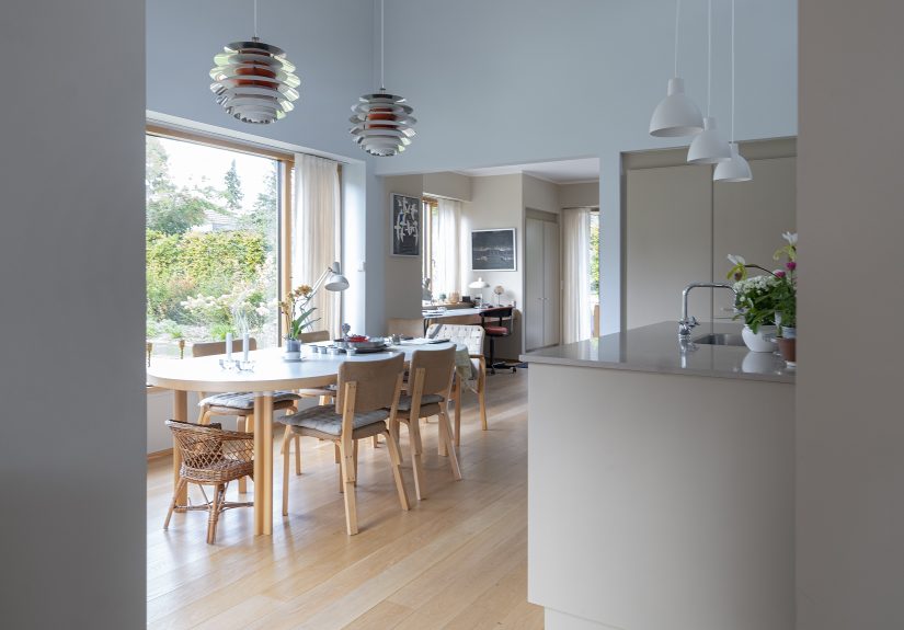
If you’ve ever stared at a kitchen photo and thought, “I want that… but I also want to be able to find my spatula without filing a missing-person report,” welcome. This Danish open kitchencreated for an 80-year-old design enthusiast who clearly has excellent taste and zero patience for nonsensehits a sweet spot: serene, practical, and quietly joyful.
The vibe is Scandinavian calm with a wink of color: pale walls, warm wood cabinetry, a soft blush backsplash, a clay-toned countertop, and cheerful glassware that looks like it belongs in a museum gift shop (in the best way). It’s open to the dining area, designed for real life, and built around qualitybecause at 80, you’ve earned the right to buy things once.
Why This Kitchen Feels Calm (Without Falling Asleep)
Calm kitchens aren’t about stripping out personality. They’re about lowering visual “noise” so the good stuffthe materials, light, and a few well-chosen colorscan actually be heard.
Three calm-making moves happening here
- Low-contrast background: Soft, almost-snowy walls and pale cabinetry keep the room bright and breathable.
- Natural materials doing the heavy lifting: Wood, tile, and stone-like surfaces add texture so you don’t need clutter for “character.”
- Color as an accent, not a takeover: Think “glassware and tile,” not “every cabinet is screaming teal.”
In other words: the kitchen is calm because it’s edited, not because it’s boring. Like a great outfitsimple base, excellent shoes, one accessory that makes people ask where you got it.
The Layout: Open, Social, and Senior-Friendly
Open kitchens can either feel like a warm invitation… or like you’re cooking in the middle of a busy airport terminal. The difference is flowespecially when the kitchen connects directly to dining and living spaces.
What to copy from this open-plan setup
- A clear work zone: Cooking and prep stay contained, so guests can hover without becoming obstacles.
- An island that earns its rent: Storage, serving space, and a visual anchorwithout blocking traffic.
- “No-tripping” priorities: Wide pathways, predictable circulation, and fewer pinch points matter at every age, but they’re golden for aging in place.
Practical spacing rules (so your kitchen isn’t a contact sport)
Use these as planning guardrails when you adapt the look:
- Work triangle sanity: Keep the sink, cooktop, and fridge in reasonable reach (not a cardio workout).
- Keep traffic out of the triangle: Guests should be able to pass through without cutting between you and a hot pan.
- Give yourself real aisle space: Aim for comfortable clearance between counters, islands, and appliancesespecially if more than one person cooks.
If you’re designing for longevity, you can also build in small “future-proof” upgrades now: easy-grip pulls, task lighting, pull-out shelves, and zones for daily routines so you’re not constantly reaching, bending, or rummaging.
The Color Story: Whispery Walls + Blush Tile + “Dessert Counter”
This kitchen nails a color strategy that’s both soothing and memorable: keep the big surfaces quiet and put color where it sparkles.
Steal the palette
- Walls: Soft white with a gentle warmthbright, but not sterile.
- Backsplash: Pale pink subway tile that reads as “glow” more than “pink.”
- Countertops: A clay/coral tone that feels grounded and slightly unexpected (like a really good terracotta pot).
- Accessories: Colorful glassware in rose, amber, dusty blue, and greensmall hits that make the room feel lived-in and loved.
The trick is restraint. If your walls, cabinets, counters, tile, stools, and toaster are all trying to be the main character, the kitchen becomes exhausting. Here, the base is calm, and the accents get to be charming.
Cabinetry and Materials: The “Limestone-Wood” Effect
The cabinetry in this Danish look is a light, stone-tinted wood tonesoft enough to feel serene, warm enough to avoid “all-white fatigue.” It’s the kind of finish that makes you want to run your hand over it and say, “Yes, this is why we don’t buy the cheapest option.”
How to recreate it in the U.S.
- Look for: light oak, ash, birch, or maple; bleached/pickled finishes; matte sealants; simple slab or subtly framed fronts.
- Avoid: high-gloss lacquer (unless you love fingerprints), heavy orange stains, or super-busy wood grain that steals attention from the calm palette.
- Pro move: choose one “hero” finish (the cabinets), then keep counters and tile quieteror vice versa. This kitchen chooses harmony over drama.
Want extra calm? Reduce upper cabinets and lean on an island, drawers, and a few open shelves for daily-use items. Less visual bulk, more air, more light.
Lighting: Minimal Overhead, Maximum Mood
Lighting is where Scandinavian kitchens quietly flex. Instead of one harsh ceiling fixture that makes everyone look like they’re starring in a medical drama, this look layers simple pendants with softer ambient light.
Copy these lighting ideas
- Simple pendants over the island: Clean shapes that don’t visually clutter an open plan.
- A vintage moment in the dining area: A little shine (like chrome) adds contrast and depth.
- Task lighting where it matters: Under-cabinet or focused lighting makes prep easier and saferespecially for older eyes.
For aging in place, lighting isn’t just aesthetic. Prioritize bright, even task lighting at prep and cooking zones, plus soft night lighting for safe movement after dark. You can do “calm” without doing “dim.”
Furniture + Accessories: Make the Practical Pieces Pretty
This kitchen doesn’t rely on decoration for decoration’s sake. The furniture and tableware are the decorbecause they’re functional, sculptural, and thoughtfully chosen.
What to steal
- Simple wood seating: Classic, comfortable, and visually light. Bentwood-style chairs or understated Scandinavian silhouettes work beautifully.
- One “soft color” furniture accent: A stool or small piece in misty blue, sage, or dusty rose adds charm without chaos.
- Colorful glassware as art: A couple of sets in coordinated tones can make open shelves feel intentional instead of messy.
Open shelving without the “I live in a catalog” pressure
Open shelves can be gorgeous and useful, but only if you keep them curated. Treat them like a tiny gallery:
- Repeat shapes (stacked plates, matching glasses) so the shelf reads calm.
- Use color in clusters (all rose glass on one side, amber on the other).
- Leave breathing roomempty space is not a failure; it’s a design feature.
Steal This Look: A Copyable Recipe (Not a Carbon Copy)
You don’t need the exact Danish brands to recreate the feeling. Think of this as a recipe: same flavors, flexible ingredients.
The “Calm + Colorful Danish Open Kitchen” checklist
- Base palette: warm white walls + light wood cabinetry
- One soft statement tile: blush subway, pale blue, or creamy handmade-look tile
- Countertop with warmth: clay, taupe, warm gray, or soft beige (matte finishes feel calmer)
- Island with storage: prioritize drawers, pull-outs, and a landing zone for daily items
- Simple pendants: clean silhouettes, warm bulbs, glare-free placement
- Furniture in natural materials: wood chairs, woven accents, comfortable seating height
- Color accents in small objects: glassware, bowls, vases, linens
- Age-friendly upgrades: great task lighting, easy-grip hardware, organized zones, non-slip runners if needed
Make It Work in a Real American Home
Here’s how you translate this Danish look into common U.S. layoutswithout relocating to a modern villa outside Copenhagen (though if you do, invite us all).
If you have a standard suburban open plan
- Keep pendants visually light so the kitchen doesn’t dominate the living area.
- Use the island as the “bridge” between cooking and gatheringstorage on the kitchen side, serving space on the living side.
- Choose finishes that look good from a distance (because open plan means your kitchen is always on stage).
If you have a smaller kitchen
- Skip upper cabinets on one wall and do a short run of open shelving to keep it airy.
- Choose a narrower island or a freestanding worktable with storage underneath.
- Let color live in tile and accessories so the space stays visually open.
If you’re renovating with aging in mind
- Create task “zones” (coffee, prep, baking, cleanup) so daily routines are efficient.
- Use drawers and pull-outs more than deep lower cabinetseasier access, less bending.
- Consider a safer cooktop option if that fits your lifestyle, and prioritize lighting and slip-resistant flooring.
Maintenance Plan: Calm Kitchens Are Mostly a Habits Problem
Design gets you 60% of the way. The other 40% is not letting your kitchen become the dumping ground for mail, chargers, and that one mystery screwdriver.
Three habits that keep this look looking good
- Daily reset: five minutes to clear counters and return items to their “homes.”
- One visible category: pick one thing you’re proud to display (glassware, bowls, cookbooks). Hide the rest.
- Limit the “extras”: calm kitchens don’t own 27 novelty mugs. (Or they do, but they’re stored somewhere out of sight and judged silently.)
Closing Thoughts: Calm, Color, and a Kitchen That Ages Gracefully
This Danish open kitchen works because it respects real life. It’s open and welcoming, but thoughtfully planned. It’s quiet, but not bland. And it’s designed with the kind of confidence that comes from knowing exactly what you likeand choosing quality that will still look good years from now.
Steal the philosophy first: prioritize light, natural materials, and flow. Then steal the fun: blush tile, clay-toned counters, and colorful glassware that makes an ordinary Tuesday feel like you set the table for a tiny celebration. Because you did.
Experiences: What Living With a Calm, Colorful Open Kitchen Really Feels Like
People tend to think of an “open kitchen” as a design decision, like choosing cabinet pulls or tile. But once you live with oneespecially a calm, Scandinavian-leaning spaceyour relationship with the room changes in ways you don’t fully expect.
First, mornings become easier to start. In a visually quiet kitchen, your brain doesn’t have to sort through chaos before it finds the coffee. The soft wall color and light wood finishes do something subtle but real: they make the room feel forgiving. Even if you left a bowl out overnight, the space doesn’t scream at you. It gently suggests you’re a human being who ate cereal, not a criminal who committed “countertop crimes.”
Second, the open layout turns everyday cooking into social time. In a closed-off kitchen, the cook disappears. In an open kitchen, you’re part of the conversation. That’s a gift at any age, but it’s especially meaningful for older adults who value connection. You can prep vegetables while still hearing the stories at the table, or you can sit for a break without feeling like you’ve “left the action.” The kitchen becomes less of a workplace and more of a lived-in hub.
Third, the color accents start working like emotional punctuation. A couple of rose-tinted glasses, a dusty-blue bowl, a warm terracotta countertopthese small hits of color make the space feel personal without overwhelming it. Over time, those objects become little rituals: the “Saturday morning mug,” the bowl that always holds clementines, the glass you reach for when a friend comes over. In a calm background, those items stand out in a way that feels almost therapeuticlike the room is quietly cheering you on.
There’s also a practical side to the calm. When storage is thoughtfuldrawers that actually make sense, an island that holds everyday tableware, a clear place for prepyour body works less. You reach less, bend less, and spend less time searching. Many people who design with aging in mind report that the biggest relief isn’t a flashy gadget; it’s simply having the right things in the right places. A well-zoned kitchen reduces strain and makes cooking feel possible even on lower-energy days.
Of course, open kitchens are honest. If you go full open shelving and never edit, the kitchen will look “lived-in” in the way a laundry chair looks lived-in. The best experience comes from balance: a few open shelves for the pretty, frequently used items, and closed storage for the rest of life’s clutter. When that balance is right, the kitchen stays calm more oftenand when it’s not calm, it’s easy to reset.
Finally, a calm and colorful open kitchen tends to age wellemotionally and aesthetically. Neutral bases with warm materials don’t burn out like loud trends. And the color, because it’s mostly in accessories, can evolve. Today it’s rose and clay. Next year it’s a little more blue. The kitchen stays familiar, but it never feels stuck. That’s the real luxury: a space that supports you now and still feels like you later.