Table of Contents >> Show >> Hide
- Why Bridgerton-Inspired Paint Colors Work So Well
- The Best Bridgerton-Inspired Paint Colors
- 1. Ewing Blue for the Ultimate Bridgerton Blue
- 2. Graceful for an Airy, Romantic Blue
- 3. White Raisin for Candlelit Ballroom Warmth
- 4. Malted Milk for a Blushing Neutral
- 5. Tea Room for a Gentle Regency Blush
- 6. Fruit Shake for a More Playful Pink
- 7. Riverdale for a Dusty Garden Green
- 8. Renew Blue for a Modern Regency Twist
- 9. Rainwashed for Spa-Soft Blue-Green Walls
- 10. Elmira White for Quiet-Luxury Regency Style
- 11. Purple Earth for a More Dramatic Featherington Moment
- How to Use These Colors Room by Room
- How to Keep the Look Elegant, Not Overdone
- Living With Bridgerton-Inspired Paint Colors: The Real Experience
- Conclusion
If your home has been feeling less “most eligible estate in Mayfair” and more “rental with one overhead light,” allow me to suggest a delightful remedy: paint. Not just any paint, of course. We are talking about Bridgerton-inspired paint colorsthe kind of shades that whisper romance, old-world glamour, and just enough drama to make your hallway feel like it knows a secret.
The appeal of the Bridgerton look is not only the gowns, the gardens, or the general abundance of chandeliers. It is the palette. The show’s interiors lean into powdered blues, creamy yellows, blush pinks, dusty greens, and elegant neutrals, with the occasional rich purple or jewel-toned flourish for scandal. In other words, the palette is soft, layered, and decorative without becoming sugary. That makes it surprisingly usable in real homes, even if your household contains more delivery boxes than string quartets.
What makes these colors work so well is balance. The classic Bridgerton household look feels restrained and polished, while the more flamboyant side of Regency-inspired design embraces warmer pinks, richer purples, and decorative greens. Together, they create a spectrum that can suit nearly every room in a modern home. You can go full duchess in the dining room, keep things quietly romantic in the bedroom, or simply borrow a whisper of the aesthetic for a bathroom, entryway, or reading nook.
Below, you will find the best Bridgerton-inspired paint colors, along with practical guidance on where they work best, what mood they create, and how to keep your home looking elegant instead of overly themed. Because the goal is not to make your guests feel like they must arrive by carriage. The goal is to make them ask, “Wait, why does your living room look so good?”
Why Bridgerton-Inspired Paint Colors Work So Well
At its best, the Bridgerton palette feels timeless because it is built on classic decorating principles. The colors are soft enough to live with every day, but distinctive enough to feel intentional. Powder blue can act like a neutral when layered with cream and gold. Blush pink can feel grown-up when paired with walnut wood and antique brass. A dusty sage or blue-green can calm a room while still giving it personality. Even the richer shades, like plum or mulberry, feel grounded when used in moderation.
Another reason this palette performs so beautifully is contrast. Regency-inspired interiors are rarely flat. They mix matte paint with gleaming metals, delicate florals with carved wood, and airy colors with strong architectural details. That means your wall color does not have to do all the heavy lifting. A pale blue wall becomes more interesting beside white trim, a gilded mirror, and linen drapes. A soft greige becomes more luxurious when paired with layered fabrics and a curvy lamp. Paint is the stage, not the entire play.
The Best Bridgerton-Inspired Paint Colors
1. Ewing Blue for the Ultimate Bridgerton Blue
If you want the shade that most closely captures the dreamy, aristocratic spirit associated with the Bridgerton home, start with a delicate blue. Ewing Blue by Benjamin Moore is an especially strong choice because it feels light, historic, and quietly refined. It is the kind of color that makes crown molding look more expensive and afternoon light look more flattering.
Use it in a bedroom, sitting room, or formal dining room where you want softness without blandness. Pair it with ivory drapery, antique gold frames, and warm white trim. The result is gentle and polished, like a handwritten invitation on thick paper. Very pretty. Very proper. Very difficult to argue with.
2. Graceful for an Airy, Romantic Blue
Graceful by Glidden is another lovely blue, but it reads a little fresher and more casual. Where Ewing Blue feels stately, Graceful feels breezy. If Bridgerton Blue had a younger cousin who summered near the coast and still wrote excellent thank-you notes, this would be it.
This shade works especially well in breakfast rooms, powder rooms, and smaller bedrooms. It has enough color to feel special, but not so much that it overwhelms the space. Add rattan, pale oak, or cream upholstery if you want the room to feel bright and inviting instead of overly formal.
3. White Raisin for Candlelit Ballroom Warmth
Not every Bridgerton-inspired room needs to be blue. In fact, some of the most successful Regency-style spaces rely on buttery, creamy, low-key yellows that catch the light beautifully. White Raisin by Sherwin-Williams delivers exactly that effect. It is a soft yellow with a nostalgic warmth that feels sunny but not loud.
This is a wonderful color for foyers, dining rooms, or any room that feels chilly in cooler light. It plays beautifully with white millwork, warm woods, and aged brass. The effect is gracious and glowy, like a room permanently lit for a dinner party that might produce gossip before dessert.
4. Malted Milk for a Blushing Neutral
If your version of Bridgerton style is less “look at my ballroom” and more “I appreciate subtle beauty and own linen napkins,” Malted Milk by Sherwin-Williams is a smart pick. It is a blushing neutral with soft warmth, which makes it ideal for anyone who wants a romantic look without committing to obvious pink.
This shade is especially effective in living rooms, guest rooms, and hallways. It feels elegant, flattering, and easy to decorate around. Try it with darker woods, soft taupes, and muted floral patterns for a room that feels layered and calm rather than sugary.
5. Tea Room for a Gentle Regency Blush
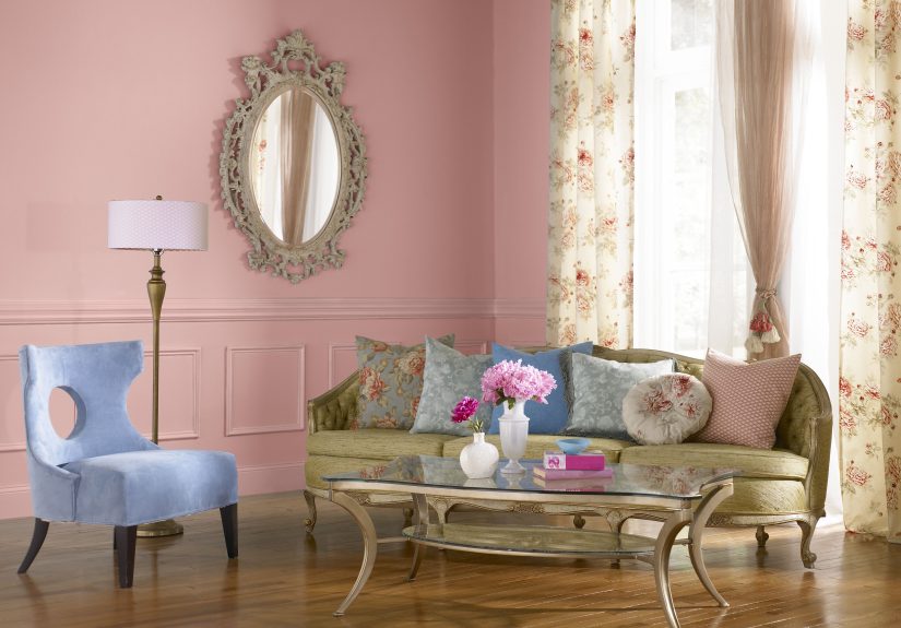
For those ready to embrace pink with open arms and excellent posture, Tea Room by Behr is a charming option. It is a welcoming blush that creates a peaceful atmosphere, which makes it ideal for spaces meant to feel soft and intimate.
Use it in a bedroom, dressing room, nursery, or powder room. The key is to keep the rest of the palette sophisticated. Add creamy whites, soft grays, champagne metal finishes, and maybe one floral print that looks collected rather than cutesy. That way the room reads romantic and grown-up, not like it is auditioning to be a cupcake.
6. Fruit Shake for a More Playful Pink
Fruit Shake by Benjamin Moore pushes the pink story a bit further. It has warmer, orange-leaning undertones, which make it feel lively rather than powdery. If Tea Room is the quiet conversation by the window, Fruit Shake is the witty line delivered at exactly the right moment.
This color shines in small doses: an accent wall, a vanity nook, a paneled mudroom, or the inside of a bookcase. It is especially effective when balanced with marble, brass, dark wood, or deep green accessories. Done well, it feels whimsical and editorial. Done poorly, it can become bubblegum in a hurry. Respect the drama and keep the styling sharp.
7. Riverdale for a Dusty Garden Green
One of the easiest ways to bring the Bridgerton mood home without leaning too heavily into pastel territory is to use a softened green. Riverdale by Behr is a versatile medium green with a dusty gray edge, which gives it a lived-in, composed quality.
This is a beautiful choice for libraries, studies, entryways, and kitchens with classic cabinetry. It feels grounded and elegant, especially with black accents, unlacquered brass, or checkerboard floors. It also plays nicely with floral fabrics and botanical art, which helps bridge the gap between Regency fantasy and actual real-life decorating.
8. Renew Blue for a Modern Regency Twist
Renew Blue by Valspar is a green-influenced blue that feels calm, polished, and a little more contemporary than a traditional powder blue. If you want Bridgerton inspiration without making the room feel like a costume, this is one of the smartest shades on the board.
Try it in bathrooms, bedrooms, or home offices where you want a peaceful atmosphere with character. Pair it with natural linens, creamy whites, warm woods, and quiet gold accents. It has enough depth to feel current, but enough softness to stay in conversation with the Regency palette.
9. Rainwashed for Spa-Soft Blue-Green Walls
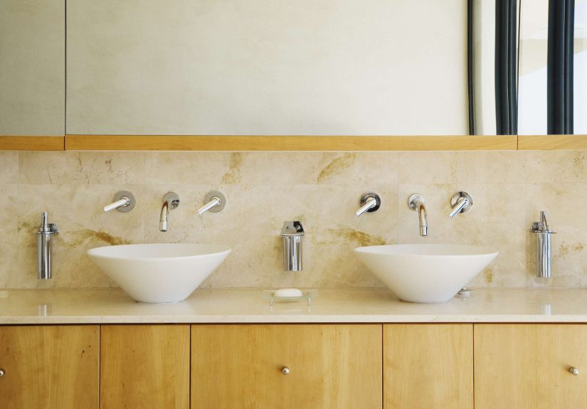
Every grand home needs at least one room that feels like a private exhale. Rainwashed by Sherwin-Williams is perfect for that purpose. This watery blue-green has a serene quality that works beautifully in bathrooms, laundry rooms, and smaller bedrooms where calm matters more than spectacle.
Unlike sharper mint or aqua shades, Rainwashed feels softened and mature. It pairs beautifully with white tile, pale stone, brushed brass, and gentle natural textures. If your dream is “Bridgerton, but make it less ballroom and more bath tray,” this is your color.
10. Elmira White for Quiet-Luxury Regency Style
Not every Bridgerton-inspired home needs obvious color. Sometimes the most elegant choice is a graceful neutral that lets the architecture and furnishings do the flirting. Elmira White by Benjamin Moore is a light greige with an easy, effortless elegance that feels especially useful in today’s homes.
Use it in open-concept spaces, stair halls, guest rooms, or anywhere you want a soft, polished backdrop. It works beautifully with plaster finishes, antique-style rugs, carved wood furniture, and subtle gold accents. Think of it as the wall color equivalent of excellent tailoring: never loud, always impressive.
11. Purple Earth for a More Dramatic Featherington Moment
No Bridgerton-inspired palette would be complete without at least one shade for readers who secretly prefer the dramatic side of the ton. Purple Earth by Valspar offers that moodier, richer energy. It has purple character, but with earthy depth, which keeps it from feeling cartoonish.
This color is ideal for a dining room, library, bar nook, or a deeply theatrical powder room. Use it with restraint and confidence. Add warm woods, gilded frames, velvet upholstery, and low lighting. Suddenly the room looks less “painted purple” and more “someone here definitely has a backstory.”
How to Use These Colors Room by Room
Bedroom
The best choices for a Bridgerton-style bedroom are Ewing Blue, Graceful, Tea Room, or Renew Blue. These shades create softness without putting the room to sleep completely. Keep the bedding layered and the trim crisp. Add one antique-inspired piece, like a pleated lamp or a curved wood bench, to make the room feel dressed rather than decorated.
Living Room
For a living room, Malted Milk, Elmira White, or Riverdale make the most sense. They are flexible enough for everyday life while still giving the room a polished, collected atmosphere. If the space has tall ceilings or formal millwork, White Raisin can also be wonderful, especially when paired with deep wood tones and soft upholstery.
Dining Room
Dining rooms can handle more personality, so White Raisin, Ewing Blue, or Purple Earth are all strong contenders. The right choice depends on the mood you want. White Raisin feels elegant and candlelit. Ewing Blue feels graceful and classic. Purple Earth feels bold, decadent, and slightly dangerous in the best possible way.
Bathroom or Powder Room
Bathrooms are a perfect place to try Rainwashed, Renew Blue, or Tea Room. These colors feel romantic in smaller spaces and work beautifully with tile, stone, and brass fixtures. Because bathrooms are compact, the paint often feels richer and more intentional, which is exactly what you want in a tiny room that should still have a point of view.
How to Keep the Look Elegant, Not Overdone
The simplest way to avoid turning your home into a stage set is restraint. Pick one or two Bridgerton-inspired colors per room, then support them with classic materials: linen, wood, stone, glass, and metal. Avoid pairing every pastel with every floral with every ruffle all at once. That road leads not to elegance, but to decorative confusion.
It also helps to mix periods. A Regency-inspired wall color can look amazing beside a modern sofa or clean-lined light fixture. In fact, that contrast often makes the room feel fresher. The goal is not strict historical accuracy. The goal is emotional accuracy: romance, softness, charm, and just enough grandeur to make ordinary life feel a bit more ceremonious.
Living With Bridgerton-Inspired Paint Colors: The Real Experience
Here is the part people do not always say out loud: choosing a Bridgerton-inspired paint color changes more than the wall. It changes the mood of the room, the way you notice light, and even the pace at which the space seems to move. A pale blue bedroom feels quieter in the morning than a plain white one. A blush powder room feels more considered, more dressed, almost as though the room itself decided to make an effort. A soft yellow hallway can take a forgettable pass-through space and make it feel welcoming before anyone even hangs up a coat.
That is the real charm of this palette. It is not merely “pretty.” It is atmospheric. Ewing Blue catches daylight in a way that can make a room feel gentler and more expensive. Tea Room, especially in the evening, gains warmth and softness that flatter both skin tones and lamp light. Riverdale changes beautifully throughout the day, sometimes reading green, sometimes gray, sometimes like the color of a garden viewed through a drawing room window. These are the kinds of shades that reward attention, which makes living with them feel more pleasurable over time.
There is also something deeply satisfying about using color to create ritual in everyday life. A breakfast room painted Graceful can make weekday coffee feel less like survival and more like a civilized event. A dining room wrapped in White Raisin can make takeout seem oddly elegant. Even a tiny bathroom painted Rainwashed can feel like a retreat instead of a utility space. No, the room will not suddenly produce violin covers of pop songs. But it may encourage you to light a candle, straighten the towels, and pretend you have always been this put-together.
Another experience worth mentioning is how adaptable these colors are. People often assume romantic palettes are difficult to style, but Bridgerton-inspired shades are surprisingly cooperative. They work with antiques, yes, but they also work with contemporary pieces, thrifted finds, and practical basics. A greige like Elmira White can unify old and new furniture with almost alarming efficiency. A color like Malted Milk can soften modern architecture and make a newer home feel more layered. Renew Blue can bridge classic and current better than many trendier hues because it feels both fresh and familiar.
Most importantly, these colors create memory. That may sound lofty for a gallon of paint, but it is true. People remember rooms with a point of view. They remember the lovely blue guest room, the charming pink powder room, the green kitchen that somehow felt calm and cheerful at the same time. Good color gives a room identity, and identity is what turns square footage into atmosphere. That is why the best Bridgerton-inspired paint colors work so well: they are decorative, yes, but they are also emotional. They make a home feel intentional, expressive, and a little more romantic than it did before.
And really, in a world full of safe beige decisions and suspicious gray flips, that feels like a worthwhile act of rebellion.
Conclusion
The best Bridgerton-inspired paint colors are not about copying a television set wall for wall. They are about borrowing the show’s most successful visual ideas: powdery blues, candlelit creams, graceful blushes, dusty greens, and the occasional dramatic jewel tone. Whether you want a bedroom that feels dreamy, a dining room with grandeur, or a bathroom with a romantic point of view, this palette offers plenty of beautiful options that still feel livable in a modern home.
If you want the easiest entry point, start with Ewing Blue, White Raisin, Tea Room, or Riverdale. If you prefer a quieter take, choose Elmira White or Malted Milk. And if your decorating style leans toward deliciously dramatic, Purple Earth is waiting patiently with excellent posture and a raised eyebrow.