Table of Contents >> Show >> Hide
- What “Oversized” Really Means (So You Don’t Make a Toothpick Sign)
- Materials & Tools
- Step-by-Step: Build Your Oversized Welcome Sign
- Step 1: Choose your board and prep it like a pro
- Step 2: Paint your base color (and don’t skip the edges)
- Step 3: Plan your layout (this is where your sign starts looking expensive)
- Step 4: Transfer letters with no stencil (choose your favorite “cheat code”)
- Method A: The “printer tile + ballpoint” transfer (my favorite)
- Method B: Chalk transfer (fast and forgiving)
- Method C: Graphite/transfer paper (clean lines, minimal mess)
- Method D: Projector method (big sign energy)
- Step 5: Paint the letters (without wobble, panic, or existential dread)
- Step 6: Add charm (without turning it into a craft store explosion)
- Step 7: Seal it for outdoor life
- Step 8: Display it safely
- Style Ideas That Don’t Require a Whole New Sign
- Troubleshooting: Fix the Common “Oops” Moments
- Maintenance (Because Outdoor Décor Lives a Hard Life)
- Conclusion
- of Real-Life Experience (a.k.a. Lessons Learned the Hard Way)
You know that moment when someone walks up to your door and you can feel them judging your life choices?
(Is that just me?) An oversized “Welcome” front door sign fixes at least 37% of that anxietyby greeting guests
before they can notice the mystery smudge on your storm door.
The best part: you don’t need a stencil, a cutting machine, or a degree in “Handwriting That Doesn’t Look Like a
Doctor’s Prescription.” This tutorial shows you how to build a big, bold front door/porch welcome sign using easy
transfer tricks, simple lettering techniques, and a finish that can handle real-life weather.
What “Oversized” Really Means (So You Don’t Make a Toothpick Sign)
“Oversized” is not a vibeit’s math (but the friendly kind). For a front door sign that actually reads from the
sidewalk, these proportions work well:
- Height: 48–72 inches (4–6 feet) depending on your porch space
- Width: 9–12 inches for a classic vertical porch sign look
- Thickness: 3/4 inch is sturdy without feeling like you’re carrying a small canoe
If you’re leaning the sign beside the door (most common), aim for about 2/3 the height of your door. If you’re
hanging it on the door, keep it narrower and lighterbecause nobody wants a welcome sign that also doubles
as a door workout.
Materials & Tools
Beginner-friendly shopping list
- Board: 1×10 or 1×12 pine board (or exterior-grade/MDO-style panel if you want extra durability)
- Sandpaper: 120 grit + 220 grit
- Primer: bonding primer (especially if knots are visible)
- Paint: exterior-grade paint (latex/acrylic works well for most porch signs)
- Lettering: acrylic craft paint + small angled brush, or paint pens for crisp edges
- Transfer method supplies: printer paper, painter’s tape, pencil/pen, chalk or graphite paper (optional)
- Topcoat: spar urethane/varnish for outdoor protection
- Extras: wood filler, tack cloth, ruler/tape measure, level
Optional upgrades (a.k.a. “I like nice things”)
- Trim pieces: 1×2 strips to frame the sign for a finished look
- Hanging hardware: D-rings + picture wire, or a door hanger hook
- Decor accents: faux greenery, ribbon bow, seasonal mini-tag
Step-by-Step: Build Your Oversized Welcome Sign
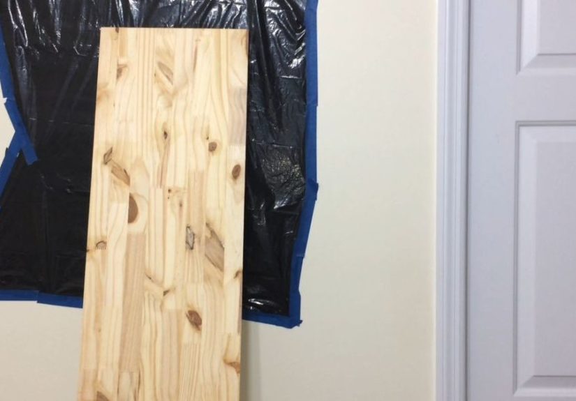
Step 1: Choose your board and prep it like a pro
If you’re using pine, inspect for knots. Knots are charming until they bleed through your paint like a ghost that
specifically haunts DIY projects. Sand the board (120 grit first, then 220 grit), wipe off dust, and fill cracks or
dents with wood filler. Let it dry, then sand smooth.
Prime the board, especially if you’re painting a light color. Primer improves adhesion and helps block tannin
bleedparticularly important for knotty wood. Once dry, lightly sand again with 220 grit for a smoother finish.
Step 2: Paint your base color (and don’t skip the edges)
Apply 1–2 coats of your base color. A small foam roller gives a smooth look fast; a brush is fine toojust keep
strokes consistent and avoid overworking the paint. Paint the edges and the back if the sign might be exposed to
humidity or rain. Sealing all sides helps reduce warping and gives you a longer-lasting sign.
Let the base coat cure fully before lettering. “Dry to the touch” is not the same as “ready for me to aggressively
tape paper onto it.”
Step 3: Plan your layout (this is where your sign starts looking expensive)
Oversized signs look best when the layout is intentional. Here are three quick rules that work almost every time:
- Give letters room to breathe: leave 2–3 inches margin at top and bottom
- Keep a consistent baseline: even “hand-lettered” should feel aligned
- Pick readable fonts: one bold script + one simple block font is a classic combo
Want a foolproof layout? Try: WELCOME (big), then a smaller line like to our home or your
family name. Or keep it clean with just “WELCOME” and let a bow/greenery do the talking.
Step 4: Transfer letters with no stencil (choose your favorite “cheat code”)
A stencil-free sign is really just a sign where you transfer the design in a different way. Pick one method below:
Method A: The “printer tile + ballpoint” transfer (my favorite)
- Type your wording in a font you like and size it large.
- If it doesn’t fit on one page, “tile” print it (your printer settings can split it across multiple pages).
- Trim and tape pages together, then tape the paper to the board in position.
- Trace the letters firmly with a ballpoint pen. You’re creating pressure lines that help guide your paint.
When you remove the paper, you’ll have a faint guide (or slight indentation) to followno stencil required.
Method B: Chalk transfer (fast and forgiving)
- Flip your printed design over.
- Rub chalk over the back of the letters (white chalk works best on dark boards).
- Tape it down and trace the letters from the front.
- Remove paper and you’ll see chalk outlines to paint over.
Bonus: mistakes wipe off easily. Downside: chalk can smudge, so paint soon after transferring.
Method C: Graphite/transfer paper (clean lines, minimal mess)
Place graphite paper between your printed design and the board, tape everything down, and trace your letters. This
is great when you want crisp outlines without chalk dust.
Method D: Projector method (big sign energy)
If you have a small projector, project your design onto the board, adjust size/position, and trace with pencil.
This works especially well for super-large signs, curved script, or detailed flourishes.
Step 5: Paint the letters (without wobble, panic, or existential dread)
For bold block letters, use a small angled brush and acrylic paint. For script or fine outlines, paint pens can
give you a clean edge with less fuss. Either way:
- Use light coats: two thin coats beat one gloopy coat every time
- Anchor your hand: rest your pinky or the side of your hand on the board for stability
- Turn the board: rotate the sign so you’re pulling strokes in a comfortable direction
Want your sign to look extra polished? Add a subtle shadow (a lighter gray behind black letters) or outline the
letters with a fine paint pen. It’s like eyeliner for your signdramatic, but in a good way.
Step 6: Add charm (without turning it into a craft store explosion)
A simple bow and greenery at the top is a classic. Keep it proportional: oversized sign, medium bowunless you’re
going for “my sign is wearing formalwear.”
Seasonal hack: attach a small removable mini-plaque (Velcro dots work) that can say “Fall,” “Joy,” “Hello Spring,”
or whatever mood your porch is in this week.
Step 7: Seal it for outdoor life
If your sign might see humidity, sun, or the occasional sideways rain, topcoat matters. Many standard polyurethanes
are meant for interior use, while spar urethane/varnish is formulated to handle outdoor exposure and wood movement.
Apply multiple thin coats, let each coat dry fully, and lightly sand between coats for adhesion and smoothness.
Pro tip: don’t rush this step. The sealant is what makes your sign look “boutique” instead of “I made this yesterday
and now it’s bubbling like soup.”
Step 8: Display it safely
- Leaning porch sign: add rubber feet or felt pads on the bottom corners
- Hanging on the door: use a sturdy door hanger hook (avoid nails in the door)
- Renter-friendly option: lightweight board + removable hanging strips (check weight ratings)
Style Ideas That Don’t Require a Whole New Sign
Modern minimal
White background, black sans-serif “WELCOME,” small line art (like a thin wreath outline).
Farmhouse classic
Stained wood look with white letters, plus greenery and a chunky ribbon bow.
Color pop
Deep navy or charcoal base, warm white lettering, and a bright accent color in the bow.
House-number combo
Make your sign do double duty: “WELCOME” + house number at the bottom. It’s décor and helpfullike a
fashionable GPS.
Troubleshooting: Fix the Common “Oops” Moments
My paint bled under the edges
This usually happens when the base coat wasn’t cured or the brush was overloaded. Let it dry, then touch up with
the base color using a small detail brush. If you’re using paint pens, go slow and keep strokes light.
My letters are uneven
Add a thin outline to “tighten” edges, or turn small wobbles into intentional hand-lettered character. Perfection is
overrated; charm is undefeated.
The board warped
Warping often comes from uneven moisture exposure. Seal all sides next time, store the board flat while drying, and
avoid leaving it in a damp garage like it’s marinating.
The topcoat looks cloudy or bubbly
Cloudiness can come from humidity or applying too thick. Bubbles often come from over-brushing or using a roller on
certain finishes. Lightly sand once fully dry and recoat with thin, even layers.
Maintenance (Because Outdoor Décor Lives a Hard Life)
Give your sign a quick wipe every few weeks, especially after pollen season or storms. Once or twice a year, inspect
for chips or rough spots. A light scuff sand and a fresh topcoat can extend the life of your sign dramatically.
Conclusion
An oversized welcome front door sign is one of those high-impact porch upgrades that looks custom, feels personal,
and costs way less than buying boutique décor. With stencil-free transfer methods, simple lettering tools, and a
durable outdoor finish, you can make a sign that stays crisp through the seasonswithout needing fancy equipment or
a calligraphy fairy godmother.
of Real-Life Experience (a.k.a. Lessons Learned the Hard Way)
The first oversized “WELCOME” sign I ever made (hypothetically… definitely not autobiographical…) taught me an
important truth: big signs amplify everythingyour good design choices and your questionable ones. On a small sign,
a slightly crooked “E” is a quirky detail. On a six-foot porch sign, that same “E” becomes a landmark. Like, “turn
left at the wobbly letter” energy.
The biggest game-changer was learning to treat layout like a real step, not an afterthought. Once I started taping
the design up, walking ten feet away, and checking spacing with fresh eyes, the sign instantly looked more
professional. If you only do one “extra” thing, do that. Your future selfstanding outside with a brush and
confidencewill be grateful.
Next lesson: the board matters more than you think. A cheap, twisty board will fight you from start to finish. It
won’t sit flat, it won’t paint evenly, and it’ll warp at the exact moment you’re feeling proud. Picking a straighter
board (and sealing the edges and back) makes the whole process calmer. There’s a special peace that comes from a
sign that doesn’t look like it’s slowly melting into your porch floor.
For stencil-free lettering, chalk transfer is the easiest “I just want it done” approach, but it can smudge if you
’re heavy-handed. Graphite paper is cleaner, but you have to be careful not to press so hard that you dent the wood.
The surprise winner for me was the tiled print + ballpoint trace: it’s cheap, it’s precise, and it gives you a
faint groove or guide that feels like training wheels for your brush. It’s the closest thing to having a stencil
without actually having a stencil.
Paint pens deserve their own shout-out. If your handwriting confidence is fragile (hello, it’s me), paint pens help
you control edges and keep line thickness consistent. They also make touch-ups easy, which is crucial because you
will touch up. Everyone touches up. Even people who pretend they don’t touch up.
Finally: topcoat patience is not optional. The urge to rush is strongespecially when the sign looks finished and
you just want to style it next to a cute doormat and take photos. But outdoor protection is what keeps your sign
from fading, peeling, or getting that weird “sticky forever” feeling. Thin coats, proper dry time, light sanding
between coatsthis is the boring part that makes the pretty part last.
And once it’s up? The sign does something surprisingly nice: it makes your entry feel intentional. It’s a small
signal that says, “Hi, humans. You’re welcome here.” Even if inside, you’re still trying to remember whether you
have snacks and if the porch light works. The sign has your back.