Table of Contents >> Show >> Hide
- Quick Color ID Card
- What Province Blue Actually Looks Like (Not What Your Screen Promises)
- Coordinating Colors That Play Nicely With Province Blue
- Easy Palettes You Can Copy-Paste Into Real Rooms
- Where Province Blue Shines (And Where It Might Pick a Fight)
- Finish Matters More Than People Admit
- How to Sample Province Blue Without Regrets
- Common “Province Blue Problems” (And Easy Fixes)
- Real-Room Examples You Can Visualize
- Experiences With Province Blue 2135-40 (An Extra of Real-Life Vibes)
- SEO Tags
Province Blue 2135-40 is the paint color equivalent of that friend who can dress up for a wedding
or show up in jeans and still look put-together. It’s a medium blue-green with a soft, gray “filter”
that keeps it from feeling loudmore coastal calm than pool noodle neon.
One important reality check before we fall in love: screens lie. Your phone, your laptop, your
cousin’s “calibrated” monitor… all of them. Province Blue is famous for shifting with lighting, sheen,
and what’s around it, so sampling is not optional unless you enjoy surprises of the “why does my wall
look greener at night?” variety.
Quick Color ID Card
| Color name / number | Province Blue 2135-40 |
|---|---|
| Family vibe | Blue-green (teal-leaning) softened with gray |
| Light Reflectance Value (LRV) | 31.57 (mid-depth; noticeably colored but not cave-dark) |
| Collection | Color Preview (a large, hue-and-value–organized collection) |
| Best “first try” placement | Accent wall, bedroom, office, powder room, built-ins, or a statement front door |
What Province Blue Actually Looks Like (Not What Your Screen Promises)
Undertones: the secret sauce
Province Blue lives in that sweet spot where blue and green overlap, then gets “matured” by gray.
In practical terms, it can read as:
- More blue in cooler daylight or when paired with crisp whites and cool grays.
- More green under warm bulbs, near natural woods, or next to beige/cream.
- More gray when the room is dim or when surrounding finishes are also muted.
That gray influence is why Province Blue feels sophisticated instead of tropical. It’s teal’s
calmer, better-rested sibling.
Lighting: where the plot twists happen
Because the LRV is around 31.6, Province Blue doesn’t bounce a lot of light back into the room.
In bright spaces, it looks crisp and tailored. In low-light rooms, it can deepen into a moodier,
smokier blue-green.
Room direction matters, too. North-facing rooms often feel cooler and can pull out cool undertones.
South-facing rooms tend to warm colors up. East and west exposures can create dramatic morning/evening
shifts. Translation: Province Blue can be one color at 9 a.m. and a different personality by dinner.
Coordinating Colors That Play Nicely With Province Blue
If you want “professionally coordinated” without reinventing the color wheel, start with these
classic companions:
Crisp whites and soft whites
- Super White OC-152: sharp, clean contrast for modern trim and ceilings.
- White Drifts OC-138: softer, slightly warmer balance for a less stark look.
Light blue partners that keep it airy
- Ice Mist 2123-70: very light, breezy liftgreat for adjacent rooms or ceilings.
- Iceberg 2122-50: a pale, cool companion that keeps the palette calm and cohesive.
Similar colors if Province Blue is “close…but not quite”
If you like the general direction but want a nudge, consider:
Jamestown Blue HC-148, Water’s Edge 1635, Franklin Lakes 1643,
or Amsterdam AF-550. These sit in a similar neighborhood but can read slightly different
in depth or undertone.
Easy Palettes You Can Copy-Paste Into Real Rooms
Palette 1: Modern coastal (not “nautical theme party”)
- Walls: Province Blue 2135-40 (accent wall or full room if there’s good light)
- Trim/Ceiling: Super White OC-152
- Materials: white oak, rattan, linen, brushed brass
- Bonus color: a sandy beige rug or warm off-white upholstery to keep it inviting
Palette 2: Soft Scandinavian
- Walls: Province Blue (one or two walls)
- Adjacent spaces: Iceberg 2122-50
- Trim: White Drifts OC-138
- Look: pale woods, black accents, simple shapes, cozy textiles
Palette 3: Moody library (but still friendly)
- Built-ins / cabinets: Province Blue in a durable finish
- Walls: warm greige or creamy neutral
- Metals: antique brass, oil-rubbed bronze
- Textiles: cognac leather, wool, deep cream
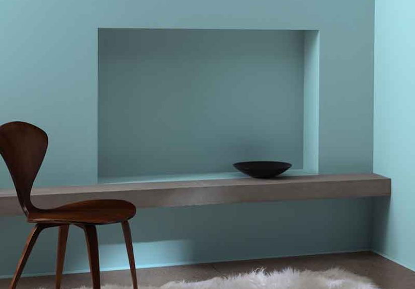
Where Province Blue Shines (And Where It Might Pick a Fight)
Bedrooms
Blue family colors are often chosen for bedrooms because they feel calm and grounded. Province Blue
adds a little sophistication with its gray softness. In a bright bedroom, it reads fresh; in a dimmer
bedroom, it turns cozy and cocoon-like.
Home offices
Province Blue is focused without being sterile. Pair it with warm wood desks and clean white trim
and you get “quiet competence”the color version of answering emails without sighing.
Kitchens and cabinetry
On cabinets, this shade can feel custom and high-end, especially with brass hardware and a warm
backsplash. The big decision here is sheen: cabinets typically want something more washable and
durable than a flat wall finish, and higher sheen will also make the color look slightly richer
and more dimensional.
Bathrooms and powder rooms
Province Blue can read spa-like when paired with white tile and simple fixtures. In a powder room,
it’s dramatic in a good waylike a little jewel box that doesn’t take itself too seriously.
Exteriors and front doors
The blue-green-gray balance makes Province Blue a strong candidate for a statement door, shutters,
or even sidingespecially if your exterior has stone, warm brick, or neutral trim. Sunlight can push
it bluer and clearer; shade can deepen it.
Finish Matters More Than People Admit
Paint sheen isn’t just about shineit changes how you perceive color. More sheen reflects more light,
which can make Province Blue look brighter, cleaner, and slightly more “blue.” Flatter finishes absorb
light and can make the same color feel deeper and more velvety.
Practical finish picks (no drama, just results)
- Walls: Matte or eggshell for most rooms; eggshell is a popular “easy to live with” choice.
- High-traffic walls: Eggshell or satin (more cleanable, slightly more reflection).
- Trim/doors: Semi-gloss or a “soft gloss” style finish if you like definition.
- Cabinets/built-ins: Satin to semi-gloss depending on the look you want and your tolerance for shine.
How to Sample Province Blue Without Regrets
If Province Blue had a motto, it would be: “I look different depending on the time of day.” So sample
like you mean it.
A simple sampling routine that works
- Go big enough. A tiny dab is useless. You need a generous area so your eye reads it as a wall color.
- Do two coats. One coat can look thin and misleading (and can let the old wall color interfere).
- Move it around. If you can, paint a foam board so you can test multiple walls and angles.
- Check morning and night. Natural light vs. artificial light can change the read dramatically.
- Compare with trim. Hold your chosen white next to ittrim color can swing it bluer or greener.
Province Blue is also available in peel-and-stick sample formats through partners that use real paint,
which is great if you’d rather not keep a “test patch museum” on your walls.
Common “Province Blue Problems” (And Easy Fixes)
“It looks too green.”
- Try a crisper, cooler white trim (it can pull the color back toward blue).
- Swap very warm bulbs for a more neutral light temperature.
- Reduce nearby yellow-beige elements (rugs, creams, golden woods) if they’re pushing green.
“It looks too gray and flat.”
- Increase lighting (layers: overhead + lamp + task lighting).
- Choose a slightly higher sheen for more life and reflection.
- Add contrast: bright white trim, darker accents, or warmer textures to keep it from going “dusty.”
“It’s darker than I expected.”
- Use it as an accent wall and keep the other walls lighter.
- Pair it with pale companions like Ice Mist or Iceberg in adjacent spaces.
- Consider lighter related shades in the same family if you want the vibe with less depth.
Real-Room Examples You Can Visualize
Example 1: A bright, south-facing living room
You’ve got warm, consistent light and medium-tone wood floors. Province Blue on a single fireplace wall
anchors the room without swallowing it. Use Super White trim for clean edges, then bring in a natural
linen sofa and a woven rug to keep everything relaxed instead of “formal showroom.”
Example 2: A north-facing office that feels chilly
North light can intensify coolness. If you still want Province Blue, balance it with a warmer white
(like a softer off-white trim), warm wood shelving, and cozy textures. Add a table lamp with a shade
that warms the light slightly. The goal is “calm” not “Antarctica chic.”
Example 3: Kitchen cabinets with brass hardware
Province Blue on lower cabinets looks tailored and timeless, especially with brass pulls and a warm
white backsplash. Keep upper walls light (Iceberg or a clean white) so the space doesn’t feel heavy.
Choose a cabinet-appropriate durable finishthis is not the place for the most delicate, ultra-flat look.
Experiences With Province Blue 2135-40 (An Extra of Real-Life Vibes)
My favorite thing about Province Blue is also the thing that makes people swear it’s “changing on purpose.”
The first time you sample it, you’ll probably have a moment where you walk past the test area and think,
“Oh, that’s perfect.” Then you’ll come back later and think, “Wait… was it always that color?”
Congratulationsyou’ve met a chameleon with excellent manners.
In morning light, Province Blue tends to feel crisp and airy, like the color of a calm inlet before the
boats wake up. It can read more blue, especially if your trim is a bright white and the room has cooler
daylight. This is when it feels clean and modernlike it belongs in a Scandinavian living room with a
structured sofa and a throw blanket that costs more than your first car. (Not judging. We all have hobbies.)
Late afternoon is where it starts to show its personality. If you’ve got warmer sun or western exposure,
the green note can come forward. This is not a bad thingit’s what gives Province Blue that subtle coastal
energy without yelling “BEACH HOUSE!” It pairs beautifully with honey oak, walnut, and even slightly
amber-toned hardwoods because the gray keeps it from getting too tropical. Add brass hardware or warm
metals and suddenly the whole space looks intentionallike you hired a designer instead of panic-ordering
paint at 8:47 p.m.
Under warm artificial light at night, Province Blue can deepen and look moodier. In a bedroom, that’s a win:
the color turns into a soft cocoon, especially in matte or eggshell finishes that don’t bounce light around.
In a hallway or smaller office, though, it can feel heavier unless you’ve got enough lamps. This is where
people decide whether they love “cozy and enveloping” or whether they’d prefer “light and airy and also
please don’t remind me winter exists.”
The most useful real-world trick I’ve seen (and used) is testing Province Blue on a movable board, then
walking it around the room like you’re giving it a house tour. Put it on the wall that gets the most light.
Put it in the shadowy corner. Hold it next to your flooring. Thenthis part mattershold your chosen trim
white next to it. Province Blue can look cleaner and bluer with a crisp white, or softer and slightly
greener with a warm off-white. The trim is basically the color’s hype person.
Finally, once it’s up on the wall for real, Province Blue has that rare quality of feeling “designed” without
feeling trendy. It looks great with modern shapes, but it also behaves in traditional homes. It doesn’t
demand a total room makeoverthough it may quietly convince you that your throw pillows could use an upgrade.
Paint does that. It starts with one wall and ends with you reorganizing your entire life at the hardware store.