Table of Contents >> Show >> Hide
- What Is Rockport Gray (HC-105)?
- Undertones: Why Rockport Gray Looks Expensive (and Occasionally Sneaky)
- How Lighting Changes Rockport Gray (Room-by-Room Truth)
- Where Rockport Gray Looks Best
- Best Trim and White Paint Pairings for Rockport Gray
- Coordinating Colors That Make Rockport Gray Sing
- Rockport Gray With Popular Materials and Finishes
- How to Sample Rockport Gray Like a Pro (So You Don’t Become a “Repaint Weekend” Person)
- Common Mistakes to Avoid With Rockport Gray
- 4 Easy “Room Recipes” Using Rockport Gray
- Is Rockport Gray the “Best Gray Paint Color” for You?
- Real-Life Experiences: Living with Rockport Gray (Extra )
Choosing a gray paint color sounds easyuntil you realize “gray” is basically a mood ring with a gallon handle.
One minute it’s calm and sophisticated; the next it’s greenish, purplish, or oddly… dentist-office-ish.
If you want a gray that feels grounded, classic, and surprisingly flexible, Benjamin Moore Rockport Gray (HC-105)
deserves a spot on your shortlist (and maybe on your walls).
Rockport Gray is often described as a “rich medium gray,” but in real homes it reads more like a
warm gray/greige with personalitydeep enough to add contrast and depth, yet soft enough to live with every day.
Think: tailored blazer, not concrete bunker.
What Is Rockport Gray (HC-105)?
Rockport Gray (HC-105) is part of Benjamin Moore’s Historical Collection, which is known for timeless,
architecture-friendly colors. In plain English: it’s built to look good in more than one decade.
Rockport Gray’s key specs (a.k.a. the “will this be too dark?” reality check)
- Color family: Medium-depth neutral (warm gray/greige leaning)
- LRV (Light Reflectance Value): ~36.6 (medium depth; not a “barely-there” gray)
- Overall vibe: Cozy, grounded, classicgreat when you want contrast without drama
That LRV number matters because it tells you Rockport Gray won’t behave like a pale gray that disappears in daylight.
It has enough pigment to hold its ownon cabinets, exterior siding, a statement wall, or a whole room if you have decent light.
Undertones: Why Rockport Gray Looks Expensive (and Occasionally Sneaky)
The reason Rockport Gray wins hearts is also why you should sample it: undertones.
Rockport Gray generally reads as a warm gray with a soft greige base, but depending on your surroundings, you can notice:
- A subtle violet/inky cast that adds depth (especially in cooler light or shadowy areas)
- A muted green hint that can show up near greenery, certain stones, or warm-white lighting
- A taupe warmth that plays nicely with wood tones and warmer finishes
Translation: Rockport Gray doesn’t sit flat. It has dimension, which is why it often looks “designer” even in a simple room.
But it also means your lighting, floors, and countertops get a vote.
How Lighting Changes Rockport Gray (Room-by-Room Truth)
North-facing rooms
North light is cooler and more consistent, so Rockport Gray can look slightly more neutral-to-cool.
This is where you might notice that whisper of violet or a truer “gray” read.
South-facing rooms
South light is warmer and brighter, so Rockport Gray tends to look cozier and more greige.
The warmth becomes more obvious, and the color can feel inviting rather than moody.
East- and west-facing rooms
Expect a daily personality shift: brighter and warmer earlier in east-facing spaces, and warmer/glowier later in west-facing ones.
If you love a color that changes with the day, this is a feature. If you want a color that never changes, you may prefer a flatter neutral.
Artificial lighting
Warm bulbs (especially very warm LEDs) can pull Rockport Gray toward taupe/greige.
Cooler bulbs can emphasize the gray and that slightly inky depth.
This is why sampling under your real bulbs (not just daylight) is non-negotiable.
Where Rockport Gray Looks Best
Rockport Gray shines when you want a neutral with enough depth to feel intentional. Here are the places it tends to look its best:
1) Cabinets and vanities
Rockport Gray is a sweet spot for cabinetry: deeper than “safe gray,” but not so dark that you’ll constantly be wiping fingerprints
like a museum curator. It pairs beautifully with:
- White quartz or marble-look counters
- Warm woods (oak, walnut)
- Brushed nickel, antique brass, or matte black hardware
2) A statement wall or built-ins
Want an accent wall that doesn’t scream “I saw this on social media at 2 a.m.”? Rockport Gray adds contrast and structure.
It’s great behind:
- A fireplace surround
- Bookshelves or a media wall
- Board-and-batten or wainscoting
3) Exteriors (siding, shutters, doors)
Rockport Gray is often used outside because it reads classic and architecturalespecially on traditional homes.
On exteriors, the color can appear lighter in full sun, which is another reason the medium depth works so well.
4) Bedrooms and offices that want “calm, not cold”
If you’re tired of icy grays that feel sterile, Rockport Gray’s warmth makes a bedroom or office feel grounded.
Pair it with soft textiles, warm whites, and natural materials for an elevated, relaxed look.
Best Trim and White Paint Pairings for Rockport Gray
Trim color can make Rockport Gray look crisp and tailoredor muddy and confused. The goal is to choose a white
that supports Rockport Gray’s warmth without turning everything beige.
Crisp and clean contrast
- Chantilly Lace (OC-65): Bright, clean, modern contrastgreat if you like sharp edges
- Super White (OC-152): Another crisp option for a fresh, high-contrast look
Soft, classic, and forgiving
- White Dove (OC-17): A favorite warm-ish white that keeps the palette cohesive
- Simply White (OC-117): Warm and friendly without looking creamy in most spaces
- Cloud White (OC-130): Soft warmthespecially nice in traditionally styled homes
Pro tip: If your home has lots of warm elements (honey oak floors, beige tile, warm stone), choose a softer white
like White Dove or Simply White. If your finishes are cooler (gray tile, black windows, modern metals), go crisper
with Chantilly Lace or Super White.
Coordinating Colors That Make Rockport Gray Sing
Rockport Gray plays well with both muted colors and bold accents. Here are coordinating directions that work reliably:
Warm neutrals for a seamless flow
- Sheraton Beige (HC-57): A classic warm neutral pairing that feels traditional and cozy
- Edgecomb Gray (HC-173): Lighter greige that keeps everything soft and connected
- Natural linen tones: Think oatmeal, flax, warm white textiles
Soft color accents (calm, coastal, and livable)
- Beach Glass (1564): A soft blue-green that feels spa-like next to Rockport Gray
- Kitty Gray (1589): A lighter gray that keeps the palette monochromatic but not boring
High-contrast drama (without regret)
- Hale Navy (HC-154): Deep navy for a classic, confident contrast
- Kendall Charcoal (HC-166): Dark gray for layered, tonal sophistication
- Jet Black (2120-10): Use sparingly on accents or doors for a tailored look
Want a shortcut? Build a palette with Rockport Gray + a warm white + one muted color (like Beach Glass) + one dark anchor
(like Hale Navy or Kendall Charcoal). That combo covers walls, trim, accents, and “what do I do with this weird nook?” moments.
Rockport Gray With Popular Materials and Finishes
One reason Rockport Gray is so versatile is that it bridges warm and cool materials. Here’s how it typically behaves:
Wood tones
Rockport Gray is especially friendly with medium-to-warm woods (oak, walnut). It can also work with darker stains,
where it reads sophisticated rather than muddy.
Stone and tile
With cooler gray tile, Rockport Gray feels warmer and more inviting (nice balance). With beige or pink-beige tile,
it can either calm the warmth orif the undertones fightmake things look slightly off. This is where sampling is your best friend.
Metals
Brushed nickel keeps it classic, matte black modernizes it, and antique brass warms it up beautifully.
If you want a safe, timeless choice, brushed nickel is hard to mess up.
How to Sample Rockport Gray Like a Pro (So You Don’t Become a “Repaint Weekend” Person)
Sampling is the difference between “wow, this is perfect” and “why does my wall look faintly like a storm cloud over spinach?”
Here’s a practical approach:
-
Use a real sample: Try a paint sample or a peel-and-stick sample so you see the color at a meaningful size.
Tiny chips are basically paint-color clickbait. - Move it around: Check it on multiple walls, including corners and near trim. Rockport Gray changes with light direction.
- Wrap corners and edges: This helps you see the color in both light and shadow at the same time.
- Check day and night: Look at it in the morning, afternoon, and under your evening lights.
- Compare it: Put it next to your trim white and your biggest fixed finish (flooring, countertop, tile).
If you’re using peel-and-stick samples, they’re designed to be movable and reusable, which makes it easier to test Rockport Gray
in multiple spots without turning your walls into a patchwork quilt.
Common Mistakes to Avoid With Rockport Gray
1) Assuming it’s a light gray
With an LRV in the mid-30s, Rockport Gray is medium depth. In a very dark room, it can feel heavier than expected.
If the space lacks windows, plan for brighter trim, layered lighting, and lighter textiles.
2) Ignoring undertones in fixed finishes
Countertops, stone fireplaces, and tile have undertones too. If your countertop leans pink-beige and your lighting is warm,
Rockport Gray might read more taupe. If your tile leans green-gray, Rockport Gray might echo that green hint.
Sample next to what you cannot change easily.
3) Picking the wrong trim white
A too-creamy trim can make the whole palette look yellowed. A too-cold bright white can make Rockport Gray look warmer by comparison.
Choose your contrast level intentionally (crisp vs soft).
4 Easy “Room Recipes” Using Rockport Gray
Recipe A: Classic Living Room
- Walls: Rockport Gray (eggshell)
- Trim: White Dove (satin)
- Accents: Black picture frames, warm wood coffee table, linen drapes
Recipe B: Modern Kitchen Cabinets
- Cabinets: Rockport Gray (satin or cabinet-grade enamel)
- Walls: Soft warm white
- Hardware: Matte black or antique brass
- Countertops: White quartz or a light stone look
Recipe C: Calm Bedroom
- Walls: Rockport Gray (matte for a velvety feel)
- Trim: Simply White (satin)
- Textiles: Warm whites, oatmeal, soft blues/greens
Recipe D: Timeless Exterior
- Siding: Rockport Gray
- Trim: Crisp white
- Front door: Hale Navy or a classic black for contrast
- Extras: Natural wood or warm metal house numbers for charm
Is Rockport Gray the “Best Gray Paint Color” for You?
“Best” depends on your home, but Rockport Gray is a top-tier choice if you want:
- A medium-depth neutral that isn’t flat or boring
- A gray that feels warm and livable, not icy
- A color that works across stylestraditional, transitional, coastal, modern farmhouse
- A paint color that pairs well with white trim, natural woods, and classic accents
If you want the palest possible gray, Rockport Gray may feel too deep. But if you want a gray with substanceone that can anchor a room,
elevate cabinetry, or give your exterior a classic edgeRockport Gray is a strong contender.
Real-Life Experiences: Living with Rockport Gray (Extra )
Rockport Gray is one of those colors people often describe with the same sentence structure:
“I didn’t realize I’d love it this much.” It’s not flashy on a paint chip, but once it’s on the wall, it tends to feel
intentionallike your home suddenly got its act together and started making responsible choices.
In day-to-day living, one of the most common “aha” moments happens when the light changes. In the morning, Rockport Gray can look cleaner
and more neutral, especially in cooler light. By afternoon, many homeowners notice a warmer, cozier readmore greige than grayparticularly
in sunnier rooms. At night, under warm bulbs, it can deepen and feel a little moodier, which is exactly why it’s so popular for bedrooms,
offices, and dining rooms where you want a soft, relaxing atmosphere instead of bright, high-energy walls.
Another real-world win: Rockport Gray tends to play nicely with “normal house stuff.” If you’ve got wood floors that aren’t perfectly on-trend
(hello, honey oak), Rockport Gray can help them look more classic and less “early 2000s throwback.” With stone countertops, it often acts like a
peacemaker, tying together warm and cool flecks without picking a fight. And with white trim, the contrast can be crisp enough to feel polished
but not so stark that the room looks like a black-and-white photo.
On cabinets and vanities, people often report a sweet-spot effect: Rockport Gray looks substantial and high-end, but it doesn’t go so dark that
every crumb, splash, or fingerprint becomes a headline. (No paint color is totally immune to the laws of kitchen physicsbut this one doesn’t
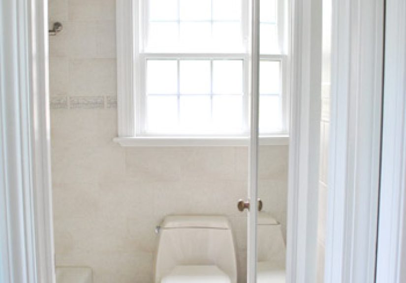
make you feel like you need a lint roller for your doors.) In bathrooms, Rockport Gray frequently feels spa-like when paired with soft whites
and muted blue-greens, and it can make dated tile look calmer and more coordinatedespecially when you choose a trim white that bridges the undertones.
For exteriors, the “experience” people talk about most is confidence. Rockport Gray reads classic from the curb and tends to photograph well,
which matters whether you’re listing a home, hosting friends, or just enjoying the quiet satisfaction of pulling into your driveway and thinking,
“Yep. Nailed it.” In direct sun, it can appear a touch lighter; in shade, it looks richer and more groundedso the house feels dimensional rather
than flat. Pair it with a clean white trim and a darker front door color, and you get that timeless, architectural look that works in a lot of neighborhoods.
The biggest practical takeaway from real homes is also the least exciting: sample it. Rockport Gray is flexible, but it’s not identical in every setting.
If your lighting runs very warm, you may see more taupe; if your room is cool and shaded, you may notice more of the deeper gray character.
Once you’ve seen it in your spacemorning, afternoon, eveningyou’ll know whether Rockport Gray feels like “best gray paint color” material for your home
or whether you need something lighter or more neutral. Either way, you’ll be making the decision with evidence… like a paint color scientist, but with better throw pillows.