Table of Contents >> Show >> Hide
- Before You Pick a “Happy Color,” Do These 4 Quick Reality Checks
- 14 Mood-Boosting Kitchen Paint Colors That Brighten Your Day
- 1) Fresh Forest Green (the “bring the outdoors in” boost)
- 2) Classic Navy (confident, cozy, and surprisingly cheerful)
- 3) Raspberry Red (bold, warm, and appetite-friendly)
- 4) Icy Sky Blue (refreshing like a “cold plunge,” minus the screaming)
- 5) Charcoal-Black (dramaticbut make it elevated)
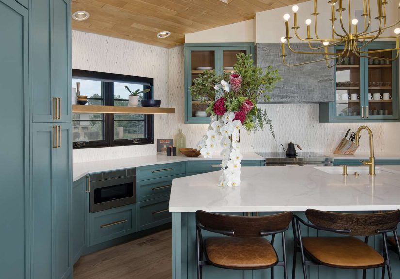
- 6) Deep Sage Green (calm + energized, the unicorn of moods)
- 7) Coral (sunny, upbeat, and surprisingly “grown-up”)
- 8) True Black (the “devil-may-care” statementdone smart)
- 9) Jewel Teal (playful, glamorous, and instantly “special”)
- 10) Deep “Blue-Red” (red, but with restraint)
- 11) Mustard Gold (retro warmth that makes everything feel sunnier)
- 12) Evergreen Island Green (a nature pop that still feels classic)
- 13) Midnight Blue (moody, polished, and weirdly uplifting)
- 14) Moody Ocean Blue-Green (rich, sophisticated, and calming)
- How to Make These Colors Feel Bright (Even When They’re Deep)
- Conclusion: The “Brighten Your Day” Kitchen Is One Paint Job Away
- Real-Life Experiences: What These Colors Feel Like After You Actually Live With Them (Extra )
The kitchen isn’t just where dinner happensit’s where mornings begin, where snack negotiations go down, and where you
suddenly remember you were supposed to be “meal prepping.” So if any room deserves a little extra joy, it’s this one.
And while new countertops are lovely (and also the price of a small spaceship), paint is the fastest way to change a
kitchen’s vibewithout refinancing your toaster.
Color has a very real impact on how a space feels. Warm hues can energize, cool hues can calm, and the right shade can
make your kitchen feel like a bright, welcoming hub instead of a fluorescent-lit “where happiness goes to defrost.”
The trick is choosing colors that lift your mood and play nicely with the stuff you can’t change overnightlike
cabinets, countertops, and that one mysterious tile you inherited from a previous decade.
Before You Pick a “Happy Color,” Do These 4 Quick Reality Checks
1) Start with your fixed finishes (a.k.a. the “face the fixtures” rule)
Kitchens are full of “permanent roommates”: cabinets, counters, floors, appliances, and backsplashes. Instead of choosing
paint in a vacuum, take a hard look at undertoneswarm wood, cool marble, creamy quartz, stainless steeland pick a color
that complements them. When the paint works with your fixed finishes, the whole room feels intentional (not like a paint
color wandered in and decided to stay).
2) Lighting changes everythingmorning, noon, and “why is it so gloomy at 4 PM?”
Natural light shifts all day, and artificial lighting can swing warm or cool. That means the same paint can look airy and
cheerful at breakfast and oddly muddy at dinner. Always test samples on multiple walls and check them in the lighting you
actually live withdaylight, evening lamps, and those bright task lights that reveal every crumb you’ve ever loved.
3) Use LRV to predict brightness (your secret cheat code)
LRVLight Reflective Valuetells you how much light a color reflects. Higher LRV = brighter feel; lower LRV = moodier and
more dramatic. If your kitchen is small or low-light, you’ll generally want mid-to-high LRV colors on larger surfaces
(walls, uppers) and reserve deep shades for islands, lowers, or accents so the room doesn’t feel like it’s absorbing joy.
4) Pick a finish that can handle real life
Kitchens get splatters, steam, fingerprints, and the occasional sauce explosion that feels personal. A washable finish
matters. Satin and semi-gloss tend to perform well for kitchen walls and trim because they’re durable and easier to wipe
downmeaning you can clean the wall without also removing the wall.
14 Mood-Boosting Kitchen Paint Colors That Brighten Your Day
Below are 14 designer-loved, mood-lifting color directionseach with practical tips for where to use it and what to pair it
with. Think of this as your “happy kitchen” menu, no reservation required.
1) Fresh Forest Green (the “bring the outdoors in” boost)
A crisp, mid-to-deep green makes a kitchen feel grounded and lively at the same timelike you live near a forest, even if
you actually live near a parking lot. It’s mood-boosting because it feels familiar and natural, and it plays beautifully
with wood tones.
Where it works best
Try it on lower cabinets, an island, or a single wall to add energy without overwhelming the space. Pair with bright
whites to keep it fresh.
Try these shades
Dunn-Edwards Pine Haven (a vibrant, sophisticated green). If you want a softer version, look for “sage-leaning”
greens that still read cheerful.
2) Classic Navy (confident, cozy, and surprisingly cheerful)
Navy feels tailored and comfortinglike the kitchen put on a blazer and now everyone’s behaving. It creates contrast that
makes light countertops, brass hardware, and white trim look even brighter, which can lift the whole room visually.
Where it works best
Great for walls in a mostly white kitchen, or for cabinetry if you have good lighting. If your kitchen is darker, keep navy
to lowers or the island and go lighter above.
Try these shades
Benjamin Moore Old Navy for a rich, saturated navy. For an even more dramatic accent, consider a deeper “midnight”
navy on an island.
3) Raspberry Red (bold, warm, and appetite-friendly)
Red is energetic and stimulatingperfect for kitchens that need a little spark. The key is choosing a red with depth (think
“berry” or “dessert”) rather than a bright stop-sign red that can feel harsh over time.
Where it works best
Try it as an island color, a pantry door, or even on banquette walls. Balance it with creamy whites, warm neutrals, or pale
stone to keep it inviting.
Try these shades
Benjamin Moore Raspberry Truffle for a rich, food-inspired red that reads warm and lively.
4) Icy Sky Blue (refreshing like a “cold plunge,” minus the screaming)
A bright, clean sky blue can feel energizing and crispespecially in kitchens with cooler finishes (stainless steel, gray
veining, white quartz). It’s the color equivalent of opening a window and letting your brain breathe.
Where it works best
Use it on walls, a breakfast nook, or cabinetry in a well-lit kitchen. If you’re cautious, start with a small section like a
pantry wall or open shelving backing.
Try these shades
Benjamin Moore Iceberg for that crisp, wake-me-up effect without turning cartoonish.
5) Charcoal-Black (dramaticbut make it elevated)
Dark tones can be mood-boosting because they feel confident and “designed.” Charcoal reads softer than pure black, and it
can make a kitchen feel like a high-end restaurant (the kind where you pretend you can taste “notes of oak” in sparkling
water).
Where it works best
Ideal for lower cabinets, built-ins, or a statement wall. Pair with warm metals (brass, aged bronze) and lighter uppers to
keep the room from feeling heavy.
Try these shades
Farrow & Ball Railings is a designer favorite for a deep, sophisticated near-black that still has character.
6) Deep Sage Green (calm + energized, the unicorn of moods)
Sage is one of the most popular kitchen color directions because it’s soothing, natural, and flexible. Deeper sage feels
richer and more timeless than sugary pastels, and it plays well with both warm and cool surfaces.
Where it works best
Lower cabinets, islands, or full cabinetry in a bright kitchen. It also looks beautiful against light walls, which helps
brighten the space overall.
Try these shades
Benjamin Moore Mohegan Sage for a rich, sultry sage that still feels livable.
7) Coral (sunny, upbeat, and surprisingly “grown-up”)
Coral sits between pink and orangewarm, lively, and flattering. It adds an upbeat energy that feels social and welcoming,
like your kitchen is always ready for friends, even if your fridge is currently just condiments and optimism.
Where it works best
Use coral on an accent wall, a pantry door, or even inside glass-front cabinets for a joyful pop. Pair with creamy whites
and natural wood to keep it chic.
Try these shades
Benjamin Moore Coral Gables for a bold coral that feels energetic without being neon.
8) True Black (the “devil-may-care” statementdone smart)
Black can feel energizing because it’s bold, graphic, and modern. The trick is choosing the right sheen and placement.
Glossy black can show fingerprints and scratches fast, so a softer finish often feels more realistic for a busy kitchen.
Where it works best
Best on an island, lower cabinets, or a built-in coffee bar, paired with bright walls and plenty of light-reflective
surfaces.
Try these shades
Sherwin-Williams Tricorn Black is a classic, statement-making black that designers reach for often.
9) Jewel Teal (playful, glamorous, and instantly “special”)
Teal feels fun and creativeespecially in a kitchen. It’s a mood lifter because it’s unexpected but not chaotic, and it
looks great with brass, marble, and warm wood.
Where it works best
Cabinets in a bar area, a kitchen island, or a bold accent wall. If you love drama, consider a higher-gloss finish on
cabinetry for a boutique-hotel vibe.
Try these shades
Benjamin Moore Largo Teal for a jewel-toned teal that feels lively and high-impact.
10) Deep “Blue-Red” (red, but with restraint)
If bright red feels too intense, choose a red with a hint of blue. It still brings warmth and energy, but it lands more
refinedlike the difference between shouting and delivering a confident toast.
Where it works best
A red island can anchor a large kitchen beautifully. Keep surrounding walls lighter so the red reads as a focal point, not a
takeover.
Try these shades
Farrow & Ball Rectory Red for a deep red that feels grounded and dramatic.
11) Mustard Gold (retro warmth that makes everything feel sunnier)
Mustard tones are energetic and cozy at oncebrightening in a “golden hour” kind of way. They can make a kitchen feel more
welcoming, especially when paired with wood and warm metals.
Where it works best
Great on walls in kitchens that need a playful punch, or as an accent on an island or pantry area. Pair with creamy whites,
charcoal, or navy for a balanced palette.
Try these shades
Sherwin-Williams Goldenrod for that bold-but-livable mustard warmth.
12) Evergreen Island Green (a nature pop that still feels classic)
A deep, pine-leaning green feels fresh and “alive,” especially when used as a contrast to lighter cabinets. It’s one of the
easiest ways to add personality without committing to color on every surface.
Where it works best
Perfect for a kitchen island, especially with oak floors, light walls, and dark countertops for crisp contrast.
Try these shades
Sherwin-Williams Isle of Pines is a standout for islands and focal cabinetry.
13) Midnight Blue (moody, polished, and weirdly uplifting)
Midnight blue adds sophistication and depthlike your kitchen suddenly knows what a wine pairing is. When balanced with
lighter surfaces, it feels fresh and modern rather than heavy.
Where it works best
A statement island, lower cabinets, or a built-in hutch. Keep walls light and add warm lighting to prevent the color from
reading too severe.
Try these shades
Benjamin Moore Midnight Blue for a bold, elegant blue that pairs beautifully with lighter tones.
14) Moody Ocean Blue-Green (rich, sophisticated, and calming)
Blue-green shades can feel both serene and energizedlike standing near the ocean, minus the sand in your shoes. They’re
especially good at adding richness while still feeling approachable.
Where it works best
Works on walls, cabinetry, or a feature area (like around open shelving). Pair with bright whites, pale stone, and warm
metals for a balanced look.
Try these shades
Sherwin-Williams Underseas is a softer-yet-saturated ocean-inspired option that brings depth without feeling dark.
How to Make These Colors Feel Bright (Even When They’re Deep)
Use the 60-30-10 rule so color feels intentional
If you’re worried about going “too colorful,” borrow a classic decorating approach: use one dominant color (about 60% of
what you see), a secondary color (30%), and an accent (10%). For example: creamy walls and uppers (60%), deep green lowers
(30%), and brass hardware or a patterned runner (10%). This keeps bold colors happynot hectic.
Balance with bright partners
Deep colors feel brighter when they’re paired with high-contrast elements: warm whites, light countertops, glossy tile,
and reflective metals. Even swapping hardware to a warmer finish can make the whole palette feel more inviting.
Sample like a professional (because your kitchen deserves the truth)
Paint big swatches or use sample boards. View them morning, afternoon, and evening. The “perfect” color should still look
good when you’re tired, hungry, and staring into the fridge like it owes you answers.
Conclusion: The “Brighten Your Day” Kitchen Is One Paint Job Away
Mood-boosting kitchen paint colors aren’t just about trendsthey’re about how you want your home to feel every day. Whether
you lean into sunny mustard, calming sage, confident navy, or a teal that deserves its own fan club, the best choice is the
one that works with your lighting, complements your fixed finishes, and makes you smile when you walk in.
Start small if you want: an island, a pantry door, or a breakfast nook wall. Or go big and give your cabinets the color
they’ve been quietly begging for. Either way, a brighter kitchen is one of the most satisfying upgrades you can make
because you’ll see it (and feel it) every single day.
Real-Life Experiences: What These Colors Feel Like After You Actually Live With Them (Extra )
The funniest thing about painting a kitchen is that you don’t just “change a color”you change the way your day starts.
Homeowners often describe it like upgrading their morning routine without touching their alarm clock. A mustard gold or
buttery yellow kitchen doesn’t magically turn you into a morning person, but it can make the space feel sunnier when you’re
still half asleep and negotiating with your coffee maker. The light bounces around more warmly, the room feels friendlier,
and suddenly you’re standing there thinking, “Okay… maybe I can deal with emails today.”
Deep greensespecially sage and forest tonestend to create a different kind of mood boost: calm competence. People often
say the kitchen feels “settled,” like the visual noise turns down a notch. It’s the color version of taking a deep breath.
In busy households, that can matter. When you’re cooking, helping with homework, and trying to find the missing lunchbox
lid, a grounded green can make the room feel less frantic. Pair it with warm wood and soft whites and the kitchen reads
cozy, not heavy.
Blues are where experiences get interesting. Some people worry blue will feel cold, but in real kitchens, many find the
right blue becomes a “reset button.” A crisp sky blue can feel clean and energizingespecially near a sink or breakfast
nookbecause it reads fresh even on chaotic days. Meanwhile, navy and midnight blue often get described as “surprisingly
comforting,” like the kitchen feels more grown-up and put together. People who choose these darker blues frequently mention
how much they love the contrast at night: under warm pendant lights, the room glows, and the color feels rich rather than
gloomy.
Teal and coral are the colors that spark the most compliments. Homeowners often report that guests comment on the kitchen
immediatelysometimes before they even say hello. Teal tends to feel “fun but classy,” especially with brass hardware, and
coral often reads “happy” in a flattering way, like the room is smiling. These are the shades that make everyday cooking
feel a little more like hosting. Even if the meal is frozen dumplings, the kitchen acts like you planned a vibe.
Then there’s black and charcoal, which can sound like the opposite of “brightening your day”until you live with it.
People who pick a deep charcoal or true black in the right spot (usually an island or lowers) often say the kitchen feels
more intentional and more modern. The mood boost comes from contrast: whites look brighter, metals look warmer, and the
whole space feels styled. The common advice from people who love dark kitchens is simple: keep the finish practical, add
good lighting, and balance it with lighter partners so it feels boldnot brooding.
Across the board, the most repeated “experience” isn’t about a specific colorit’s about testing first. Homeowners who
sample properly report fewer regrets and more “wow, this is exactly what I wanted.” And that’s the real mood boost: walking
into your kitchen and feeling like it finally matches your energywhether that energy is sunny, calm, dramatic, or
delightfully “extra.”