Table of Contents >> Show >> Hide
- What Makes a Wallpaper “Good” (Besides Looking Cool)?
- Start With the Destination: Phone, Desktop, or Both?
- The Three Wallpaper Styles That Rarely Fail
- Make It Readable: Contrast, Calm Zones, and UI-Friendly Design
- Your Wallpaper Toolkit: From “I Can’t Draw” to “I Own Too Many Fonts”
- Export Like You Mean It: Formats, Quality, and File Size
- Where to Get Visuals Legally: Public Domain and Open Access Goldmines
- A Mini “Wallpaper Lab”: 5 Recipes You Can Make Today
- Test It Like a Pro (In 30 Seconds)
- Conclusion: Make Wallpapers That Feel Like You (But Nicer)
- of Wallpaper-Making Experiences (So You Don’t Have To Learn the Hard Way)
You know that moment when you pick a “simple” wallpaper, set it, and suddenly your app icons look like they’re trying to survive a blizzard? Yeah. A great wallpaper
isn’t just a pretty pictureit’s functional art. It frames your day, keeps your screen readable, and quietly says, “I have my life together,” even if you’re currently
eating cereal out of a mug.
“Hey Pandas, Make Some Wallpapers” feels like the kind of friendly internet prompt that dares a creative crowd to show up with their best visualsmoody gradients,
dreamy landscapes, minimalist patterns, and that one person who inevitably submits a chaotic meme. And honestly? That’s the magic. Wallpapers are one of the easiest
ways to practice design, photography, and digital art without needing permission from a gallery owner or your inner critic.
What Makes a Wallpaper “Good” (Besides Looking Cool)?
The best wallpapers do three jobs at once: they look great, they stay out of the way, and they still feel personal. A wallpaper is the background of your digital life,
which means it needs to play nice with icons, widgets, clocks, notifications, and whatever else your phone or computer throws on top of it.
A quick test: if you set your wallpaper and immediately have to squint to find your apps, your wallpaper is auditioning for the role of “main character.”
Wallpapers should be confident, not needy.
The “Functional Beauty” Checklist
- Clear space for UI: Leave calmer areas where icons and text sit.
- Strong focal point: One main subject beats five competing ones.
- Smart contrast: Enough separation so text/icons don’t vanish into the scenery.
- Right crop: Designed to survive different screens and awkward zoom/crop behavior.
- Optimized export: Crisp details without turning your file into a storage-hogging monster.
Start With the Destination: Phone, Desktop, or Both?
Wallpapers are basically real estate deals: location matters. A phone lock screen has a clock and widgets. A home screen has icons. A desktop might have a taskbar,
multiple monitors, or a dock. Before you design anything, decide where it’s going to live.
Phones: Notches, Clocks, Widgets, and the Great Crop Mystery
Modern phones love to crop. They’ll zoom your image, shift it, or apply motion/parallax effects depending on settings. That means you should design with “safe zones”:
keep important details away from the very top and bottom edges, and avoid placing critical elements exactly where the clock or widgets usually appear.
A practical approach: create your wallpaper a bit larger than your screen needs, keep the main subject centered, and treat the edges as “nice-to-have” scenery.
If your masterpiece relies on tiny text in the top-left corner, your lock screen is about to commit crimes against typography.
Desktops: Resolution, Scaling, and Multi-Monitor Chaos
On computers, the cleanest results usually happen when your wallpaper matches your display’s native resolution (or is larger and scales down nicely).
If you use “Fill,” your image may crop. If you use “Fit,” you may get borders. If you use “Stretch,” congratulationsyour mountains now look like taffy.
If you run multiple monitors, consider a “panoramic” wallpaper that spans across displays, or make a single wallpaper that still looks good when repeated or cropped.
A calm, wide composition works better than a centered portrait that ends up sliced by monitor bezels like a tragic sandwich.
The Three Wallpaper Styles That Rarely Fail
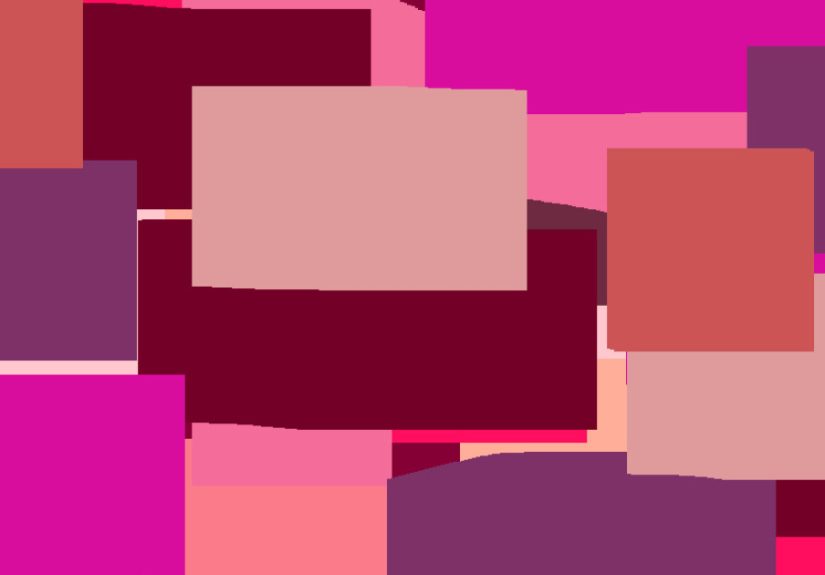
1) Minimal Gradient (Aka: The “I’m Busy but Tasteful” Look)
Gradients are wallpaper cheat codes. They’re smooth, modern, and naturally create readable areas for icons. Add a tiny bit of grain/noise to prevent banding
(those awkward stripes that show up in flat color transitions), and you’ve got a premium look with minimal effort.
2) Photo With Intentional Negative Space
A great wallpaper photo isn’t just a great photo. It’s a great photo with breathing room. Look for images with simple skies, soft bokeh, fog, water, or
clean architectural surfacesareas where icons can sit without fighting for attention.
3) Pattern or Texture (Subtle, Not Loud)
Patterns work best when they’re quiet: small-scale shapes, soft repeats, or gentle textures. A wallpaper pattern should feel like a background, not a
nightclub flyer.
Make It Readable: Contrast, Calm Zones, and UI-Friendly Design
If you want your wallpaper to feel “high-end,” prioritize readability. Your lock screen clock, widgets, and notification text need contrast against the image.
Busy backgrounds make everything feel messyeven if the art is gorgeous.
Easy Readability Tricks (That Don’t Ruin the Art)
- Add a soft overlay: A subtle darkening or lightening layer can improve text clarity.
- Blur behind UI areas: Keep the subject sharp, soften the region where icons sit.
- Use vignettes thoughtfully: A gentle edge-darkening can pull focus inward and calm the borders.
- Choose simpler compositions: One subject + clean background beats “everything everywhere all at once.”
Bonus tip: if your phone supports color theming based on wallpaper, remember your background can influence your entire interface palette. A neon wallpaper may
turn your UI into a highlighter partyfun for a day, exhausting by Tuesday.
Your Wallpaper Toolkit: From “I Can’t Draw” to “I Own Too Many Fonts”
You don’t need fancy software to make a wallpaperbut knowing the options helps. Pick the tool that matches your patience level.
Option A: Fast Photo Remix (10 Minutes)
- Pick a strong photo with negative space (sky, fog, water, simple walls).
- Crop for your target screen orientation (portrait for phones, landscape for desktops).
- Duplicate the layer, blur the duplicate, and reduce its opacity (creates calm zones).
- Add a subtle gradient overlay to guide readability (darker near text-heavy areas).
- Export in a high-quality format with sane compression.
Option B: Shape-Based Design (Beginner-Friendly, Super Clean)
Build a wallpaper using a few geometric shapes, a gradient, and a texture. This is how you get that “modern design studio” vibe without needing illustration skills.
Keep it to 2–4 colors, and let spacing do the heavy lifting.
Option C: AI-Assisted Concepts (Use Responsibly)
AI image tools can help you brainstorm styles fast: cyberpunk skylines, dreamy watercolor forests, minimalist ink landscapes, you name it. The key is to
treat AI like a sketch partner, not a magic “steal art” button. Use your own prompts, review usage rights, and consider doing a quick edit pass (color,
crop, clarity) so the result feels intentional.
A Prompt Formula That Actually Works
Try this structure:
[subject] + [style] + [color mood] + [lighting] + [composition] + [texture] + “minimal background space for icons”.
Example: “Mountain lake at dawn, cinematic minimalism, cool blues and warm peach highlights, soft mist, centered horizon, subtle film grain,
minimal background space for icons.”
Export Like You Mean It: Formats, Quality, and File Size
The goal is crisp detail without bloated files. For device wallpapers, JPEG and PNG are the most universally practical.
If you’re publishing wallpaper downloads on the web, newer formats like WebP or AVIF can shrink file sizesjust remember some users still want classic formats.
Quick Format Guide
- JPEG: Great for photos. Smaller files. Can show compression artifacts if pushed too hard.
- PNG: Great for crisp shapes, text, and clean gradients (especially with careful export). Supports transparency.
- WebP/AVIF: Excellent compression for web distribution. Great for download pages, with fallbacks if needed.
Two Export Mistakes People Make Constantly
- Obsessing over DPI/PPI for screens: For screens, pixel dimensions matter most. DPI is mainly a print concern.
- Over-compressing: If your gradient turns into blotchy soup, lower compression and try subtle grain to hide banding.
Also, some managed-device environments enforce wallpaper file type and size limits. If you’re making wallpapers for organizations or teams, keep an eye on
file size and stick to common formats.
Where to Get Visuals Legally: Public Domain and Open Access Goldmines
If you’re building wallpapers from real images (space photos, vintage posters, historic photography, museum collections), you can find incredible material that’s
free to useif you know where to look and you respect the rules. Many U.S. public institutions provide public domain or open-access assets, but you should still
read usage notes, especially for trademarks, identifiable people, or third-party content included in a collection.
Smart Sourcing Moves
- Prefer public domain or CC0 assets when you want maximum flexibility.
- Check collection notes for exceptions (some items may still be under copyright).
- Avoid using official insignias/logos in ways that imply endorsement.
- When in doubt, use your own photosyou automatically control rights.
A Mini “Wallpaper Lab”: 5 Recipes You Can Make Today
Recipe 1: The Soft Gradient + Grain
- Create a new canvas for your device orientation.
- Build a two- or three-color gradient (keep it smooth).
- Add a tiny amount of noise/grain (just enough to stop banding).
- Darken the top area slightly if you use lots of lock screen widgets.
Recipe 2: The “Icon-Friendly Landscape”
- Pick a landscape photo with a clean sky or water area.
- Crop so the calm zone sits behind your icons.
- Apply a soft blur to the icon zone only (masking helps).
- Export as high-quality JPEG.
Recipe 3: The Vintage Poster Remix
- Grab a public-domain poster image.
- Crop aggressivelyfocus on one bold element.
- Reduce detail in the background (blur/texture overlay).
- Add subtle paper texture so it feels cohesive.
Recipe 4: The Calm Pattern
- Choose one simple shape (dots, arches, leaves).
- Repeat it with lots of spacing.
- Use low-contrast colors for a softer look.
- Export as PNG if you want super crisp edges.
Recipe 5: The “Mood Board” Collage (Without the Mess)
- Pick 3–5 images that share a color mood.
- Arrange them with consistent margins.
- Add a translucent overlay so icons stay readable.
- Keep the center clean for clock/widgets if it’s for a lock screen.
Test It Like a Pro (In 30 Seconds)
Before you declare victory, do a quick reality check:
- Lock screen test: Is the clock readable? Are widgets clean?
- Home screen test: Can you find your apps instantly?
- Dark mode/light mode: Does it still look good in both?
- Zoom/crop behavior: Did your subject get decapitated?
If something feels off, the fix is usually simple: shift the crop, calm the background, or add a gentle overlay. Wallpapers are iterative by naturebecause your
screen is basically a living room where the furniture keeps moving.
of Wallpaper-Making Experiences (So You Don’t Have To Learn the Hard Way)
People who start making wallpapers usually go through the same mini-journey, and it’s oddly comfortinglike finding out everyone else also burns the first pancake.
The first wallpaper attempt tends to be wildly ambitious. It’s a beautiful image, full of detail, dramatic lighting, and tiny elements you’re proud of. Then you set
it as your home screen and realize your apps have disappeared into the shadows like they’re playing hide-and-seek professionally.
The second attempt is when the “aha” moment hits: wallpapers aren’t posters. A poster wants you to stare at it. A wallpaper wants you to live with it. So people
start leaving spacesoft skies, gentle gradients, blurred backgrounds, clean textures. And suddenly the phone feels calmer, like you just cleaned your desk without
actually cleaning your desk.
Then comes the “crop grief” phase. You designed it perfectly… on your computer. But your phone zooms in, shifts the framing, and trims the edges like a chef
aggressively plating food. This is when creators learn the power of safe zones. They stop placing important stuff at the very top or bottom. They center the subject.
They build extra margin around the edges. It’s not overthinkingit’s survival.
Another common experience: the accidental neon UI. Someone picks a bold, saturated wallpaper and suddenly their interface colors feel louder than expected.
That’s when people start choosing wallpapers not just for the image, but for the mood of the whole device. Warm tones feel cozy. Cool tones feel clean. Dark
wallpapers feel cinematic. Light wallpapers feel airy. The wallpaper becomes less “random image” and more “daily atmosphere.”
And thenthis is the fun partpeople develop “wallpaper seasons.” In winter, they want soft lights, cozy gradients, and calm scenes. In summer, brighter photos
and playful patterns show up. During stressful weeks, minimal backgrounds win because the screen already has enough going on. During creative bursts, more
experimental art appears because the wallpaper becomes a tiny personal gallery.
The last experience most makers share is realizing they don’t need perfection. They need options. A set of three wallpapers in the same style (one darker, one
lighter, one more colorful) is more useful than a single masterpiece. You rotate based on mood, lighting, and how busy your week feels. And eventually you end up
with a small collection that’s unmistakably yoursfunctional, good-looking, and quietly satisfying every time you unlock your screen.