Table of Contents >> Show >> Hide
- Why Yellow Feels Fresh Again in 2026
- The Yellow 2026 Spectrum: 6 On-Trend Yellow Families
- Real Paint Examples That Match the “Yellow 2026” Vibe
- How to Choose the Right Yellow: Undertones, Lighting, and the “Two-Bulb Test”
- Where Yellow Works Best in 2026 Homes
- Colors That Pair Beautifully With Yellow
- Application Tips: How to Make Yellow Look Expensive (Not Patchy)
- Health and Indoor Air: Low-VOC and Zero-VOC Paint Basics
- What the 2026 Color Authorities Suggest (and What It Means for Yellow)
- Final Thoughts: Yellow 2026 Paint Is About Warmth You Can Live With
- Experiences With Yellow 2026 Paint: 4 Real-World Scenarios (About )
Yellow paint has always had main-character energy. The problem is that sometimes it shows up like an over-caffeinated
golden retriever in a room that wanted “calm, quiet, and maybe a little Scandinavian.” For 2026, yellow is getting a
glow-up: softer, warmer, more livableand way less “school bus on a glare day.”
This guide breaks down what “Yellow 2026 Paint” really means, which yellow families feel current right now, how to
pick the right undertone, and how to actually live with the color once it’s on your walls (because vibes are great,
but so is not repainting your entire kitchen after one moody Tuesday).
Why Yellow Feels Fresh Again in 2026
Design is moving away from one-note, ultra-safe neutrals and back toward personalitywithout swinging into chaos.
Yellow fits perfectly because it can act like a neutral (yes, really) when it’s muted, creamy, or slightly earthy.
In other words: you can get warmth and optimism without turning your living room into a lemon-flavored energy drink.
The most “2026” yellows aren’t neon. They’re buttercream, warm straw, soft marigold, and grounded ochreshades that
play nicely with natural woods, warm whites, vintage brass, and even the moody browns and deep greens trending in
larger palettes.
The Yellow 2026 Spectrum: 6 On-Trend Yellow Families
“Yellow” is not one color. It’s a whole family reunion, and some relatives are easier to host than others. Here are
the six yellow directions that look especially right for 2026.
1) Butter Yellow (soft, creamy, nostalgic)
Butter yellow is the friendly one. It reads warm, cozy, and a little nostalgiclike a vintage toaster, but in a good
way. It’s also the easiest yellow to use across large surfaces because it doesn’t scream; it hums.
- Best for: kitchens, breakfast nooks, hallways, guest rooms, kids’ rooms that you want to feel calm
- Pairs with: warm white trim, light oak, sage green, denim blues, brushed brass
- Pro tip: in north-facing light, choose a butter yellow with a bit more warmth so it doesn’t look dull
2) Lemon Sorbet (clean, bright, modern)
Lemon yellows are cheerful and crisp, but the secret is controlling the intensity. In 2026, lemon looks best used
strategically: an accent wall, a ceiling, or a small room where you want a “hello sunshine” moment.
- Best for: powder rooms, ceilings, doors, playful home offices
- Pairs with: crisp whites, black accents (sparingly), pale woods, cobalt or navy
- Pro tip: glossy lemon on a front door looks intentional; flat lemon across a dim room can look tired
3) Golden Straw (warm, sunlit, “quiet luxury” friendly)
Straw yellows lean beige-gold and can behave like a warm neutral. These are the yellows that make a room feel
“expensive” without requiring you to buy anything expensive.
- Best for: open-concept living spaces, bedrooms, traditional homes, transitional style
- Pairs with: creamy whites, warm taupes, natural linen, medium woods
- Pro tip: if you’re nervous about yellow, start hereit’s the gateway yellow
4) Ochre & Saffron (earthy, architectural, artsy)
Ochre is the “grown-up” yellow. It’s grounded, earthy, and looks incredible with textured walls, plaster finishes,
terracotta accents, and vintage rugs. If butter yellow is a friendly smile, ochre is a knowing smirk.
- Best for: dining rooms, libraries, entryways, accent walls, Mediterranean and Craftsman-style homes
- Pairs with: warm whites, clay tones, deep greens, walnut wood, aged brass
- Pro tip: ochre can read “mustardy” under cool LEDstest it at night before committing
5) Mustard & Marigold (bold, cozy, statement-making)
Mustard and marigold are saturated yellows that still feel livable because they’re warmed with orange or brown
undertones. They’re great when you want drama that isn’t moody-black dramatic.
- Best for: accent walls, built-ins, furniture, mudrooms, creative studios
- Pairs with: charcoal, navy, emerald, warm whites, black metal accents
- Pro tip: if you’re using it on cabinetry, consider a satin finish for durability and richness
6) Yellow-Green “Wasabi” (playful, edgy, trend-forward)
If 2026 had a “spicy yellow,” this would be it. Yellow-green tones feel modern, fresh, and a little unexpected.
They work best when you treat them like a fashion accessory: one great piece, not head-to-toe.
- Best for: front doors, small accents, modern powder rooms, art studios
- Pairs with: warm whites, pale woods, slate blue, deep forest green
- Pro tip: yellow-green shifts dramatically with lightingsample it in multiple corners of the room
Real Paint Examples That Match the “Yellow 2026” Vibe
Below are examples from major U.S. paint lines that fit the 2026-friendly yellow spectrum. Use these as starting
points, then sample like your walls owe you money.
- Sherwin-Williams: popular yellow options like Napery, plus richer warm yellows like Kingdom Gold or Alchemy
- Benjamin Moore: classics such as Hawthorne Yellow, plus designer-loved yellows like Goldfield
- BEHR: brighter, sunny options (for accents) and softer yellows for wide walls
- Dunn-Edwards: ochre-leaning shades that suit historic and architectural styles
- Clare: modern, curated yellows designed to feel “happy” without being loud
- Magnolia Home: earthy yellows with subtle undertones that play well with warm neutrals
How to Choose the Right Yellow: Undertones, Lighting, and the “Two-Bulb Test”
Yellow is extra sensitive to undertones and lighting. The same swatch can look like soft butter at 2 p.m., then
suddenly become “greenish popcorn” at 9 p.m. under cool LEDs. Here’s how to pick a yellow you’ll still like after
the novelty wears off.
Step 1: Identify the undertone (not just the color name)
Most yellows lean one of four ways: creamy (white/brown), golden (orange),
greenish, or mustardy (brown/olive). Undertones determine whether your yellow looks
sunny, earthy, sharp, or soft.
Step 2: Test it in your real lighting
Lighting can shift undertones warmer or cooler. Warm bulbs tend to amplify yellow warmth; cooler bulbs can pull out
greenish notes. Before you commit, test your sample under:
- Daylight (morning and late afternoon)
- Your nighttime lighting (the “I live here” lighting)
- Two bulb temperatures if possible (one warmer, one cooler) so you see the full personality
Step 3: Decide if yellow is the star or the supporting actor
A whole room of lemon yellow is a commitment. A butter-yellow ceiling or a warm straw hallway? Much easier to love
long-term. If you’re unsure, choose a softer yellow or use it in a smaller zone first.
Where Yellow Works Best in 2026 Homes
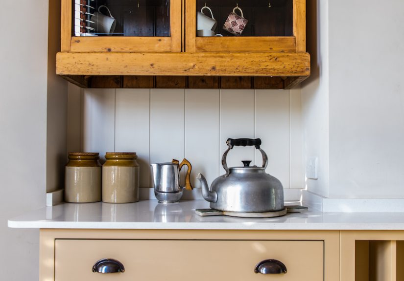
Kitchens: warm, welcoming, and not “fast-food fluorescent”
Yellow kitchens can feel cheerful and invitingespecially in buttery and mustard tones. The key is avoiding
overly-bright, high-saturation yellow across huge surfaces unless your kitchen is flooded with natural light and you
genuinely want bold. If you love yellow but worry it’ll overwhelm, use it on an island, a pantry door, or a
breakfast nook instead of every wall.
Living rooms: use yellow to warm up the “sad beige” aftermath
A straw or butter yellow can warm up a living room without feeling like a themed set. Pair it with layered neutrals
(cream, camel, oatmeal), then add contrast with navy, forest green, or black accents. The result feels fresh and
intentionallike you hired a designer, but really you just made good decisions and drank water.
Bedrooms: butter yellow for calm; ochre for cozy drama
For bedrooms, avoid the brightest yellows unless you’re going for “wake up instantly.” Soft butter or straw reads
soothing, while deeper ochre can feel cocooning and elegantespecially with warm white bedding and wood furniture.
Bathrooms & powder rooms: yellow is the cheat code for charm
Small rooms can handle more personality. A sunny yellow powder room can feel playful; an ochre powder room can feel
boutique-hotel stylish. Add a warm white ceiling and a mirror with a brass or black frame to keep it crisp.
Colors That Pair Beautifully With Yellow
Yellow is surprisingly flexible. These pairings tend to look modern (and not like an old cartoon sandwich shop):
- Warm whites: soften yellow and keep it airy
- Deep greens: earthy contrast (especially with ochre and straw)
- Navy and denim blues: classic, calming, and designer-approved
- Terracotta and clay: warm-on-warm, very 2026
- Charcoal and near-black: adds structure and sophistication
Application Tips: How to Make Yellow Look Expensive (Not Patchy)
Use the right primer strategy
Yellow (especially brighter yellows) can be tricky to cover evenly. A properly chosen primersometimes tintedcan
help you reach true color in fewer coats and avoid that “why does my wall look like a banana with commitment issues?”
moment.
Pick the right sheen for the job
- Matte/flat: forgiving on imperfect walls, softer look (great for bedrooms and living rooms)
- Eggshell/satin: more washable, a little more glow (great for hallways and kitchens)
- Semi-gloss: trim, doors, cabinets (durable and crisp, but shows surface flaws)
Sample smarter, not harder
Instead of painting one tiny square (which lies to you), test larger swatches in multiple spots. Yellow changes with
shadows, nearby finishes, and time of day. Your swatch needs to survive morning light, afternoon glare, and that one
overhead bulb you refuse to replace.
Health and Indoor Air: Low-VOC and Zero-VOC Paint Basics
If you’re painting indoors, looking at low-VOC or zero-VOC options can help reduce odor and improve comfort during
and after the project. “Low-VOC” and “zero-VOC” definitions vary by standard, but many guidance frameworks reference
VOC levels measured in grams per liter (g/L). If indoor air sensitivity is a concern, check the label, the product
data sheet, and any third-party certifications that matter to you.
What the 2026 Color Authorities Suggest (and What It Means for Yellow)
Many 2026 “Color of the Year” picks lean groundedthink warm neutrals, smoky greens, deep browns, and calm blues.
That doesn’t push yellow out; it changes how yellow shows up. Instead of neon walls, yellow becomes:
- An undertone: warm whites, creamy neutrals, and straw tones that quietly brighten a space
- An accent: butter-yellow doors, ochre built-ins, marigold furniture
- A bridge color: connecting warm woods, brass, and earthy palettes into one cohesive look
Translation: yellow in 2026 is less about shouting “LOOK AT ME” and more about making a home feel warmly alive.
Final Thoughts: Yellow 2026 Paint Is About Warmth You Can Live With
The best yellow for 2026 is the one that matches your light, your finishes, and your tolerance for bold color on a
sleepy morning. If you want easy: go butter or straw. If you want style: go ochre. If you want fun: go lemon or
wasabibut keep it intentional.
Yellow can be timeless, modern, cozy, or playful. The trick is choosing the right version of yellow, then giving it
the lighting and pairings it deserves. (Honestly, same.)
Experiences With Yellow 2026 Paint: 4 Real-World Scenarios (About )
1) The “I just wanted cozy” hallway experiment: Someone picks a butter yellow because the hallway
feels cold and shadowy. On the first day, it looks perfectwarm, welcoming, like the house is giving you a friendly
handshake. Then nighttime hits and the overhead LED turns it a little green. The fix isn’t repainting; it’s swapping
the bulb to a warmer temperature and adding a warm white runner. Suddenly the same paint reads creamy again, and the
hallway stops looking like it’s auditioning for a science lab. The lesson: yellow is a lighting snitch. It tells on
your bulbs.
2) The kitchen that needed “happy,” not “highlighter”: A homeowner loves yellow kitchens but fears
the full-wall commitment. So they paint the breakfast nook in a soft straw yellow and keep the main kitchen walls a
warm white. The nook becomes a favorite spotmorning coffee looks better, and the space feels like sunlight even on
rainy days. Friends comment that it feels “designer-y,” which is code for “you did something brave but not chaotic.”
This is peak Yellow 2026 Paint energy: controlled optimism.
3) The ochre accent wall that made the room feel furnished: In a living room with neutral furniture,
everything feels a bit… floating. Add an ochre accent wall behind a bookcase, and suddenly the room has structure.
The wall acts like a backdrop that makes art and shelving pop. Brass frames look richer, wood tones look warmer, and
the neutral sofa stops feeling like it’s waiting to be adopted. This is why earthy yellows are so “in” for 2026: they
do the job of color without demanding your whole personality in exchange.
4) The front door “tiny dose of dopamine” move: Someone wants to try a brighter yellow but doesn’t
want to live inside it. So they paint the front door a clean lemony yellow in a durable finish and keep the exterior
body color neutral. The door becomes the house’s signaturecheerful, memorable, and surprisingly classy when paired
with black hardware and simple landscaping. And if they ever get tired of it? Repainting a door is a weekend project,
not an identity crisis. Yellow 2026 Paint doesn’t have to be all-or-nothing; it can be a perfectly measured wink.